• About

LIVEdigitally

Author Archives: David Speiser

Why did Apple colossally screw up the iPod Shuffle?

Posted on April 1, 2009 by David Speiser

On a scale of 1 to 10, the new iPod shuffle is just stupid.  (You could probably tell from the title what I want to rate it.)

Good lord.  Where to begin.  Let’s start with a disclaimer.  I haven’t touched or seen the new shuffle in person.  Deride me all you want, I don’t care.  Apple has made several colossal, incredible mistakes with this device.

Anyone who’s read this blog before (only a rare few have come back more than once) knows that I care a great deal about Apple, and that I adore the aluminum shuffle.  That review was one of my very first, and it took place almost exactly 2 years ago.  I like that shuffle so much that I even got a second one and had it waterproofed.  But this new one… sigh.

Let’s see.  No buttons. Brilliant, let’s use an earphone-based switch.  Except, wait a second, what if I want to use a different set of earphones?  I can tell you for a certainty that some people (Sol) don’t like Apple’s earbuds – they just don’t fit.  So now I’m locked into Apple’s proprietary earphones whether I like it or not.  I will be unable to skip songs, pause and play, or change the volume without them.  Epic Fail.  And the controls are not very straightforward – Adrian Covert over at 
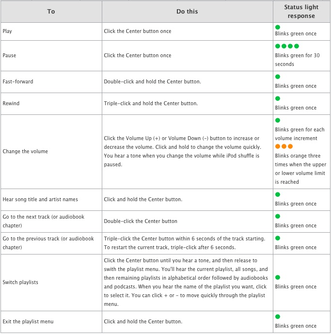
Gizmodo compares it to Morse Code.  Haha.

Form factor.  The new one is smaller.  Small as a house key.  Whoopee.  I use my square shuffle when I run, and I clip it to the waistband on my shorts.  It fits easily and doesn’t pinch or push against my skin.  The new one is long and skinny instead of square.  Maybe it occupies less cubic space overall, but it’s still longer than the square version, which means that it sticks further down the leg and is significantly more likely to pinch and press against the top of the leg while running.  Wahhhh!  I know, I’m a crybaby.  Don’t care.  I don’t see how making it rectangular and slightly smaller is an improvement.  Doubling the flash memory while shrinking the device (and preserving battery function) is a technological feat, I will grant them that.

The point is, they’re messing up an excellent product.  Even sight unseen, Apple just took a 7.5 and made it a 3.  The earphone restriction is egregious.  Moronic. Idiotic. It’s dumb.  The judgement on the form factor is my opinion.  Others may disagree, and that’s cool.  They can write their own blog.  But imho, there is no excuse for this stupidity.

Apple is a money-hungry American corporation that wants to insert themselves into our lives and control all our devices and hence have control over our actions and more importantly our buying habits.  For this I applaud them.  Seriously, I’m an American and a capitalist.  I love Apple, even if I find some of their practices annoying (DRM anyone?)  But when they start making bad (or worse yet, stupid) product decisions, that shakes my faith and my confidence in the world of consumer electronics.

As noted above, if I were force to rate this product (albeit without playing with it in person) on a scale from 1 to 10, it would get a 3.  If it weren’t being compared to such a superior previous version, it might score better.  But the earphone thing is pretty stupid.  Gahhh.

This reiew is also published at 1TO10REVIEWS.

Share this:

  • Email
  • Facebook
  • LinkedIn
  • Twitter
  • Reddit
Posted in Gadgets | Tags: Apple, ipod, shuffle | 6 Comments |

Chrome Messenger Bags – Are they just a pretty face?

Posted on February 20, 2009 by David Speiser

Chrome bags look bitchin’. The question is, do they function as well as they look?  I mean, the logo is rad, the seat-belt style buckle is unbelievably cool, and the color choices kick almost everyone elses behinds.  (Timbuk2 bags also offers cool color varietals, but they just seem so darn preppy.)  Nah, in terms of cool factor, Chrome bags definitely carry the day.  But I’m probably getting ahead of myself. Let me backtrack.

This review is about messenger bags, bike messenger bags, and specifically those made by Chrome. While we generally stick to gadgets here at LD, we have reviewed laptop bags in the past.  I got my grubby mitts on a Citizen Bike Messenger bag from Chrome Industries, based in foggy San Francisco, CA. Typically a messenger bag is a single shoulder bag that opens horizontally, has one main strap, a large primary compartment, some level of secondary organizational compartments, and then a myriad of different possible accessories.  These might include some degree of padding, a laptop compartment, stabilizer straps, a removable primary strap, a grab handle, etc. etc. ad nauseum.  (I like bags.)

Working daily in San Francisco, I keep seeing Chrome gear all over the place.  Mostly they’re carried by dirt-baggy, scruffy faced ruffians who nimbly dodge through traffic and congregate during lunch on Market and Montgomery (read: bike messengers.)  The other primary class of people carrying these bags are poseurs.  I mean, serious wannabes who think the logo is cool and want to seem hip with their designer, hip-hugger jeans, their button down shirts with swirly embroidery, their stupid looking goatee with pencil-thin sideburns on their jawline and their aviator sunglasses… yeah, you know who I mean.  I don’t want to be that guy.  And I’m not sure I can pull off the Citizen, especially off my bike (you know, just walking around.)

Now, to be clear, I am looking at messenger bags from a particular perspective.  I do use it on my bike, I commute from San Mateo to San Francisco using my bicycle and the Caltrain.  My typical time on the bike varies between 45 minutes to 1 hour and 45 minutes per day, depending on which route I choose.  So I am doing a fair amount of biking with the bag.  But I am not a bike messenger.  This means a couple things.  I am not on my bike 8 hours a day.  And I specifically need to carry a few key items, not all kinds of random crap for delivery across the city.  I am commuting to work, not routing back and forth across a concrete jungle.  I need to carry:

  • laptop
  • power charger
  • sunglasses
  • a book
  • a layer
  • a snack
  • an iphone charging cord
  • gum
I’m on the train for part of my commute, so I frequently need to yank out my computer, or get to my book to catch up on some leisure reading.  I want the bag to be comfortable, even when heavily weighted.  I want it to be weather proof, I get caught by rain frequently, especially in the Winter time. I’d like some organization options, multiple pockets and compartments.  Ideally I’d like a padded laptop sleeve, so that I can pop out the computer without having to scrabble past all the other junk in my bag.  And I want it to look dope.  Yeah, I’m vain.  I deal with it, and so should you.

Before I ever picked one up, I went to the streets and asked some regular folks sporting Chrome what they thought.  One person complained that though he was really excited at first, he didn’t like the fact that it was just a big sack.  One big hole to drop stuff into, with little or no organizational options.  This is one of my concerns too.  On the one hand, I like simplicity.  The Citizen is straightforward – it’s a bag, it holds stuff.  There are a few pockets.  One zippered, one non-zippered, and a couple of pen / pencil sleeves.
This is sufficient for most of the small items, and offers a decent level of organization.   My biggest gripe, organizationally speaking, is really the lack of a laptop sleeve and the lack of padding.  It would be great to be able to pull out the laptop and leave the rest of my gear undisturbed.  As it is, I use a neoprene sleeve that I bought aftermarket in order to put some padding around my way-too-expensive mac.  This works fine, but the sleeve would be a nice built-in feature.

It’s important to note here that the Citizen is not intended to be, and was not designed to be a laptop bag. It’s a messenger bag, for carrying stuff around on a bike.  I am choosing to use a messenger bag as a laptop bag.  If I use a screwdriver to drive a nail, I might succeed in pounding the sucker in, but I also might get some bent nails.  That being said, more and more people are bike commuting all the time – lord knows it’s hard to get a seat on the Caltrain for the 8:15AM train.  So I think I’m not the only person who’d benefit from a couple of design alterations.  And Chrome, btw, does offer some laptop-oriented bags.  But none of them are quite like the classic “messenger-style” bags, and none of their messenger bags really hit the mark for the computer commuter.

Another oddity to me is the stabilizer strap.  It seems to me like it ought to run opposite of the primary strap.  In other words, if I wear the bag on my left shoulder, then the stabilizer strap should logically come up my right side, no?  Well, Chrome disagrees, and their stabilizer runs along the same side as the primary strap, and runs under armpit (see left.)  I found this to be pretty ineffective – the bag rolls on me just as much with this as without it.
There are a couple of things I would change about this bag, to make it the perfect bag for me.  Let me reiterate – these are not necessarily shortcomings in the bag itself (at least not all of them); rather, these are things that would improve the bag for my purposes:
  • Padded laptop sleeve (I’ve covered this)
  • Waterproof zipper with storm-sleeve to access the laptop sleeve – it would be awesome to be able to yank out the laptop without needing to unbuckle two clips and rip apart massive velcro.
  • Better stabilizer strap – I think it ought to come from the other side of the bag

The lack of a zipper will stop me from using this bag when I travel.  It’s just too difficult to pull things out of the bag when it’s stuffed under the seat in front of me when I’m riding coach in an airplane.  All that velcro, ugh. But I can also understand not wanting to compromise the waterproof integrity of the bag.  And for riding into work everyday, I am willing to put up with the shortcomings because there a lot of things I really like.  I’ll tell you what I think makes this bag a big winner:

  • The buckle – it’s darn near iconic in San Francisco, and it’s just like a seatbelt in a car.  That’s rad.
  • The materials – ballistic nylon and truck tarpaulin are badass, durable and waterproof
  • The anatomical, padded shoulder strap – even heavily loaded this is a comfortable bag to ride with, even without any padding to speak of
  • Shoulder strap again, specifically, the way it holds the bag upright – with a lot of other messenger bags I’ve used (including an Osprey and a Jandd bag) there is a constant tendency for the bag to swing sideways.  The shoulder strap on the Chrome messengers actually hold the bag more or less vertically, and the shape itself (with a little help from gravity) actually hold it in place.  It was this design element that first caught my eye.
  • The one-handed tightener and loosener on the chest strap

The Citizen from Chrome is an outstanding messenger bag with an unusual and innovative design, outstanding materials, the sweetest logo on the market, a wickedly cool (unbreakable?) buckle, and awesome color options.  There are some things it does really well, and others that could stand improvement.  But on the whole I think the bag will serve well enough for my biking commuter-geek purposes, and it’s clearly outstanding for the purpose for which it was originally intended – to be a bike messenger bag that will last for years of hard abuse.  When I’m riding my bike, I’m stoked to have this bag cause it’s comfortable, functional, and cool-looking.  When I’m not on my bike and I carry this bag, I feel like a poseur, a big lame-o that’s trying too hard to look cool.

If I were forced to give this bag a numeric rating between 1 and 10, I’d have to split things up a bit.  For the purposes of a computer-commuter bag, I’d give it a 7.  As a travel bag it’s a 5.  And as a bike messenger bag this one is a 10.  If I change career paths and start delivering packages via bicycle, I won’t carry anything else.  (I’d be laughed at, scoffed and mocked by the other guys if I did anyway.)

This review is also available at 1TO10REVIEWS.

Share this:

  • Email
  • Facebook
  • LinkedIn
  • Twitter
  • Reddit
Posted in Product Reviews | Tags: Chrome, Citizen, Messenger Bag | 4 Comments |

Firemail iPhone app – Now I'm Typin' Widescreen

Posted on February 9, 2009 by David Speiser

I’ve always detested one (or two) thing(s) about my iphone. My primary moan? Why not make the landscape keyboard more widely available? On a scale from 1 to 10, using a portrait keyboard to type emails on an iPhone is immensely sucky.

Apple made landscape work in Safari; if you’re in the browser and have to type (in the URL, or in a form) the keyboard pops up in landscape mode. This means the keys are bigger, more widely spaced, and significantly easier to tap. This is good usability. In either SMS or email mode, I can only use the portrait keyboard. This is poor usability. Given the fact that the capability exists, I can’t see any reason not to make the functionality universally available.

Lots of people told me that I’d get used to the keyboard if I gave it enough time. They were wrong. It sucks. It sucked a year and a half ago, and it sucks now too. Hence my joy, my excitement, my joie de iPhone that Firemail exists. Firemail is an application available in the App store that lets a user type emails with a landscape keyboard. Lawdy lawdy, I thought the day would never come. The folks at Conceited Software are to thank for this handy piece of code. Let me do so now. Thank you Conceited Software. Try not to let it go to your head. Pun intended.

Now, the mechanics of the thing are not entirely ideal. In order to write these blessedly quick and easy to type emails, you have to load Firemail from your homescreen, not the email app. When the app opens you will be able to compose a subject and message. Once done with your composition you can save a draft (called a bookmark) or send to email. This is great for writing a new email. But what about replying to old emails? That too is possible, here’s how:

  • Open your email app
  • Open an email
  • Hit reply
  • Hit the home button
  • Open Firemail
  • Draft your response
  • Select “Send to Mobile Mail”
  • Boom shaka laka. Your email is now a reply to the email you were reading before.

I didn’t even know you could do this till I read a couple other reviews of this app. iPhone Hacks put a great one together, and so did Ben Boychuck at Macworld. Personally, I think it’s a very strong app, and it has a place on my homescreen. I do wish it integrated a little more seamlessly with the iPhone email, but it’s a very solid app and allows me to do something that’s frustrated me since my very first week with the iPhone.

The app used to be free – it was free when I downloaded it a couple months ago. Now they charge 99 cents for it, and I think it’s definitely worth that fee. It turns iPhone email from something frustrating and terrible into something that’s reasonably not sucky. If I were forced to give Firemail a numeric rating between 1 and 10, I’d call it a 7.

This entry is also posted at 1TO10REVIEWS.

Firemail demo on 12seconds.tv

Share this:

  • Email
  • Facebook
  • LinkedIn
  • Twitter
  • Reddit
Posted in LD Approved, Mobile Technology | Tags: iphone, landscape keyboard, mobile | Leave a comment |

eStarling is Startlingly Cool

Posted on January 6, 2009 by David Speiser

eStarling makes several WiFi connected digital photo frames, and I’ve been playing with their Impact V for a bit.  I’m impressed.

From the moment you open the box, eStarling does a pretty good job holding your hand and making use of the frame pretty simple.  You have all the usual options for displaying pictures that past digital frames have lead us to expect, including memory card slots that accommodate a couple different card types (SD, MS, MMC.)  But what’s way more interesting to me is the wireless and social mechanisms for displaying pictures.

When you pull the device out of the box, a greeting card immediately invites you to plug in the frame and connect it to your wifi connection (beware: this frame is much cooler if you have a wifi network.)  Once you’re connected, the frame prompts you to visit their website and activate your account.  Once you do you will get an email address dedicated to your frame, and you (or your friends and family) can email pictures to your frame.  You can also log into your account on their website to upload pictures from your computer to your eStarling account – these will then appear on your frame (it took my pictures about 15 minutes to show up.)  One of the neatest features is the social component – you can link your frame to a variety of social websites and services, including Facebook, Flickr, Phtobucket, Picassa, Twitter (not sure about this one), YouTube and more.   In addition to these services, you can also subscribe to RSS feeds – popular ones like National Geographic or even a user-designated feed.  You can also post small videos to play on your frame if you so choose.

I did have some issues with some of the social services.  For instance, I linked my Flickr account to my eStarling frame.  It was a pretty simple, one-click connection which presumably links up eStarling’s service with Flickrs API.  Two issues presented themselves though:

1. After clicking through the Flickr to link up the accounts, instead of a “Success, awesome job, well done!” screen, I was presented with a page full of gibberish.  There was no message to tell me whether I had successfully linked the account.  I didn’t know for sure until photos started appearing on the frame.

2. When those photos did appear, they weren’t mine.  They were photos of friends mine, people to whom I am linked on Flickr.  But none of my own photos made it into the frame.  Now, I like my friends and all, but I don’t need their photos on my frame.  Whether it’s going to sit in my home, or in my parent’s home, I want my own pictures on my frame.

Ultimately I was forced to use the “custom RSS” feature and take my Flickr account’s own RSS feed and manually link that with my frame.  Even after doing that, only my most recent set (about 20 pictures or so) showed up on the frame.  I don’t really know how to pull specific sets or additional photos from Flickr into the frame.

The frame has an eight inch display (800×600 pixels) and the clarity is pretty darn sharp. (Any blurring in the images in this post is due to the photographer, not the frame.)  It’s a touch screen interface, and there are light-up touch screen buttons along the right side.  You must use the touch screen in order to connect to the wireless network, but almost everything else can be accomplished through eStarling’s web portal.   The touch buttons let you skip through photos, or jump back to menus to select specifc photos, or access settings for the frame.  But I found the touch buttons a little finicky to use – fortunately the included remote also allows you to control action on the frame.

Lastly, there’s packaging.  In the unboxing I discovered very little wasteful or non-recyclable material.  There was one small piece of closed-cell foam for padding, and a foam sleeve for the frame.  Everything else was cardboard, including the majority of the boxe’s padding.  5 gold stars for being conscious of the environment.

Overall I was impressed with the frame.  The picture clarity, the simple setup, and the social components were all fantastic.  I love that it’s wifi, and I dig the fact that I can update the photos remotely, up to and including if the frame is in another state (or country.)  However, I do think the web interface and tools need a little refinement.  They are feature-rich but lacking in the fine points of usability.  Some improvements could include better feedback to user actions (letting you know if you succeeded in linking an account), and better fine-tuning of services (to include / exclude friends’ photos, etc.)  They don’t need more options, they just need to refine and improve the ones they’ve got.

eStarling Wireless Digital Photo Frame on 12seconds.tv

Daniel Lim at Slashgear also wrote a nice review of this frame.  If I were forced to give this frame a numeric rating, something which I am loathe to do, I would give it an 8 out of 10. They did a good job.  I just hope they keep improving the little sucker, especially the web interface and options.

This post is also available on 1TO10REVIEWS.

Share this:

  • Email
  • Facebook
  • LinkedIn
  • Twitter
  • Reddit
Posted in Gadgets, No/Low-tech, Product Reviews, That's Janky, Video/Music/Media, Web/Internet | Tags: digital frame, eStarling, photos | 1 Comment |

David's Jawbone II Bluetooth review

Posted on December 26, 2008 by David Speiser

I’ve been thinking about a bluetooth headset for a long time.  Since I got my iPhone, I’ve almost exclusively used the included iPod headphones / speakerphone to talk with other people.  But it tangles often and it’s starting to get worn out – the rubber on the earpieces has rubbed off completely.  🙁  That combined with the California headset law (and the joy of playing with new toys) convinced me to try to go blue.  Eric Benderoff’s review of several top bluetooth headsets gave me a little background, and the pure sex appeal of the Jawbone II gave me a starting place.

There are a lot of different possible categories from which to assess a gadget like this: form factor, simplicity of use, pairing ability, sound quality, battery life, durability, cost…  I don’t often write really analytical reviews which numerically asses and assign rankings to devices, but this time I plan to for the sake time and conveneience.  Elsewise this review will ramble, extensively.  Long.

I will rank each of the above categories with a numeric ranking between 1 and 10 (naturally) and then average out the scores.  By doing this I am essentially saying 1.) that each of the chosen categories have equal weighting, and 2.) that other possible categories (say, color) do not factor into my assessment.  Those are both true things, so take my review with the appropriate grains of sodium hydrochloride.

Form Factor: 10 (this is a sexy looking gadget, slim, black, ribbed and fancy)

Simplicity of Use: 7 (as bluetooths go, it’s pretty easy to start, pair, adjust and figure out what’s happening)

Pairing Ability: 7 (turn it on, and turn on bluetooth on your phone – they just seem to find each other)

Sound Quality: 6 (I can hear people OK.  When I need to turn the volume up high, it seems to get a little fuzzy.  People can hear me OK.  Not great, but OK.  This might be due to poor pairing, or simply the nature of the device. )

Battery Life: 6 (battery life seems to be about what you’d expect, or just a hair better.  I seem to get about 2-3 hours of active talk time.  If it sits idle on a full charge for a couple days, I can still use it.  If it sits idle after a full charge for 5 or 6 days, not so good. )

Durability: 4 (the device body seems to be fairly compact and well made, I expect it will last as well as anything else out there.  The ear pieces are another issue.  As you’ll see in the pictures below, one of my stems broke.  Jawbone is kind enough to package multiple stems [for differently sized and shaped heads / ears] so I had a backup, even though it’s a suboptimal size.  I did NOT mishandle nor manhandle the ear piece – just rotated it as it’s designed to be rotated, and the little sucker just snapped.  Boy was I irritated. )

Cost: 4 (this is a pricey little sucker.  I’ve seen it at the T-Mobile store for as little as $99, and at a Verizon store for $129.  If you shop around you’ll find it for somewhere over $100.

If we assume that each of the above categories carrie an equal weighting, then the score on the Jawbone II bluetooth headset comes out to 6.29 (10+7+7+6+6+4+4=6.2857147)

I like this device’s style and simplicity.  It’s elegant, pretty, fairly easy to use, and the it sounds good.  Not “oh my god holy crap” amazing, but it sounds good.  The cost of the unit, and the fact that the stem broke in the manner it did are both very offputting for me though, and they are the biggest limiting factors in my estimation.  That particular pair of issues (high cost with questionable durability) is expecially disagreeable.  I’ll be interested to see if/how the company responds to my customer service request.  If they do, I will update this post.

Forced to give a numeric rating between 1 and 10, this device averaged out to a 6.29.

This review is also available at 1TO10REVIEWS.

Share this:

  • Email
  • Facebook
  • LinkedIn
  • Twitter
  • Reddit
Posted in Gadgets, Mobile Technology, Product Reviews | Tags: Bluetooth, headset, Jawbone II | 2 Comments |

Video Recording on my iPhone… or very nearly (thank you 12seconds)

Posted on December 18, 2008 by David Speiser

Disclaimer: We know, love and work with the people from 12seconds.  Impartiality is severely dented, if not discarded outright.

Today 12seconds.tv did a few cool things:

  1. They’ve re-designed their website – cool new look and feel, with a strong focus on video consumption
  2. They’ve concluded their invite-only Alpha phase and opened up in a public Beta where anyone can register and use the site
  3. They’ve had their iPhone application approved and launched in the iTunes App Store (for $0.99)

I’m happy for their progress from Alpha to Beta, and I think the re-design looks great.  But I’m most excited about the iPhone app.  You all know (both of you) 😉 that I’m an iPhone user, and one of my few frustrations with the device has always been the lack of a video recorder.  Apple steadfastly refuses to release one, and there’s no third-party video recording application available (unless you choose to jailbreak your phone). This annoys me.

12seconds did not manage to sneak a video recorder through Apple’s QA team.  But they did create about the best possible workaround.  App users will take 3 photos (or choose 3 from their picture library), record twelve seconds of audio, and then post their creation to their 12seconds account (unregistered folks can create an account on the fly, in their phone.)  Somewhere in the cloud, the pics and audio are combined and then spit out as a twelve second video slideshow.  Users can email a link to their video directly from their phone  Each video has it’s own unique URL on 12seconds.tv, and can be emailed, embedded (as HTML) or downloaded onto your hard drive.  Here’s a demo video on how to use the app.

iphone app for 12seconds.tv from Sol Lipman on Vimeo.

One thing I really like about this app is the story telling aspect.  The series of pictures with audio narration really give you that James Earl Jones feeling of comfort.  Also, if you flub the audio and need to re-record, you can do so as many times as you like.  With traditional video, if you blow it, it’s blown.  The moment has passed. Here’s one video I recorded with a trial version of the app.

Cold Cuts – Chinese Food Style on 12seconds.tv

The app is a first draft.  It works, and it’s intuitive, but there are some features I’d like to see added, including wanting better flexibility in choosing photos and saving drafts.  But on the whole I think the app is very usable.  There’s just room to improve.

Kudos to the 12seconds team on a great launch and a cool app.  This is the best solution to the video-recording conundrum that Apple’s created that I’ve seen yet.

Related Posts:

MG Siegler at VentureBeat

Greg Kumparak at MobileCrunch

Rodney Rumford at FaceReviews

This post is also published on 1TO10REVIEWS.

Share this:

  • Email
  • Facebook
  • LinkedIn
  • Twitter
  • Reddit
Posted in Gadgets, LD Approved, Mobile Technology, No/Low-tech, Video/Music/Media, Web/Internet | Tags: 12seconds, App Store, iphone | Leave a comment |

A Waterproof iPod Shuffle in Review

Posted on December 8, 2008 by David Speiser

A while back, when I first saw Steve Jobs announce the new version of the iPod shuffle, with integrated clip and super-small form factor, I was excited.  I exercise a lot, mostly running, biking and swimming.  Music (or “books on tape”) makes the whole experience a lot more tolerable, and the iPod shuffle with its light weight and built-in clip is a perfect companion.

For running and biking, the shuffle is brilliant, and I use it every day.  Every day.  However, I’ve been swimming a lot more lately, and most electronics don’t do well in water, chlorinated or otherwise.  And I’ll tell you something else.  Swimming laps is boring.  Really boring.  I find it slow, tedious, dull, and insipid.  I like the feeling of endorphin release, and the positive benefits of the exercise, but man swimming laps is uninspiring.

Enter Swimman:

Swimman.com is a service that will waterproof the iPod shuffle.  You can buy the iPod through them, or purchase it directly and send it to them.  The waterproofing treatment takes about one week, and then you’re ready to go.  They also sell waterproof headphones (which I bought) to use while swimming.

Here are the basics:

  • They waterproof the shuffle
  • The On/Off slider and the Shuffle/Continuous play slider are both locked in place
  • The buttons become much stiffer

Otherwise it works the same as before.  If you want to shuffle your music you can set your playlist in iTunes to shuffle.  Once you get your device, you’ll want to clip your headphones and the shuffle to the headband, strap the excess cord under the headband, and then you’re ready to swim.

Swimman offers a number of packages to choose from, including just the shuffle itself, the headphones and the shuffle as a combo package, etc.  I went with package E, along with a pair of swimman headphones.  The waterproofing treatment is $100 plus $15 for shipping and handling.  The headphones are another $100.  And the 2GB shuffle is about $70.  So all told I’m down almost $300 for the luxury of waterproof tunes while lap swimming.

I’ve now used the waterproofed shuffle a total of 8 times.  I am stoked.  I switch back and forth between music and books on tape (nothing gets you pumped up like Joe Mantegna reading the Godfather.)  But I find that I can now swim longer and with less impatience.  Here are some pics of the shuffle in situ – (it looks just like any other):

On the whole I think this is awesome.  It ain’t cheap, so if you’re short of cash you might need to look at cheaper options.  But all of those options are considerably bulkier, heavier, and/or less convenient than the Swimman waterproofing treatment for the shuffle.

If I were forced to give the Swimman waterproofing system a numeric rating between 1 and 10, I’d give it an 8.  It would probably be a 9 or 10 if the price wasn’t so dang high.

This post is also available on 1TO10REVIEWS.

Some other related posts:

Engadget

Share this:

  • Email
  • Facebook
  • LinkedIn
  • Twitter
  • Reddit
Posted in Gadgets, Product Reviews | Tags: ipod, shuffle, waterproof | 2 Comments |

Netflix on the new XBOX 360 Live – disappointing so far

Posted on November 23, 2008 by David Speiser

On a scale from 1 to 10, the Netflix / Xbox experience is slathered in weaksauce.

I have an Xbox 360. When I heard about the new Xbox Live experience (new UI, new architecture, more features, more customization, etc.) I thought it sounded really cool. I’ve always thought it was a neat product, but I also thought there was a better interactive experience waiting to be enjoyed, if only someone would come along and develop it. Last Thursday, November 20, 2008, that experience became available for everyone.

One of the features I was most interested in was the Netflix streaming directly to your Xbox 360. I believe that digital home media have a long way to go. Networked media PC’s are a pain to set up, streaming media servers even more so, and Apple TV (even with Apple’s vaunted user-experience) isn’t an elegant or simple solution. But I have an Xbox 360, a computer (for all intents and purposes,) already hooked up to my television and with an HDMI connection.   Netflix streaming directly onto my TV? Sounds excellent.

I even resurrected a membership for this. I had Netflix a long time ago, and ended up canceling because I just didn’t get enough value from it. I get lots of movies from the Library (I know, laugh all you want, but’s it free) and I felt like I was always forgetting to return the Netflix discs and just throwing money away on the membership. So I canceled. But this Xbox partnership seemed like a good reason to renew the subscription, because of the ease, convneience, and my sheer exuberance at the prospect of streaming it right on to my Xbox. Then reality set in.

I just re-subscribed to Netflix, activated my account on the Xbox, and added (hang on) 39 movies to my queue. Thirty-nine movies. Of those, not one is available to stream the Xbox 360.  Not one.

Now that, my friends, is weaksauce.

And before you retort smartly, let me say that this is not just a bunch of brand new, extra fun movies.  Among others I have indies (Run, Fat Bot, Run – 2007), thrillers (Revolver – 2005), TV (How I Met Your Mother Season 1 – 2005), Action (Blade – 1998), Sci-Fi (Resident Evil: Extinction – 2007), and comedy (Forgetting Sarah Marshall – 2008) to name just a few.  There’s a good blend, in my opinion, of older and newer, hotter and less-hot choices in my list.  And none of them are available to stream.  That’s not acceptable.

After searching diligently I did finally find one movie, National Treasure 2, that was available for streaming to Xbox Live, and I wasn’t wholly opposed to watching it.  It worked flawlessly.  I’ve never watched any of the National Treasure movies, but my wife convinced me that I might like them, so I gave it a shot.  Truthfully, I enjoyed the movie.  Low expectations help a lot, and the history is a lot of fun.  But more importantly, the Netflix experience on the Xbox 360 was fantastic.  Moments after adding the movie to my queue, the Xbox Live page displayed it as available.  I asked to watch the movie, and in 15 seconds it was ready to go.  The picture quality was excellent, and the controls all worked perfectly.  I was REALLY satisfied with the experience of using Netflix.   Unfortunately, there’s not much for me to watch.

Netflix and Xbox have bragged that there’s a library of 12,000 shows to choose from and stream to your Xbox 360.  That’s not real helpful, if I don’t want to watch any of them.  I am sadly unimpressed, and if I were forced to give this a numeric rating between 1 and 10, right now it would get a 4.  I like the idea and the service worked well, but there’s no content I’m interested in seeing.  No bueno.

Some Related Stories & Links:

News 4 Gamers

Gizmodo

CNET News

Tom’s Guide

—————————————

Update 11/30/08:

I’ve been thinking about this situation some more.  Jivebotic and Wunder both left very good comments (on 1to10) about what movies are available, and the benefits of the Xbox / Netflix experience.  I agree with both of them.  The way I see it, there are two major problems:

1. There’s still not enough good content available on the Xbox.  Jivebotic pointed out some good movies that I can watch, sure enough.  But they’re still not the ones I want  to watch.  I don’t know why that rubs me the wrong way, but it does.  Out of 40 or so movie titles that I want to watch, I should have been able to find a couple that were available.   For me, there was not one.  

2. Netflix needs to add some kind of serach and identification mechanism, and that right quick.  Currently they do identify their “instant” titles, but there are 4 or 5 different “instant” mechanisms for streaming movies, and not all titles are available for all mechanisms.  I need a way to search for Xbox-compatible films, they need to visibly tag those films with an Xbox logo, and they need to quickly add more titles if they want to keep my business.  

This post is also available on 1to10reviews.

Share this:

  • Email
  • Facebook
  • LinkedIn
  • Twitter
  • Reddit
Posted in Gadgets, LD Approved, Video/Music/Media | Tags: Netflix, streaming media, Xbox 360 | 3 Comments |

There and back again: a Geek's holiday – iPhone vs. Google Phone G1

Posted on November 2, 2008 by David Speiser


I’ve had an iPhone for more that a year and a half.  I waited in line at an AT&T store the at the mall in Capitola in Santa Cruz, CA in June of 2007 to get the first iPhone.  I love my iPhone, and I’ve been generally happy with it since I’ve had it.  Sure, there a f ew things here  and there that I would change; I’d like better email service, and there should be a landscape keyboard available in every app, but on the whole it’s one of the best devices I’ve ever owned.  Everything was grand, until recently. 

In the last 2 or 3 months, I’ve had trouble talking on the phone.  Specifically if I just hold the phone to my face, sans bluetooth or headset (you know, like a normal phone) then people on the other end can’t hear me.  It’s an issue for me when my phone doesn’t let me talk to other people.  I went to my local Apple store and asked about getting it serviced.  They don’t do servicing.  If it’s outside of warranty (which mine is) then I can do one of three things:

  1. Deal with it
  2. Buy a new 3G phone
  3. Pay $200 and they’ll give me a brand new (or refurbished) phone of the same type
#3 doesn’t really sound like such a bad deal.  $200, a brand new phone that lets me talk and has no scratches… I’m thinking about it.  But, in the meantime, maybe I’d like a shiny new handset?  Maybe it’s time for a cool new gadget.  Voila, here comes the G1.  The new Google phone has some nifty features that sound very attractive:
  • Full size (and quality) screen, comparable to the iPhone
  • Multiple nav options (touchscreen, roly ball, keyboard)
  • Full QWERTY keyboard – that’s RAD!
  • Google branding and software – that’s a nice, reliable, comfortable thought
  • It’s new – always fun
  • Let’s me push back emotionally against the Mac Fan-Boy feeling I sometimes have (I don’t like feeling like a super-devotee to anyone)
  • It’s on T-Mobie – some people count this as a negative, but I’ve found T-Mobile to be very reliable in my home and work place, and they have the best customer servicve that I’ve ever encountered in a mobile carrier
  • 3MP camera – this is a nice upgrade from the 2MP camera on the iPhone, and I’m hopeful that they’ll come out with a video-recording application, which Apple steadfastly refuses to do (or allow)

So, in a fit exuberance I went down to my local T-Mobile store, checked out the device, and decided to just go for it.  I mean heck, I’m paying a steep price to live in California, I might as well take advantage of some of the beneftis.  In this case that includes a full 30 day trial period for any mobile carrier.  Worst case I just have to pay for 30 days of service, and then I can still return the handset and get out of my contract.  Low risk, possibly high reward. 

So I took home the Google phone, and I’ve played with it for a week now.  And I can tell you hands-down, it does not compare to the iPhone.  

There are lots of things I like.  The keyboard is great.  The applications are amazing.  I read Erick Schonfeld’s assessment on TC before I bought it, and I’ve found that I agree with him that the apps are the most fun and engaging part of the whole experience.  I also generally agree with Eric Benderoff’s article from the Chicago Tribune.  The G1 is not as pretty as the iPhone, but Google did manage to deliver an impressive first device. However, the overall experience just doesn’t compare.  Here are some of my issues and reasons:

  • The phone freezes up sometimes – apps can take 7-10 seconds to load
  • Email pull is actually slower than the iPhone, and I was hoping for an improvement
  • The SMS interface (and the email interface) just doesn’t compare with the iPhone
  • It’s a handsome device, but the quality / heft / experience of holding it and using it just isn’t as nice as the aluminum backing on my iPhone
  • As a media player (music and video) it just doesn’t come close

I have three major tasks (“Major Tasks”) for which I use my phone: calls, email, and media player.  SMS is a distant fourth.   I’d say with phone calls the two phones are about a wash.  For email, the iPhone has a nicer interface, accomodates more email services (G1 doesn’t play nice with Yahoo! mail) and has faster push and pull.  And as a MP3 player / video player, the iPhone is probably the best gadget I’ve ever used bar none.  The G1 can’t touch it.  

Given my personal requirements, the Google phone just doesn’t cut it as a replacement to my iPhone.  I’m better off to just suck it up and deal with the voice problem, or use the $180 + tax that I would have to spend on the G1 to buy a brand-new (or refurbished) iPhone.  

To summarize, I was having trouble with my iPhone.  I thought I could replace it with a G1, and have the joy of a new gadget while simultaneously supporting Google.  I was wrong.  The G1 is not a suitable replacement, or an improvement on any level (except the camera and keyboard.)  I’m stcking with my iPhone, until something better comes along.  

If I were forced to give the G1 a numeric rating between one and ten, I’d call it a seven.  That’s pretty good, but my iPhone is still a nine.  


iPhone vs. Google Phone on 12seconds.tv

This post is also available on 1TO10REVIEWS.

Share this:

  • Email
  • Facebook
  • LinkedIn
  • Twitter
  • Reddit
Posted in Gadgets, Mobile Technology | Tags: g1, Google Phone, iphone, T-Mobile | 5 Comments |

The Microsoft Wireless Laser Desktop 6000 – a review

Posted on October 19, 2008 by David Speiser

Back to basics for me on LD.  This one is just a straight-up, old fashioned gadget review.

This wireless laser Desktop 6000 v 3.0 mouse and keyboard have some pretty cool features, though the keyboard suffers from some serious performance drawbacks.  I’ll start with the mouse, and then my impressions, and then the keyboard, and my further impressions.

The mouse is well shaped, comfortable, and has some nifty features.  The front thumb button lets you magnify a small section of the screen, and the rear button lets you move back a page.  In the settings area you can re-designate some different functions for those buttons.  The USB wireless “dongle” fits into the bottom of the mouse; this dongle connects both thhe mouse and thhe keyboard.

The mouse has worked great so far.  the plastic and rubber surfacing is comfortable and pleasantly tactile.  The “magnify“ feature is OK, but the back button is awesome.  When I use my portable mouse I reach for it, and I’m  bummed that it’s not there.   This is not an incredible innovation – features like this have been around a long time.  But efficiency is a funny thing: once you get used to a simpler / faster / more efficient mechanism, it’s hard to give it up.  Overall, I am very happy with the mouse.

The keyboard has similar whiz-bang features and a wrist-friendly layout.  I’m used to using my old-school Dell keyboard, complete with coffee stains and non-ergonomic design.  This new black and smoke gray model, with it’s ergonomic curvatures, enlarged “critical keys” and rubberized hand rests seems like a huge step up.  There are some hot keys as well with useful shortcuts and lots of customization options.  My favorite key is actually the “documents key;” you can use it to open a specific folder (like “My Documents.”  🙂  Again, efficiency is a pleasant thing, and easy to get used to.

Here’s the issue: performance has been spotty.  When I first plugged in the dongle and tried to type I saw significant lag.  For a minute or two the keystrokes would be fine, then all of a sudden no type appeared.  Then ten seconds later, it all appeared in a rush. I try to delete or backup knowing that I mis-typed something, but no type is appearing (or disappearing.)  Then I have to just stop and wait for things to realign.   Sometimes it would type fine for a minute, and then lag for eight or ten characters, and then catch up again.  Also, sometimes the keyboard seems to lose itself.  By this I mean that though I haven’t moved the cursor or moused into a new application, suddenly the keyboard seems to stop typing, and I am forced to click on something else, and then click back into the “typing zone.”  Not OK.

I tried moving the dongle to a couple of different USB ports, tried the “reset / reconnect” button, and also tried installing the software that came with the setup (I like to check for plug-and-play compatibility before installing software).   After doing all of that, the performance improved significantly.  Having shut down and re-booted a half dozen times while running these peripherals seems to have helped as well.   At this point performance is largely acceptable, though not quite equivalent to my old PS/2 connected keyboard.  However the ergonomics, hotkeys,  and overall shiny-newness makes up for a lot.  As long as they type-pace keeps up with the speed of the keystrokes, I think I will stick with it.  But I’m not throwing out my old keyboard just yet.

This rig costs $99 retail – you can purchase it from Microsoft directly, or from any number of alternative online and traditional retailers.  Overall I think it’s a pretty good rig.  If I were forced to give it a numeric score from one to ten, I’d give it a 6.   If performance were as solid as my old wired keyboard, I’d give it a 9.  There’s another great review of this item over at IStartedSomething with some beautiful pictures if you want some more info on this setup.

This review is also posted at 1TO10REVIEWS.

Share this:

  • Email
  • Facebook
  • LinkedIn
  • Twitter
  • Reddit
Posted in Gadgets, Product Reviews | Tags: Desktop 6000, keyboard, laser, Microsoft, mouse, wireless | Leave a comment |

Review of Suunto Core Wristop Computer

Posted on August 22, 2008 by David Speiser

I bought a Suunto Core watch, in orange. I like climbing, and being in the mountains, so a watch with an altimeter makes at least some sense, which helps me justify the purchase of this rather expensive watch wristop computer.

Suunto is probably best known for their dive computers, both wristop computers, and the kind that attach to a SCUBA diver’s regulator. However, they also make several lines of outdoor / mountain oriented wristop computers. And they have a long history of excellence in manufacturing compasses.

An outdoor, mountain-oriented watch / wristop computer should include a couple of important features:

  1. It should tell time
  2. Effective alarm(s)
  3. Luminescence (push button, generally) for night time use
  4. Altimeter (this tells your elevation)
  5. Barometer (for monitoring changes in air pressure, a good signal of impending stormy weather)
  6. Compass
  7. And a bunch of other things like difference measurements, logbooks, “start from zero,” depth measurements (for when you go under water), rotating bezel, button lock, etc.

There’s a cool video that shows a bunch of the neater features. Check it out.

Truthfully, what initially caught my eye was the look and style of this watch. Many would call it garish. I call it me. I love the color orange, and I think the palette and style of the face itself is magnificent. My affection for the rubbery orange band ebbs and flows, but that’s easy to change. There’s a high-quality double hinge on both the top and bottom bands, which is an incredibly strong mechanism, and a good sign of quality.

If you’re not as into orange as I am, Suunto sells this watch in a number of different guises, both plainer and more grandiose than my selection. (See choices to the left.)

Aside from the aesthetics, this watch packs a lot of impressive features into a small package. Aside from telling time, my favorite feature is the altimeter. It’s necessary to calibrate it correctly; this can be accomplished either by knowing your current elevation and setting it accordingly, or by a trickier method involving the calibration of the barometer function (which is also very cool.) Truthfully, the manual on this sucker is extensive, and I have not quite waded through all of it yet. However, the watch, alarm, calendar, stopwatch, light, button lock, and basic altimeter have all fallen before my wily charms. I also had some help from my wife who is usually cleverer than me when it comes to gadgets, buttons, sequences, and other things requiring both patience and logic. Those are not my strong suits.

It’s fairly large compared to an average wrist watch, though not excessively so. It’s very comfortable, and not overly heavy in spite of its bulk. Sometimes if it slides forward and when I bend my wrist it gets in the way. Also, if I’m resting my hands on the edge of my laptop to type, the band can interfere with my personal ergonomics. Small price to pay for fortune and glory, but it’s an issue nonetheless. It’s also waterproof to 30 meters, which is not diving depth, but certainly has you covered for showers, swimming, or even most snorkeling. For more extensive water activities (like SCUBA) you might look at some of their other products.

This device is not cheap. The retail on the orange model is around $350. The least expensive Core model is $250 (in black and yellow.) You can purchase it through any number of online retailers, including Backountry.com. If you want to see one in person, REI carries them, and many high-end, well stocked outdoor retailers will also probably carry them.

If you’re looking for a distinctive looking and expensive wrist watch, or for an extremely feature-rich, mountain-focused wristop computer, this is an outstanding purchase. I highly reccomend, and if I were forced to give it a numeric rating I’d call it an 8 out of 10. I will update this review after my next big outdoor trip.

Here’s a video review of the Suunto Core in twelve seconds:

Suunto Core Wristop Computer on 12seconds.tv

This review is also posted on 1to10reviews.


Share this:

  • Email
  • Facebook
  • LinkedIn
  • Twitter
  • Reddit
Posted in Gadgets, LD Approved, Product Reviews | Tags: Core, Suunto, Watch, Wristop Computer | 1 Comment |

Blippr tackles micro reviews – micro keeps getting bigger

Posted on August 9, 2008 by David Speiser

On a scale of 1 to 10, I think Blippr is pretty cool.

Blippr is a review service; you write short-form reviews of all kinds of things (books, movies, etc.)  In an oxymoronic set of circumstances that only the Internet can enable, “micro” services are becoming huge.  Twitter started a couple of years ago, and has become a popular (in the Valley, not in Kansas) “micro-blogging” service.  In 140 characters or less you give your followers a status update.  Some people use this for life-casting (i.e. I’m going to get a burrito) and others for starting conversations (i.e. what are the chances that Vista will stop sucking?).  In my opinion, the latter is a much more interesting use for the service.

Twitter is about “micro-blogging” because they have a strict limitation on your content – all posts must be 140 characters or less.  That’s as opposed to say WordPress, which is unlimited blogging (gurgitate to your heart’s content).   12seconds (which we’re involved in directly and which we posted about last month) also imposes a user constraint (twelve seconds, in case that wasn’t obvious.)  Blippr follows suit with a constraint of their own, 160 characters or less.

Erick Schonfeld at Techcrunch wrote an article about Blippr a couple of weeks ago, which offers a fine summary of the product.  I just signed up for an account myself – want to be friends?  So far I’ve reviewed a couple of movies, Dark Knight and 300.  Blippr encourages reviews for all kinds of products, including movies, music, games, books, and more.  The restraints force you to be choosy with your words and even your characters.  (Might want to start liking the ampersand.)

I see lots of opportunities in this product to link out to other products and services, whether amazon book and music purchases, netflix movie rentals, booksfree book rentals, social networks likes Shelfari, Facebook, and more… the list is more or less never-ending.  Some of those deals could include affiliate deals that might even generate revenue, which is always a nice little bonus in an internet company.

I like the UI in Blippr.  When you type out a review, a blue bar below the text window indicates how much space you have left.  Where Twitter uses a numeric counter (which turns red and features a minus sign when you pass 140), I think the visualization of the blue bar is effective and more interesting to watch.

Blippr’s also done a great job of integrating other services; it’s quite easy to link your blips to your Twitter stream, to your FriendFeed, and to a myriad of other services.

There are a number of things I think BLippr could improve upon – doubtless they’ve considered these already, but I’ll voice them anyway.  I think it would be cool if you could embed blips, make a widget out of all my blips, specific genres of blips, etc.  It’d be nice to have the option to embed them directly on my blog, on a profile page, etc.

Also, SMS integration makes a lot of sense.  According to tehir Get Satisfaction page, that’s coming soon.  I can see a great deal of utility to that feature, especially in regards to a spontaneous interaction with something or other (i.e. I just walked out of Indiana Jones 4, and I’m so offended by the refrigerator scene that I want to tell the world RIGHT NOW!)  I get it, they don’t have the money / resources / infrastructure / developers etc.  yet.  But they need to add SMS soon.

I also think this is an appropriate complement to Yelp, and other restaurant / business review services.  I’d like to see them expand their focus (or create a sister service) that is dedicated to that market.   And lastly, outside access seems really important to me.  How can I dip into the Blippr-o-sphere on my mobile handset when I’m in line at the movie theater and the movie I wanted to see is sold out?  Or I am at Green Apple Books (Clement and 6th in San Francisco, check ’em out) and I want someone’s opinion on a book.  A short, to-the-point opinion.

Overall, I think this service shows more promise than most “web 2.0” (god I hate that term) companies.  I’m interested to see where it goes.  To the right I’ve embedded a screenshot of my (considerably) shorter review of Blippr, using Blippr.  Neat.

This is also posted at 1to10reviews.

Share this:

  • Email
  • Facebook
  • LinkedIn
  • Twitter
  • Reddit
Posted in Mobile Technology, Web/Internet | Tags: 12seconds, blippr, micro reviews, micro-blogging, Product Reviews, twitter | 2 Comments |
Next Page »

About

Jeremy Toeman is a seasoned Product leader with over 20 years experience in the convergence of digital media, mobile entertainment, social entertainment, smart TV and consumer technology. Prior ventures and projects include CNET, Viggle/Dijit/Nextguide, Sling Media, VUDU, Clicker, DivX, Rovi, Mediabolic, Boxee, and many other consumer technology companies. This blog represents his personal opinion and outlook on things.

Recent Posts

  • Back on the wagon/horse?
  • 11 Tips for Startups Pitching Big Companies
  • CES 2016: A New Role
  • Everything I Learned (So Far) Working For a Huge Company
  • And I’m Back…

Archives

Pages

  • About

Archives

  • January 2019
  • April 2016
  • January 2016
  • December 2015
  • June 2015
  • May 2015
  • April 2015
  • March 2015
  • February 2015
  • January 2015
  • December 2014
  • November 2014
  • October 2014
  • September 2014
  • August 2014
  • June 2014
  • May 2014
  • April 2014
  • March 2014
  • January 2014
  • December 2013
  • September 2013
  • August 2013
  • July 2013
  • May 2013
  • February 2013
  • January 2013
  • December 2012
  • October 2012
  • September 2012
  • August 2012
  • May 2012
  • April 2012
  • March 2012
  • February 2012
  • January 2012
  • December 2011
  • November 2011
  • October 2011
  • September 2011
  • August 2011
  • June 2011
  • March 2011
  • February 2011
  • January 2011
  • December 2010
  • November 2010
  • October 2010
  • September 2010
  • August 2010
  • July 2010
  • June 2010
  • May 2010
  • April 2010
  • March 2010
  • February 2010
  • January 2010
  • December 2009
  • October 2009
  • September 2009
  • August 2009
  • July 2009
  • June 2009
  • May 2009
  • April 2009
  • March 2009
  • February 2009
  • January 2009
  • December 2008
  • November 2008
  • October 2008
  • September 2008
  • August 2008
  • July 2008
  • June 2008
  • May 2008
  • April 2008
  • March 2008
  • February 2008
  • January 2008
  • December 2007
  • November 2007
  • October 2007
  • September 2007
  • August 2007
  • July 2007
  • June 2007
  • May 2007
  • April 2007
  • March 2007
  • February 2007
  • January 2007
  • December 2006
  • November 2006
  • October 2006
  • September 2006
  • August 2006
  • July 2006
  • June 2006
  • May 2006
  • April 2006
  • March 2006
  • February 2006
  • January 2006
  • December 2005
  • November 2005
  • October 2005
  • September 2005
  • August 2005
  • July 2005
  • June 2005
  • May 2005
  • April 2005
  • March 2005
  • February 2005
  • January 2005
  • December 2004
  • November 2004
  • October 2004
  • September 2004

Categories

  • Convergence (81)
  • Gadgets (144)
  • Gaming (19)
  • General (999)
  • Guides (35)
  • LD Approved (72)
  • Marketing (23)
  • Mobile Technology (111)
  • Networking (22)
  • No/Low-tech (64)
  • Product Announcements (85)
  • Product Reviews (109)
  • That's Janky (93)
  • Travel (29)
  • Video/Music/Media (115)
  • Web/Internet (103)

WordPress

  • Log in
  • WordPress

CyberChimps WordPress Themes

© LIVEdigitally
loading Cancel
Post was not sent - check your email addresses!
Email check failed, please try again
Sorry, your blog cannot share posts by email.