• About

LIVEdigitally

Tag Archives: mobile

YouTube Kids Review – and 10 Ways to Improve it

Posted on April 10, 2015 by Jeremy Toeman

YouTube Kids - main uiWe finally got around to downloading the iPad YouTube Kids app, now that more than half of my children can do things like spell words mostly correctly. And since there’s a bit of a family-wide addiction to Plants vs Zombies (1 and 2), they’ve been watching some gameplay video. Which got me realizing that a 6-year-old should not, at all, accidentally watch most of the results of “zombie” in a YouTube search. Enter YouTube Kids.

Here’s the family consensus of the strengths of the app:

  1. YouTube Kids does an excellent job filtering out anything age-inappropriate. In fact I put a dedicated effort trying to “trick” it with any means possible, and I couldn’t find a video that I considered PG-13, scary/gory, adult-themed, etc. Searching for “zombies” pretty much only showed animated results:
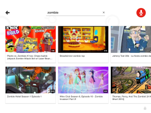
    YouTube Kids - zombie

    On a very special Thomas the Train, …

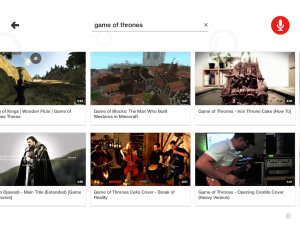
    and a search for “game of thrones” showed mostly music videos, Minecraft interpretations, and other “safe” versions:

    YouTube Kids - game of thrones

    Good thing nobody has any free time to do anything creative anymore…

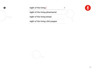
    Nothing else that I threw at it, from curse words to Skinemax-level “soft” words, came back with results. I even tried using horror movies, explosions, Michael Bay, etc:

    I hear Night of the Living Pharmacist has some pretty creepy moments

    I hear Night of the Living Pharmacist has some pretty creepy moments

    Considering this is probably the single most important role the app has, I’d call it a win if your goal is to let your kids autonomously search for videos about topics that interest them.

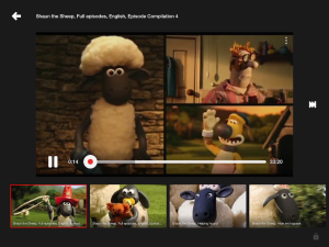
  2. It’s exceptionally easy to find copyrighted materials. A search for Shaun the Sheep (family favorite) instantly provided full episodes:
    It's Shaun the Sheep!

    It’s Shaun the Sheep!

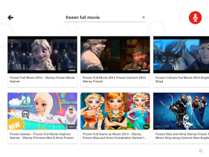
    And pretty much any search for “title of movie full movie” presented exactly that (including Frozen, Lion King, He-Man, etc):

    The illegal copy never really bothered me anyway

    The illegal copy never really bothered me anyway

    Interestingly I couldn’t find PG-13 level movies, so Harry Potter was absent, though the Harry Potter Lego Version was all over the place.

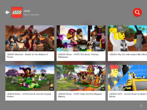
  3. Exploring and discovering learning/educational content actually is interesting. There’s tons of solid channels available, from LEGO to National Geographic and more.YouTube Kids - LEGO channel

I’d certainly call this an acceptable experience, but I’m nowhere near calling it Great. Which is disappointing, because I think it could, and should, be great. It unfortunately falls into the category of what we call “babysitter apps” – which are exactly the ones we try to avoid. We just prefer the apps that really engage our children, or that we want to use along with them. And from our perspective it falls short.

So here’s how I’d improve the YouTube Kids app:

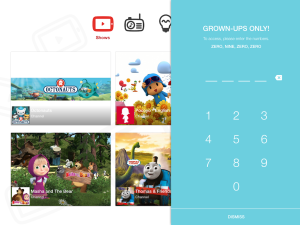
  1. Actually age-restrict Settings. Here’s what it looks like for “adult mode”:
    That's the same combination for my luggage!

    That’s the same combination for my luggage!

    While my 6yo can’t fully read, he’s got the numbers down already. Which makes the above beyond simple. Either enable a PIN-code, or have a math problem, but it needs to be a bit more serious than this.

  2. Enable simultaneous search and playback. Just like in the main YouTube app, it should be easy to have a video playing while searching for the next one you want to watch / queue up.
  3. Enable a queue / playlist. While search results become automatic playlists, as do channels, there’s no way to build your own simple playlist as you go. Maybe my 4yo couldn’t handle that, but the older ones certainly could.
  4. Save a playlist. Would be great for music videos especially.
  5. Mark/save favorite videos. If you are unfamiliar with children, there’s never ever been a video any child has ever watched only one time. More like 300 times.
  6. Add Recently Watched/History. Per the above.
  7. Subscribe to Channels. As you may have gathered by now, there’s virtually no personalization in the entire app. Why can’t I save my favorite channels, and have those appear on “my” home screen? The generic Home view is pretty useless after the kids have browsed it a few times. Also, being able to automatically find “latest episodes” from channels is a pretty core YouTube feature – one that the kids should get too.
  8. Add “Show More Results” to search. Because otherwise you can never, ever, find certain videos!
  9. Add a Web experience. Seems like a pretty natural extension, and my children do use this archaic thing I have called a computer. And once they’ve been using YouTube autonomously on the iPad, I’d like to enable them to do so on the laptop too.
  10. Allow for age ranges. Again, there’s no 8yo who wants to see the same stuff as a 4yo. With a simple range (2-4, 4-6, etc) setting, the experience would be so much better and tailored to the individual.

I’ve tried to keep the feedback fairly “light” here – things that aren’t monumental shifts in the app, but would fundamentally improve it at every level. I could go on at much more length at how to make a truly great Kids experience, but I’ll save that for another time.

Again, it’s a great start at an awesome experience, but still falls short IMHO. Though there’s one total saving grace I may have forgotten to mention. So thank you, very much, Team YouTube Kids, for this:
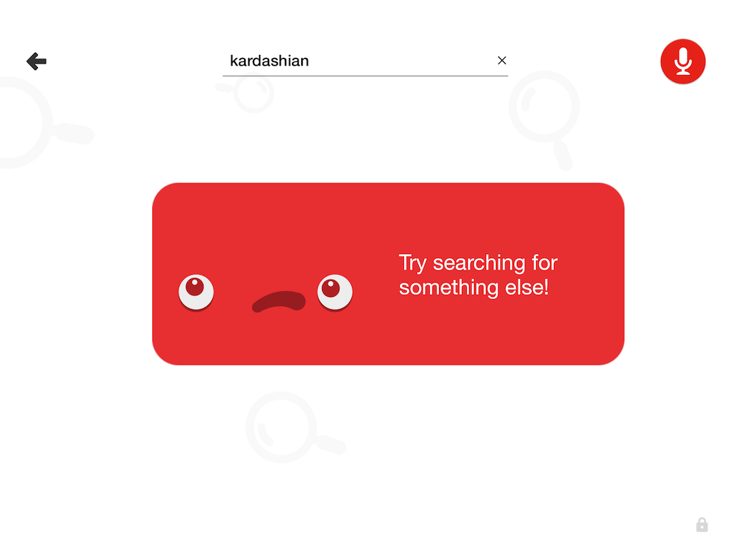
her?
her?

Share this:

  • Email
  • Facebook
  • LinkedIn
  • Twitter
  • Reddit
Posted in Product Reviews, Video/Music/Media | Tags: apps, Frozen, Harry Potter, ipad, Kardashian, mobile, Product, Shaun the Sheep, UI, ux, youtube, YouTube kids | Leave a comment |

Redefining TV in a Mobile World

Posted on September 4, 2012 by Jeremy Toeman

I had the honor to present on a “disruptive” topic at the Grow2012 conference last month in Vancouver, and, big surprise, I opted to talk about TV.  I decided to take a bit of a departure from many of my typical presentations and focus on the myths and truths (or at least truthiness) about disruption in the TV industry, with a focus on how our mobile lifestyles are changing the way we think about television.  Here’s the video (and slides):

Slides:

GROW2012 – Redefining TV in a Mobile World – Jeremy Toeman Dijit Media from Dealmaker Media

Share this:

  • Email
  • Facebook
  • LinkedIn
  • Twitter
  • Reddit
Posted in Mobile Technology, Video/Music/Media | Tags: future of tv, grow conference, grow2012, Jeremy Toeman, mobile, mobile tv, mobility, smart tv, social tv, speaking, television, vancouver | Leave a comment |

How Google Can (and Must) Fix the Android Market Experience

Posted on February 1, 2010 by Jeremy Toeman

The Android Market (droid’s equivalent to the iPhone App Store) is fundamentally broken. It’s a poor experience from start to finish, and exemplifies the grace with which Apple builds hardware and software products.  Unfortunately there’s no easy way to take screenshots directly on the device, so I’ve scraped around the ‘net to find images to reflect the issues I have.

Part 1: Finding Apps

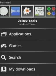
Like most sites/services, finding apps works via Search and Browse.  You can Search for something by word/term, and see apps that match – it works “ok” but not super impressive.  Browse, on the other hand, is weak. The world is divided into Applications and Games.  Games has the following categories: “All”, “Arcade & Action”, “Brain & Puzzle”, “Cards & Casino”, and “Casual” – no sports, racing, music, RPG, strategy, or pretty much anything after the letter C. Once browsing, you must sort, either by Most Popular or Newest. This means that once popular, something will stay popular.  There’s no way to sort, or filter, or even view simple things like “most popular this week”, or “highest rated” or anything else. This dramatically impacts a user’s ability to find new good apps, since there’s just no view for that.  And this is from Google, the uber-kings of data.

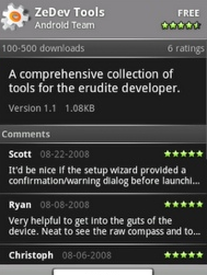
Once you find an app that seems interesting, the next step is trying to decide if you want it / it will work.  Every app has a name, publisher, # of ratings, # of downloads, description, and comments.  NO SCREENSHOTS or anything, but a description.  The comments are sometimes useful, but typically not, as you’ll often see “crashed on my droid” or “new version seems unstable” or some other complaint.  The problem with these kinds of complaints is because of all the different Droid configurations, there’s no way to tell if the comments/ratings apply to your own device.

What Should Google do?

  • Explicitly add and require screenshots of all apps
  • Allow sorting by more fields (Recently popular, Highest Rated, Most Downloaded, etc)
  • Create more categories and/or sub-categories
  • Require developers, commentors, and all other data fields to be governed by device type (i.e. allow me to see top-rated apps specifically voted on by Droid Eris users, not all Android users)
  • Clean up the Featured Apps interface, as it is really poorly done
  • Make the Android Market Website have a “send to my Droid” button (as opposed to the current site, which is inherently worthless)

Part 2: Installing & Updating Apps

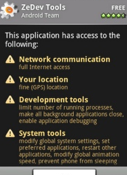
The installation process itself is fairly straightforward, once you find an app, you click the big Install button, then you are shown a cryptic screen with a bunch of warnings that you rapidly learn to ignore, then click OK.  My big complaint on this process is the aforementioned “car alarm” warnings.  I make the car alarm analogy because, much like the loud annoying car alarms we hear on random streets at random times, we pay them absolutely no attention anymore.  Which is inherently the opposite objective of a warning!  But with phrases like “Your personal information – read contact data” and “Phone calls – modify phone state”, there’s just no sense behind it.  It might as well show “PC Load Letter” and have the same amount of effectiveness.

My other gripe is on updating apps.  Since we’re still in the early stage of Droid application development, a lot of programmers are pushing frequent updates to their apps. This is great from a “shiny new toy” perspective, but getting annoying from a “stop showing me lots of alerts” perspective.  Also, there’s no way to update multiple apps simultaneously, nor auto-update an app.  And, since most developers at present are not displaying changelogs it’s hard to figure out if the update is worthwhile or not.  Further, it’s very unclear as to whether or not the comments/rating on an app are relative to the most current version or not. Lastly, and most dominant in the category of “how I know this is a Droid and not an iPhone experience,” every time I update an app, I see the warnings about that app. Every. Time.

What Should Google Do?

  • Make the warnings less technical sounding and more clear/comprehensible. “Modify phone state” is virtually meaningless to me, whereas “Make a phone call automatically” is pretty clear English.
  • Remove all the warnings that are “commonplace” – I inherently assume an app is capable of doing things like connect to the Internet, prevent my phone from sleeping, etc.
  • Allow users to “skip” an update, or enable auto-update for any given app.  Also allow users to update all apps.
  • Require that all upgrades/new releases of apps have explicit lists of what’s changed since prior version
  • Have ratings/comments be associated with both the “overall app” as well as the “current version”.
  • Only show the warnings screen when the new version of the app does (important) things that the previous version did not do.  In other words, if I’ve already installed Google Voice, which is capable of Making Phone Calls, and there’s an update to it, I don’t need to re-confirm that I want to allow it to Make More Phone Calls.

Part 3: Buying, Rating, and Uninstalling Apps

For the complaints I’d read, I was surprised at the overall seamlessness of purchasing an app through the Android Marketplace/Google Checkout process. Other than some confusing messaging, the step-by-step process worked the first time through it.  That said, I was disappointed it didn’t autofill any of my personal information (not even my name).  Also, there was a lack of clarity with regards to the fact that my credit card was “saved” by Google Checkout, with no clear way as to how to only do a one-time purchase.

Rating applications is easy, but per my aforementioned comments, needs more criteria.  My rating should get tied to the specific version of the app, and the platform I’m using as well.  Overall the rating/comment system is fairly thin, and could use improvement.

Uninstalling applications from an Android device is one of the more awkward experiences of the system.  There’s no “uninstaller”, instead you navigate back into the Market, find the app in My Downloads, then uninstall from there.  This is mostly awkward because everything else in Droid is either a click-and-drag or a long-click – so the navigation/usage paradigm you learn by using the system all of a sudden doesn’t come into play.  Now in reality I’m being a little dramatic, as once you’ve learned it, it’s easy, but it’s just another example of the kluge-like nature of the marketplace. Then again, if it’s so easy why does it take 9 steps on an eHow page (they don’t show the same path I use, but that’s also kind of the point)?

What Should Google Do?

  • Enable one-time payments that do not require saving credit card data!
  • Enable payments directly through mobile carriers (this should go straight to my Verizon bill) and/or third parties who work with carriers (for example BOKU, who is one of Stage Two‘s clients, but if anyone thinks I’d write this long a post just to reference a client in parentheses of another point, you clearly have too much time on your hands).
  • Moderate user interface “cleanup” and optimization for the checkout process
  • Again, fix the rating/comment system.  Include the “this comment was/wasn’t helpful” feature as well
  • Put an Uninstaller “app” inside Android, and let the user click-and-hold an app to invoke a menu (would make more sense than the current method anyway)

Conclusion

To be clear: There are some great apps in the Android market (current fave’s: Amazon, Evernote, Twidroid, wpToGo, Shazam, Robo Defense, Advanced Task Killer, Lookout) .  Droid is not a terrible platform. But there are some major user experience gaps today, and based on the seemingly endless list of new Droid devices slated to ship in 2010, improvement must happen soon.  I’m also not a fan of the numerous versions of Droid and the various enhancements built by Motorola, HTC, etc.

While Apple might get criticism for their closed-system nature, it most certainly allows them to build devices with consistently known experiences. Either Google or their manufacturers will need to do the same if they truly want to compete in the SuperDuperSmartyPantsPhone category.

Share this:

  • Email
  • Facebook
  • LinkedIn
  • Twitter
  • Reddit
Posted in Mobile Technology | Tags: android, App Store, apps, droid, droid eris, eris, google, iphone, market, mobile | 15 Comments |

What Wouldn't Jobs Do?

Posted on January 24, 2010 by Jeremy Toeman

The other day I surmised on what the iPad (still calling it that – it’s the shortest option) might be, as a device.  With only three days left to go prior to launch, I still find myself pondering the “how do they build something at the right price point that’s useful beyond the context of novelty and/or on the commode?” question. While many are going gaga over pretty much anything that could come out, I in my stubborn fashion still just can’t conceptualize what we are about to see.  Of course I’m effectively ready to pre-order it, but I still can’t piece it all together in my head.  So as the follow-up to what might the product be, I thought I’d amble on about what I don’t think we’ll see…

Hardware without software
One of my general rants about Tablet PCs is the lack of compelling software.  Sure Microsoft splashed some “touch features” across the OS, but for the most part it’s a trainwreck.  Apple won’t do this. Everything that ships on the iPad will be designed completely to work in a touch fashion, or it won’t be included period.  I’m still torn between whether it’ll be a version of OS X or a version of the iPhone OS, but either way, the device will ship with oodles of applicable software, custom-built to be great in gesture, touch, multi-touch, or even by looking at it the right way.

Niche or otherwise narrow market scoped
I stated in my last post that a possible product category is just a heads-on Kindle killer.  I’d characterize this as a small opportunity – yes, it’s been great for Amazon, but the market for “better than Kindle e-readers” is small. The only small product Apple still ships is the Apple TV, which they’ve characterized as a hobby product (and rightfully so) from day one.  Granted they haven’t actually said anything about the iPad yet, but their PR machine is too smart to let this much buzz build up and fall that short.  Then again, if this thing doesn’t come with an espresso maker and difribulator, some people are going to be disappointed.

An open platform

Even though the modern day Mac world is based on Unix and has a wide developer base with tons of open source projects, it’s pretty safe to call Apple a company that chooses the proprietary path more often than not.  And while this might frustrate many, the benefits of typically stable products are certainly appealing to the masses.  I expect the iPad will sit somewhere between the iPhone, with individually manually approved apps, and the OS X platform.  Based on the reports today that some apps are supposedly already being run on the iPad (of course these reports prove absolutely nothing, as it could either be an updated iPhone with a new OS, or simply another “labs” product running around campus.  but where would modern tech blogging be without unsubstantiated rumor circulation and amplification?) , my leaning is a differentiated version of the iPhone OS, with more leniency in app approval, but still not open. Many will complain, many will profit, and many will love it.

Focused on productivity
Unlike the Microsoft approach to “ecosystem” – where everything other than the Xbox is able to view and edit Excel spreadsheets – my hunch is the iPad is all about lifestyle, the Internet, and entertainment.  I’d guess there’s a native version of Safari, some kind of simple email and calendaring, and that’s about it.  I think Apple doesn’t have any interest in trying to build buzz or sales into the corporate world, and will instead stay close to their home turf with consumer appeal.  I’d go so far as to say it’ll be fun to use, and the new user experience will center entirely around delivering entertaining content.

Support every mobile carrier
Okay, this is one of those “I think I’m right, but what if they really figured it out???” things (Google didn’t really, and they’ve got some smarty folks too).  Supporting all the US carriers is cost prohibitively “impossible” – you’d need a minimum of 2 different antennas/chips and the relationships in place.  Doing this adds to cost, which is transferred somewhere (consumers), and for the most part neither manufacturers nor consumers like to have “wasteful” componentry.  Which means it’s much more likely there’s either multiple SKUs, or only one carrier.  And since the former isn’t very Apple-y, it’s much more likely there’s only one carrier involved – or none at all (which makes some sense, if this were 1997).  Further, this gets messy when we consider Verizon, the best network in the US, as their CDMA platform is unused in Europe, a place where Apple sells a lot of stuff.

I could probably add a few more pages of the what I don’t think will happen variety, but they start getting less interesting in my own opinion (5 colors of iPads! – not).  I did have one more “I’ll bet they do” item, which is…

Embrace Augmented Reality Even More
Lots of hot trends in the technosphere, from Twitter to FourSquare, from App Stores to Cloud Computing.  But Augmented Reality is actually an interesting one, has more usefulness than others, and is right up Apple’s alley.  I’d predict there are several native applications and services that provide very cool augmented reality features.  I’m firmly in the camp of one or more cameras on the iPad, and I think Apple will include one or more fun exploits of the concept from the get-go.  I don’t know if it’ll be as awe-inspiring as PlayGunman, our amazing lasertag on iPhone game, but hopefully it’ll be close (disclosure – I’m extremely involved in it. also, I’m joking around – if Apple can’t make our game look like Adventure on the 2600, I’d be stunned. and it’s not like our guys are slackers, but it’s freaking Apple).  Apple will definitely do some kind of boundary-pushing move with this device, and I’d hunch that augmented reality is one of the areas they could truly make us think a little differently.


Share this:

  • Email
  • Facebook
  • LinkedIn
  • Twitter
  • Reddit
Posted in Convergence, Gadgets, Mobile Technology | Tags: Apple, apple tablet, augmented reality, ipad, iphone, mobile, tablet | 2 Comments |

Not-So-Live at CES 2010

Posted on January 10, 2010 by Jeremy Toeman

En route to Vegas, I got myself completely ready for “liveblogging” CES 2010.  My plan was to walk the show floor, find interesting stuff, and either make a quick video or take a picture and blog.  In order to achieve this goal, I had the following technologies prepped:

  • My Droid Eris.  I was fairly confident that the Verizon network would hold up well during the show, giving me 3G bandwidth when and where I’d need it.  Further, it has a 5MP camera – good enough for CES picture taking. Usefulness: 9/10.
  • Ardica jacket w/Moshi Power Pack. Stage Two is doing some consulting work with Ardica, so they gave me a jacket to use during the show in order to keep my Eris charged (since the battery while doing 3G connectivity drains ridiculously fast). Usefulness: 10/10. And as a bonus it kept me warm outside!
  • Flip minoHD. As my backup to my Droid, I had a Flip ready to make all sorts of interesting videos, just in case. Usefulness:2/10. I only made one video with the Flip, but it did work when I needed it.
  • WpToGo (Android App). Gave me near-perfect mobile access to the WordPress blog. Usefulness: 8/10
  • Ustream Broadcaster (Android App). Gave me live videostreaming directly from the phone. Usefuless: 9/10
  • TwiDroid (Android App). Gave me access to Tweet and monitor Tweets. Usefulness: 9/10

Right now you’re probably thinking “well golly jee, Jeremy, it sure sounds like you were set up as the ultimate mobile blogger. What ever could have gone wrong?”

First, while the network connectivity far outpaced my iPhone friends, it still just wasn’t good enough for really watchable mobile video. My friend “Tivoboy” sent me a note that said “live stream is cool and novel, but vid quality is poor doesn’t make for real viewing or ANY future use.”  After receiving that (4 videos later), I pretty much stopped.  Here’s a sample video:

So, now that I was reduced to still imagery and blogging, I ran into the next hurdle: I’m amazingly slow at typing on my Eris, and CES is really busy.  Every time I took a pic, I wanted to upload and write right away, but in reality I pretty much had to keep moving.  So I decided to keep the major storytelling for after I returned, and used Twitter for any “real-time” updates.  I’ll spend the rest of the week getting all the content online (depending on how much MW2 I end up playing).

Overall I thought it was a pretty decent CES.  Nothing outstanding, but then there really hasn’t been much amazing to see at CES in years anyway.  It’s the fundamental branding problem of the show.  Further, the rapidity at which content was shared by Engadget and others radically diminished the in-person wow factor.  When you already know about the various 3DTV, ultra-slim TVs, netbooks, tablets, e-readers, and everything else that’s being shown, it takes a bit away from the in-person showiness of it all.

I think this is the fundamental challenge to keep the show interesting and excited for the attendees (beyond their busy schedules full of meetings).  By Friday afternoon (day 2) when I was walking the show with Robert Scoble and Rocky, we had already seen everything we wanted to see.  This is compounded by the (and forgive the word) “lemming-ness” of the big players.  Once 3DTV was pre-established to be a hot thing, it became the only thing, and as a result, boring.  You simply can’t get excited by 5 different demos of the same technology (especially not one that many of us just aren’t excited about).

Share this:

  • Email
  • Facebook
  • LinkedIn
  • Twitter
  • Reddit
Posted in Gadgets | Tags: ardica, blogging, ces, CES 2010, conference, consumer electronics show, convention, droid eris, flip, gadgets, mobile, robert scoble, twitter, verizon | 3 Comments |

Test post from my droid

Posted on January 6, 2010 by Jeremy Toeman

image

If this works, you should be seeing a picture of a jerk parking.

Share this:

  • Email
  • Facebook
  • LinkedIn
  • Twitter
  • Reddit
Posted in No/Low-tech | Tags: mobile, parking, test | 5 Comments |

Firemail iPhone app – Now I'm Typin' Widescreen

Posted on February 9, 2009 by David Speiser

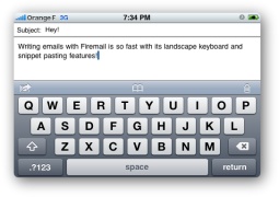
I’ve always detested one (or two) thing(s) about my iphone. My primary moan? Why not make the landscape keyboard more widely available? On a scale from 1 to 10, using a portrait keyboard to type emails on an iPhone is immensely sucky.

Apple made landscape work in Safari; if you’re in the browser and have to type (in the URL, or in a form) the keyboard pops up in landscape mode. This means the keys are bigger, more widely spaced, and significantly easier to tap. This is good usability. In either SMS or email mode, I can only use the portrait keyboard. This is poor usability. Given the fact that the capability exists, I can’t see any reason not to make the functionality universally available.

Lots of people told me that I’d get used to the keyboard if I gave it enough time. They were wrong. It sucks. It sucked a year and a half ago, and it sucks now too. Hence my joy, my excitement, my joie de iPhone that Firemail exists. Firemail is an application available in the App store that lets a user type emails with a landscape keyboard. Lawdy lawdy, I thought the day would never come. The folks at Conceited Software are to thank for this handy piece of code. Let me do so now. Thank you Conceited Software. Try not to let it go to your head. Pun intended.

Now, the mechanics of the thing are not entirely ideal. In order to write these blessedly quick and easy to type emails, you have to load Firemail from your homescreen, not the email app. When the app opens you will be able to compose a subject and message. Once done with your composition you can save a draft (called a bookmark) or send to email. This is great for writing a new email. But what about replying to old emails? That too is possible, here’s how:

  • Open your email app
  • Open an email
  • Hit reply
  • Hit the home button
  • Open Firemail
  • Draft your response
  • Select “Send to Mobile Mail”
  • Boom shaka laka. Your email is now a reply to the email you were reading before.

I didn’t even know you could do this till I read a couple other reviews of this app. iPhone Hacks put a great one together, and so did Ben Boychuck at Macworld. Personally, I think it’s a very strong app, and it has a place on my homescreen. I do wish it integrated a little more seamlessly with the iPhone email, but it’s a very solid app and allows me to do something that’s frustrated me since my very first week with the iPhone.

The app used to be free – it was free when I downloaded it a couple months ago. Now they charge 99 cents for it, and I think it’s definitely worth that fee. It turns iPhone email from something frustrating and terrible into something that’s reasonably not sucky. If I were forced to give Firemail a numeric rating between 1 and 10, I’d call it a 7.

This entry is also posted at 1TO10REVIEWS.

Firemail demo on 12seconds.tv

Share this:

  • Email
  • Facebook
  • LinkedIn
  • Twitter
  • Reddit
Posted in LD Approved, Mobile Technology | Tags: iphone, landscape keyboard, mobile | Leave a comment |

Turn Your Dumbphone into a Smartphone. For Free.

Posted on December 11, 2008 by Jeremy Toeman

My phone doesn’t do email.

It doesn’t synch with my calendar.

I can’t browse the Web (well, technically it can, but it’s quite janky).

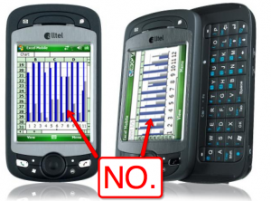
For crying out loud, I can’t even view or edit an Excel spreadsheet on it!

I have, sigh, a dumbphone.  And I love it.  I don’t have my office in my pocket. I don’t get interrupted during dinner with some email that didn’t need to get to me until the next day.  I can taxi from the runway to my gate without developing callouses on my thumbs.  I don’t have to worry about cutting and pasting anything. Are there times where I wish I had an iPhone or other boxy-but-good smartphone?  Sure.

It turns out there’s an amazing amount of things I can do with my phone without needing a lot more “smarts” in it.  Here’s a list of services I use to augment my phone’s experience.  The common theme, as you’ll quickly notice, is it’s all about SMS.

  • Check a flight status:  text to GOOGL (46645) the word “flight” followed by airline and flight number (e.g. “flight AC 759” or “flight UA 09”), you’ll get today’s flight time
  • Check a stock quote: GOOGL the word “stock” followed by ticker (e.g. “stock AAPL”)
  • Set/receive calendar events: if you use gcal you can configure it to text you alerts, and even set calendar appointments by text.  I use this all the time.
  • Send yourself a reminder: use kwiry‘s sms-based reminder/to-do system
  • Get a restaurant/business phone number: again, GOOGL and the name of the place (add the zip code for more accuracy).  this one isn’t perfect, but it’s pretty impressive
  • Research a question: try out chacha by texting your question to 242242, you’ll get a (typically) useful answer.  this is one of my favorite “tricks”, especially if I’m near a screen-pinching iPhone addict trying to find out the same information, but with oh so much more effort
  • Get a sports score: yup, GOOGL, the word “score” and your team (e.g. “score Canadiens”).
  • Lifecast: if you must, you must.  twitter, flickr, 12seconds, and other services all accept SMS and MMS messages.
  • Financial services: there are lots of new options that let you get financial updates via text, including mint.com and others
  • And the rest: Here’s a full list of all the things you can do with GOOGL. Pretty impressive, eh?

Here’s my “killer missing app” for a useful SMS service: LinkedIn/Plaxo lookups.  I have all my contacts organized – why can’t I just send in a text and get someone’s phone number or address without much effort?  Seems like a nobrainer.

So no, I won’t be shelling out a fistful of cash for any of this year’s crop of smartphones.  As I’ve said many times, all that “convenience” isn’t much of a benefit in context people becoming less detached from their real world experiences while being overly connected to their worklife.  If your name doesn’t rhyme with Harack Okama, odds are pretty good you aren’t getting recurring emails Saturday at 9pm while you’re at dinner that you *have* to check.  If you are, you need a better job.

Share this:

  • Email
  • Facebook
  • LinkedIn
  • Twitter
  • Reddit
Posted in Mobile Technology | Tags: iphone, mobile | 5 Comments |

How Verizon Could Improve Their Mobile Gaming

Posted on August 28, 2008 by Jeremy Toeman

As a long-time Verizon Wireless customer (originally back with GE!), I must say I’m generally quite happy with my service. My bill is a tad high, but then again we have 2 phones with lots of minutes, a Family plan and full access in the US and Canada, thus offsetting our home phone bill (~$10/mo for a landline). During my daily busride, I like to play games on my phone (Samsung SCH-U740 – awesome). I think Verizon may have created one of the best platform potentials but laden it with one of the worst user experiences I’ve ever seen.

In my phone menu, going to Games, then Get New App gives me a fairly easy set of options. I can instantly buy one of their top 2 games/promotions, or browse through categories to find what I want. The categories are pretty self-explanatory, and that’s about where the usability ends.

Picking a game brings you to a screen with three options: Subscription price, Unlimited price, and Info. On a rare occasion there’s also the option for a Free Trial, but we’ll ignore that for now. Let’s presume that I pick an interestingly named title, for example “Stranded: A Game of Survival” ($2.99 Sub, $7.99 Unl). Clicking “info” shows me the following text:

You awake Stranded on a mysterious island with other survivors. You discover that not everyone can be trusted. Will you escape? Without a price plan that includes an unlimited data feature, you will incur either (depending on your plan) airtime charges at applicable overage rates if you exceed your minutes bundle or megabyte (“MB”) charges of $1.99/MB for downloading the application. Some applications may result in additional charges for sending/receiving data during use. [Size:479KB]

First of all, I don’t know anything about the game! This category (strategy games) includes things ranging from Command and Conquer to Triple Scoop Twist, so there’s no information about gameplay. Is it a RTS? An RPG? A puzzle? Etc. Interestingly the website has nice screenshots and much more text describing the game itself. Why isn’t this available in the game page on the phone when I’m considering a purchase?  Even the website descriptions are lacking the specifics I’d want to know to make a decision.

Second, the data usage warning is terrible. I get that they want to warn me about a potential charge, but how is the text they use going to help? I don’t know if the app actually uses airtime/minutes to play, or if that’s just for the download itself! I understand it is a lot of extra work to figure out a user’s plan in real-time (well, no, I don’t *really* understand it, but I’ll give them the benefit of the doubt), but a simple clarification of the English would be swell.

Finally, I think a lot more free trials would sell me a lot more applications. I’ve downloaded several of the ones that give me a free level to play, or a few minutes of playtime, and have actually purchased one game as a result. I am a big believer in putting some bait on the hook, as opposed to just throwing a hook in the water and saying “here fishie fishie fishie!”  Especially considering Verizon’s Get-It-Now system is a complete walled garden, I don’t think there’s a way to “steal” a game even if I wanted to!

For the record, I’ve purchased the following games: Sudoku (good version too), Diner Dash (fun, but a bit repetitive), Call of Duty 4 (I’m such a sucker, though it was simple and fun), Transformers (not much more than meets the eye), and Townsmen 3 (meh).  I’d really like to have a very simple Ultima-style RPG (think Ultima 2 or 4) that can be played in short, bite-sized amounts of time.  It doesn’t look like I’ll be able to figure it out even if I find one, but one can always hope…

Share this:

  • Email
  • Facebook
  • LinkedIn
  • Twitter
  • Reddit
Posted in Gaming, Mobile Technology | Tags: Gaming, mobile, samsung, verizon | Leave a comment |

About

Jeremy Toeman is a seasoned Product leader with over 20 years experience in the convergence of digital media, mobile entertainment, social entertainment, smart TV and consumer technology. Prior ventures and projects include CNET, Viggle/Dijit/Nextguide, Sling Media, VUDU, Clicker, DivX, Rovi, Mediabolic, Boxee, and many other consumer technology companies. This blog represents his personal opinion and outlook on things.

Recent Posts

  • Back on the wagon/horse?
  • 11 Tips for Startups Pitching Big Companies
  • CES 2016: A New Role
  • Everything I Learned (So Far) Working For a Huge Company
  • And I’m Back…

Archives

Pages

  • About

Archives

  • January 2019
  • April 2016
  • January 2016
  • December 2015
  • June 2015
  • May 2015
  • April 2015
  • March 2015
  • February 2015
  • January 2015
  • December 2014
  • November 2014
  • October 2014
  • September 2014
  • August 2014
  • June 2014
  • May 2014
  • April 2014
  • March 2014
  • January 2014
  • December 2013
  • September 2013
  • August 2013
  • July 2013
  • May 2013
  • February 2013
  • January 2013
  • December 2012
  • October 2012
  • September 2012
  • August 2012
  • May 2012
  • April 2012
  • March 2012
  • February 2012
  • January 2012
  • December 2011
  • November 2011
  • October 2011
  • September 2011
  • August 2011
  • June 2011
  • March 2011
  • February 2011
  • January 2011
  • December 2010
  • November 2010
  • October 2010
  • September 2010
  • August 2010
  • July 2010
  • June 2010
  • May 2010
  • April 2010
  • March 2010
  • February 2010
  • January 2010
  • December 2009
  • October 2009
  • September 2009
  • August 2009
  • July 2009
  • June 2009
  • May 2009
  • April 2009
  • March 2009
  • February 2009
  • January 2009
  • December 2008
  • November 2008
  • October 2008
  • September 2008
  • August 2008
  • July 2008
  • June 2008
  • May 2008
  • April 2008
  • March 2008
  • February 2008
  • January 2008
  • December 2007
  • November 2007
  • October 2007
  • September 2007
  • August 2007
  • July 2007
  • June 2007
  • May 2007
  • April 2007
  • March 2007
  • February 2007
  • January 2007
  • December 2006
  • November 2006
  • October 2006
  • September 2006
  • August 2006
  • July 2006
  • June 2006
  • May 2006
  • April 2006
  • March 2006
  • February 2006
  • January 2006
  • December 2005
  • November 2005
  • October 2005
  • September 2005
  • August 2005
  • July 2005
  • June 2005
  • May 2005
  • April 2005
  • March 2005
  • February 2005
  • January 2005
  • December 2004
  • November 2004
  • October 2004
  • September 2004

Categories

  • Convergence (81)
  • Gadgets (144)
  • Gaming (19)
  • General (999)
  • Guides (35)
  • LD Approved (72)
  • Marketing (23)
  • Mobile Technology (111)
  • Networking (22)
  • No/Low-tech (64)
  • Product Announcements (85)
  • Product Reviews (109)
  • That's Janky (93)
  • Travel (29)
  • Video/Music/Media (115)
  • Web/Internet (103)

WordPress

  • Log in
  • WordPress

CyberChimps WordPress Themes

© LIVEdigitally
loading Cancel
Post was not sent - check your email addresses!
Email check failed, please try again
Sorry, your blog cannot share posts by email.