 The Android Market (droid’s equivalent to the iPhone App Store) is fundamentally broken. It’s a poor experience from start to finish, and exemplifies the grace with which Apple builds hardware and software products. Unfortunately there’s no easy way to take screenshots directly on the device, so I’ve scraped around the ‘net to find images to reflect the issues I have.
Part 1: Finding Apps
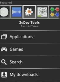
Like most sites/services, finding apps works via Search and Browse. You can Search for something by word/term, and see apps that match – it works “ok” but not super impressive. Browse, on the other hand, is weak. The world is divided into Applications and Games. Games has the following categories: “All”, “Arcade & Action”, “Brain & Puzzle”, “Cards & Casino”, and “Casual” – no sports, racing, music, RPG, strategy, or pretty much anything after the letter C. Once browsing, you must sort, either by Most Popular or Newest. This means that once popular, something will stay popular. There’s no way to sort, or filter, or even view simple things like “most popular this week”, or “highest rated” or anything else. This dramatically impacts a user’s ability to find new good apps, since there’s just no view for that. And this is from Google, the uber-kings of data.
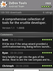
 Once you find an app that seems interesting, the next step is trying to decide if you want it / it will work. Every app has a name, publisher, # of ratings, # of downloads, description, and comments. NO SCREENSHOTS or anything, but a description. The comments are sometimes useful, but typically not, as you’ll often see “crashed on my droid” or “new version seems unstable” or some other complaint. The problem with these kinds of complaints is because of all the different Droid configurations, there’s no way to tell if the comments/ratings apply to your own device.
What Should Google do?
- Explicitly add and require screenshots of all apps
- Allow sorting by more fields (Recently popular, Highest Rated, Most Downloaded, etc)
- Create more categories and/or sub-categories
- Require developers, commentors, and all other data fields to be governed by device type (i.e. allow me to see top-rated apps specifically voted on by Droid Eris users, not all Android users)
- Clean up the Featured Apps interface, as it is really poorly done
- Make the Android Market Website have a “send to my Droid” button (as opposed to the current site, which is inherently worthless)
Part 2: Installing & Updating Apps
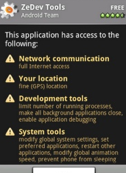
The installation process itself is fairly straightforward, once you find an app, you click the big Install button, then you are shown a cryptic screen with a bunch of warnings that you rapidly learn to ignore, then click OK. My big complaint on this process is the aforementioned “car alarm” warnings. I make the car alarm analogy because, much like the loud annoying car alarms we hear on random streets at random times, we pay them absolutely no attention anymore. Which is inherently the opposite objective of a warning! But with phrases like “Your personal information – read contact data” and “Phone calls – modify phone state”, there’s just no sense behind it. It might as well show “PC Load Letter” and have the same amount of effectiveness.
 My other gripe is on updating apps. Since we’re still in the early stage of Droid application development, a lot of programmers are pushing frequent updates to their apps. This is great from a “shiny new toy” perspective, but getting annoying from a “stop showing me lots of alerts” perspective. Also, there’s no way to update multiple apps simultaneously, nor auto-update an app. And, since most developers at present are not displaying changelogs it’s hard to figure out if the update is worthwhile or not. Further, it’s very unclear as to whether or not the comments/rating on an app are relative to the most current version or not. Lastly, and most dominant in the category of “how I know this is a Droid and not an iPhone experience,” every time I update an app, I see the warnings about that app. Every. Time.
What Should Google Do?
- Make the warnings less technical sounding and more clear/comprehensible. “Modify phone state” is virtually meaningless to me, whereas “Make a phone call automatically” is pretty clear English.
- Remove all the warnings that are “commonplace” – I inherently assume an app is capable of doing things like connect to the Internet, prevent my phone from sleeping, etc.
- Allow users to “skip” an update, or enable auto-update for any given app. Also allow users to update all apps.
- Require that all upgrades/new releases of apps have explicit lists of what’s changed since prior version
- Have ratings/comments be associated with both the “overall app” as well as the “current version”.
- Only show the warnings screen when the new version of the app does (important) things that the previous version did not do. In other words, if I’ve already installed Google Voice, which is capable of Making Phone Calls, and there’s an update to it, I don’t need to re-confirm that I want to allow it to Make More Phone Calls.
Part 3: Buying, Rating, and Uninstalling Apps
For the complaints I’d read, I was surprised at the overall seamlessness of purchasing an app through the Android Marketplace/Google Checkout process. Other than some confusing messaging, the step-by-step process worked the first time through it. That said, I was disappointed it didn’t autofill any of my personal information (not even my name). Also, there was a lack of clarity with regards to the fact that my credit card was “saved” by Google Checkout, with no clear way as to how to only do a one-time purchase.
Rating applications is easy, but per my aforementioned comments, needs more criteria. My rating should get tied to the specific version of the app, and the platform I’m using as well. Overall the rating/comment system is fairly thin, and could use improvement.
Uninstalling applications from an Android device is one of the more awkward experiences of the system. There’s no “uninstaller”, instead you navigate back into the Market, find the app in My Downloads, then uninstall from there. This is mostly awkward because everything else in Droid is either a click-and-drag or a long-click – so the navigation/usage paradigm you learn by using the system all of a sudden doesn’t come into play. Now in reality I’m being a little dramatic, as once you’ve learned it, it’s easy, but it’s just another example of the kluge-like nature of the marketplace. Then again, if it’s so easy why does it take 9 steps on an eHow page (they don’t show the same path I use, but that’s also kind of the point)?
What Should Google Do?
- Enable one-time payments that do not require saving credit card data!
- Enable payments directly through mobile carriers (this should go straight to my Verizon bill) and/or third parties who work with carriers (for example BOKU, who is one of Stage Two‘s clients, but if anyone thinks I’d write this long a post just to reference a client in parentheses of another point, you clearly have too much time on your hands).
- Moderate user interface “cleanup” and optimization for the checkout process
- Again, fix the rating/comment system. Include the “this comment was/wasn’t helpful” feature as well
- Put an Uninstaller “app” inside Android, and let the user click-and-hold an app to invoke a menu (would make more sense than the current method anyway)
Conclusion
 To be clear: There are some great apps in the Android market (current fave’s: Amazon, Evernote, Twidroid, wpToGo, Shazam, Robo Defense, Advanced Task Killer, Lookout) . Droid is not a terrible platform. But there are some major user experience gaps today, and based on the seemingly endless list of new Droid devices slated to ship in 2010, improvement must happen soon. I’m also not a fan of the numerous versions of Droid and the various enhancements built by Motorola, HTC, etc.
While Apple might get criticism for their closed-system nature, it most certainly allows them to build devices with consistently known experiences. Either Google or their manufacturers will need to do the same if they truly want to compete in the SuperDuperSmartyPantsPhone category.