• About

LIVEdigitally

Tag Archives: user experience

Why Apple Will Make a MacBook Touch (eventually)

Posted on May 14, 2012 by Jeremy Toeman

A few weeks ago someone mocked up a concept MacBook touch, and in a nutshell, they way-y-y-y-y overthought it.  After a week(ish) using my iPad with an external keyboard, I can see how the worlds could and should collide.  And I think it’s exactly what Apple plans to do – one day. The concept is already as much as there in their products anyway: ship Mountain Lion with the ability to “launch” iOS.  That’s it.

In the current OS X, Lion, we already have LaunchPad, a feature clearly designed for a touch-screen interface, mainly because it’s the exact UI for iOS apps.  This would/should be touch-enabled.

Next, OS X already has an App Store, the inventory of which could easily expand to include iOS apps.

The LaunchPad would become the primary “desktop”, and Finder would move to be an app instead of the primary navigation metaphor.

Apps could then be written as OS X, or OS X with touch, or iOS.  Standard OS X apps would function like they do today, expecting a mouse + keyboard interface.  That’s the easy part.

iOS apps would go into full-screen, thought likely not include the ability to rotate – but maybe they wouldn’t have to.  The next-gen MacBooks are already rumored to go retina anyway, which provides enough pixels for a portrait-mode app to run on the screen size of a 13″ laptop.  Granted, a ton of apps would work poorly – things that require lots of motion sensitive or heavy gesture inputs.  But maybe that’s okay.  Maybe this isn’t about a laptop with great Infinity Blade capabilities, it’s a bit more focused on productivity.  More on this in a bit.

OS X with touch apps would be able to support mouse + keyboard + touch interfaces.  This is the tricky part.  There are times when touch works great, other times when the mouse is ideal.  For example, a pull-down menu is going to be too tiny to easily work with a finger, but the mouse is perfect.  Similarly, mouse-overs are useful for many applications, and the pixel-level work in design apps could never be done without a mouse.  But moving files, selecting apps to run, and creating free-form quick designs are all radically better with a touch input.  Gestures are awesome methods of navigating through computing interfaces.  There’s a right balance, and as long as Apple can clearly delineate best practices, I think some great new experiences would emerge.

Combining the full power of OS X and iOS brings great power, and accordingly, great… You know.  But in all seriousness, this isn’t meant as a “make a MacBook all fun like the iPad” nor is it “turn the iPad into a productivity center”.  It’s both.  The computing era has evolved to the point where touch is a key part of things.  Further, Apple is uniquely positioned to create a product like this, where the touch features augment the overall platform, as opposed to just being gimmicky.  Lastly, they’ll create yet another leap forward that their competition will have to spend eons catching up to.

ps – for those wondering, I’m using the Logitech Ultrathin Keyboard for iPad. I love it.  I started with the Apple Wireless Keyboard (with great sleeve by SF Bags) but ultimately preferred Logitech’s solution.  Amazingly.

Share this:

  • Email
  • Facebook
  • LinkedIn
  • Twitter
  • Reddit
Posted in General | Tags: Apple, ios, ipad, logitech ultrathin wireless keyboard, macbook, macbook air, touch, user experience | Leave a comment |

The Only Two Ways People Watch TV

Posted on March 2, 2012 by Jeremy Toeman

Over the past 30 years we’ve evolved the television experience from something where everybody watched the same shows on the same channels on the same devices in the same rooms at the same time to a world where that’s almost never the case.  Today, with the exception of appointment TV, it’s such a fragmented landscape that it’s almost a challenge to find other people watching the same stuff you do.  But with all the variance in content, services, devices, location, price, etc, there’s still really only two ways people choose to watch TV.  This is a subtle, but extremely important concept to anyone in the business of changing television.

Deliberate viewing: you go to the TV with a specific piece of content in mind.  This includes live TV (“let’s watch Idol at 8pm tonight”), your DVR (“I need to watch last night’s 30 Rock”), and any VOD/OTT platform such as Comcast OnDemand, Netflix, Hulu, etc (“I’m going to watch the first season of Breaking Bad”).  We could also include a deliberate type of content in this category (“I’m going to watch a comedy” – not necessarily something you’d say out loud, but if you are in the mood for something funny, that’s a pretty deliberate concept).  I also refer to deliberate viewing as “search mode” for TV, since you will specifically search for the piece of content you want, whether by changing the channel, navigating your OnDemand menu, or going to your DVR library.

Random viewing: you go to the TV with no idea what you want to watch.  This includes simple channel surfing (“nope, next!”) as well as direct channel changing (“I wonder if anything good is on TNT now.  Maybe Shawshank or Blues Brothers??”).  It also includes browsing the OnDemand options (“I wonder if there’s anything new on Netflix?”) and even your DVR (“Maybe we recorded something we haven’t watched yet?”).  I also refer to random viewing as “browse mode” for TV, since you are just perusing lists of stuff until you find something you are content to watch.  Note the last phrasing here, as random viewing is less about the “excitement” factor of watching something deliberately, and more about the “good enough to pass the time” factor, with the potential for excitement.

Now for the cold, hard fact: any “future TV” service or product which doesn’t account for both types of TV viewing, will fail. This includes OTT services, smart TV apps, second screen apps, third screen apps, eighth screen apps, widgets, websites, gadgets, platforms, and everything else under the hood.  Again, if you cannot service both primary needs of a viewing audience, your system is a goner – unless, that is, you are specifically aiming to replace an existing component of those services (in other words – if your live TV service is designed to replace another live TV service, that’s viable, since the consumer’s ecosystem will still include whatever else it had before).

How do I back this up without cold, hard facts?  Because people don’t really change much, and TV, specifically, is not merely “another” activity up there with Angry Birds, Facebook, Pinterest, reading books, etc.  Watching TV is a very specific type of activity, one about entertainment and more importantly, escape.  Life is hard, TV lets you escape for a period of your day – why on earth would Americans spend 4-8 HOURS per day in front of it otherwise?

So if people don’t change, and people need escape (especially as they age – I’m not talking about 13 year olds here, for the most part), they need some version of deliberate and random lean back TV watching.  Could this include YouTube videos? Sure. How about an all-on demand lineup?  Doubtful.  How about a “TV is just an app” concept? Doubtful. It’s why most cord-cutting theories aren’t holding water.  It’s why #SocialTV is still mostly just a fad. It’s why most “second screen” apps are just barely gaining traction. It’s why Google TV is such a mess right now.  It’s why Apple TV is still a hobby.  Sure, these things work absolutely great for some, but absolutely don’t for most.

The future of TV involves a lot of change.  And the more things change, the more they stay the same.  Long live TV.

Share this:

  • Email
  • Facebook
  • LinkedIn
  • Twitter
  • Reddit
Posted in Convergence | Tags: apple tv, channel service, deliberate tv, dijit, future of tv, google tv, lean back, random viewing, Second Screen, social tv, TV, user experience, video on demand, vod | 3 Comments |

It's got a pen?!

Posted on February 5, 2012 by Jeremy Toeman

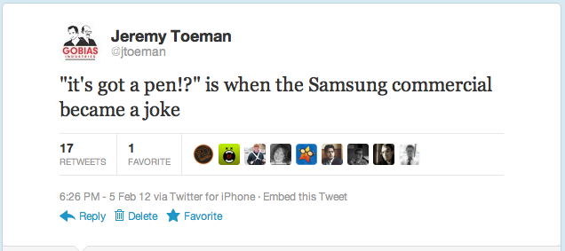
For the 14 people who missed the Super Bowl this year, a “notable” commercial was the debut of the Samsung Galaxy Note, which basically enlisted virtually every trick of the trade.  Hipster rock band? Check. Playful teasing of Apple users? Check. Flashy seeming new gadget? Check. Tablet with a stylus? Check.  Wait a sec, rewind, what is this, 1998?  Or, as I tweeted (and BTW, Twitter – yet another simple feature: enable easy embedding and reblogging of tweets to other platforms, because screenshots? really?):

So my advice this evening is to Samsung and everyone else competing with the iPad – which is actually nobody in reality.  If you want to play this game, you need to stop grasping at straws.  Go build a damn good product and the market will support your endeavors.  I’d heard some interesting buzz about the Note, that it might be the first “other” tablet to give the iPad a real run for its money.  And then? StylusGate.

Now wait, maybe it’s not about consumers.  Maybe it’s enterprise or other specific applications.  I’m sure there’s a decent market in several verticals for a tablet with a stylus (something I blogged about a full year ago now!).  But your marketing wasn’t about some productivity device, it was about consumers.

Does anyone really think any hipster, businessman, student, soccer mom, or any other typical consumer with an iota of self-respect would walk around using a stylus when everyone else doesn’t have to and can accomplish the exact same goals?  That commercial didn’t show a product superior to an iPad.

That’s the key thing here.  The stylus is showing up in an effort to get on par with the iPad’s user experience.

Except it doesn’t.

Not even close.

Share this:

  • Email
  • Facebook
  • LinkedIn
  • Twitter
  • Reddit
Posted in Mobile Technology, That's Janky | Tags: Apple, galaxy, galaxy note, ipad, samsung, stylus, user experience | 4 Comments |

Why Smart TV User Interfaces Suck

Posted on February 3, 2012 by Jeremy Toeman

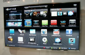
Please don’t look at the following images on a full stomach:


Ok, sorry I had to do that, but it’s important.  And to my friends on the TV manufacturing side of the world – it’s not your fault!  It’s not your fault! Most “Smart TV” user interfaces, suck, and you’re doing your best.  But fundamentally they violate so many rules of user experience design. But why are they so bad?  In a nutshell, its for the same reason you don’t expect loggers to sell fancy high-end furniture (think about that one for a second).  The products are being built from the wrong end of the production team.

For the dining room table, what do you think, arrow foot or ball foot?

Let’s agree that user experience design is a challenge to begin with.  Apple does it great, everyone else, not so much – and even Apple products have flaws.  Further, virtually everything about a “ten foot” user interface (the terminology we use to describe what happens on-screen on your TV) is a broken interaction model, so this is going to be crippled no matter what.  I’ll write about this more in the future, but I believe there’s a fundamental breakdown on the limitations of what you can do with any 10′ UI and a remote control, regardless of gestures, speech, etc.

Next, per my logger analogy, effectively the teams building these products have absolutely no experience nor expertise at this kind of design.  The world of consumer electronics has (barely) evolved from dials, knobs, and switches to doing highly complicated interfaces on screens.  Not only that, every year the requirements are changing!

And since this is a new field (despite almost 20 years worth of ten-foot UIs), there are very very few folks out there who have dived deeply into this problem (the Wikipedia page on the topic barely even requires a scrollbar to read everything).  So the same people who are used to just getting the TV to work right, are now also in charge of creating “an experience”.  I think this is a guaranteed to fail situation, and it’s unfortunate for everyone involved.

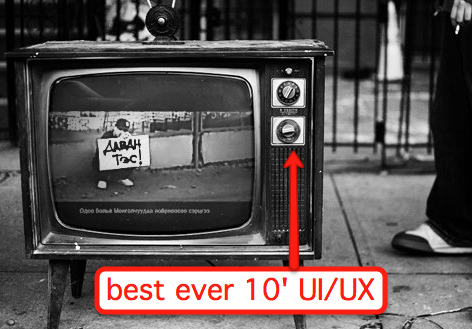
The last "easy" TV user interface.

I do have some tips and thoughts for these UIs, since I can’t effectively get everyone to just up and stop making them (pretty please?).  First, you can read my comments a while back on designing better Boxee and Google TV apps.  Now, here’s three more things to think about:

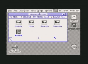
  • Stop making things look like Commodore 64 graphics.  Seriously, I understand the graphics processors inside the TV platforms are low powered inexpensive solutions, but people have a natural (bad) reaction to seeing such low quality graphics on their beautiful HD sets.  If you can’t match them up, find ways to cut down on the overall interface and use the scarce resources to make things prettier.  See Boxee, Google TV, and Apple TV for the “prettier” 10-foot experiences.

Now in beautiful Full 1080p HD

  • Understand a 2D “grid” of options.  Many of these UIs create multiple planes of interfaces, yet fail to recognize the user has to navigate with a simple UDLR remote control (or wand or whatever).  This creates unpredictable experiences, and makes your user less naturally comfortable with the interface.  You should be able to look at the screen and always know “what happens if I push the Up arrow button”.
  • Reduce button clicks.  At no point should the user have to click more than 3 times to get from one part of the screen to another, and you should never create an internal scrollable region.  For example, my VUDU service (which I love) has me scroll through long lists of movies when browsing a category (such as Comedy/Drama, which, let’s face it, really means depressing movie with some funny moments).  But, as a result, if I want to change the category,I need to scroll all the way up to the top of the screen again to choose a new option.  This is too much work!

Ultimately, this again reinforces my belief that anything new coming from Apple will be highly based on AirPlay concepts, and the 10-foot UI will one day be a thing of the past.  And what will replace it?  This.

Share this:

  • Email
  • Facebook
  • LinkedIn
  • Twitter
  • Reddit
Posted in Convergence | Tags: Apple, apple tv, design, future of tv, gestures, google tv, smart tv, social tv, user experience, user interface, vudu | 8 Comments |

Decoding "I Cracked It"

Posted on December 16, 2011 by Jeremy Toeman

As Nick Bilton wrote:

“I’ve finally cracked it!” Steven P. Jobs, co-founder of Apple, told his biographer, Walter Isaacson.

This topic seems to come up time and time again in the “future of TV” discussions, and was revived today over at AllThingsD: “Though it’s currently only embedded in the new iPhone 4S, Siri could eventually change the face of the TV industry.”  I’ve seen a few other stabs at what “cracking it” could possibly refer to, but none seem quite right.

First, regarding voice-controlled TVs.  Is this part of the future?  Absolutely, unquestionably, undeniably.  Siri hacking is already a hobby, and the idea of “TV, channel 702 please” or “TV, Watch The Office” or “TV, Record New Episodes of Arrested Development” all sound great.  But how much of an improvement is this really?

I’d call it a minor enhancement – specifically in context to all the action happening in the second screen. If you can pick up your smart phone or iPad and perform roughly the same query in one of dozens of apps, then “talking” this command doesn’t really sound like a HUGELY big deal.  It sounds incremental.  And “cracking it” doesn’t seem like it’s about incremental.  As I’ve written about previously, I don’t think it’s about physical gestures either, and as I’ll write about more in the future, it’s unlikely “apps” nor about some “new” 10-foot user interface (those are terrible, and are dead, thankfully).

What if the interview wasn’t about some futurey thing we’ll see one day?  What if it’s not some mystical innovation that we can’t possibly fathom?  See, I talk to virtually everybody in the future of TV industry, and not a single person seems to be able to imagine what this could be.  That’s a whole lot of smart, industry-relevant, savvy people to be so in the dark.

So I’m going to take a giant leap backwards on the statement “I cracked it” and instead of looking at what might come, I’m looking at what’s already there.  See, from my eyes, the single biggest improvement to the TV experience I’ve ever seen happened last year.  I think “I Cracked It”exists, and it’s called AirPlay.

AirPlay takes a fundamental mindshift from thinking about whats happening ON the screen, where you have to use a remote (or gesture or voice or whatever) to control some awkward, ill-performing, frustrating, fundamentally LOUSY user interface.  AirPlay shifts the interface to your favorite location, the device you hold, and carry with you all the time.  AirPlay enables you to have the most organic, natural, helpful user experience you can, then just shift that experience to the device you want, easily and flawlessly.  It’s an awesome experience.

For the record, I don’t mean this to be a gush about Apple TV / AirPlay – merely the experience the two together provide, one I anticipate will be replicated by others, and soon. The future of TV interfaces will be controlled by your second screen, and you’ll have one simple way to get it to the screen of your choosing.  Today that’s done by AirPlay, but by the end of 2012 you’ll see this type of offering from a variety of manufacturers and app providers.

The first “moment of change” for TV user interfaces happened in the late 1990s by TiVo.  The next one happened in 2010, by Steve Jobs & Apple.  And yes, he cracked it.

Share this:

  • Email
  • Facebook
  • LinkedIn
  • Twitter
  • Reddit
Posted in General | Tags: airplay, apple tv, Steve Jobs, television, TV, user experience, ux | 5 Comments |

I'm in like with Siri

Posted on December 6, 2011 by Jeremy Toeman

While Mat from Gizmodo is calling Siri “Apple’s broken promise” (and he makes valid points) I see it a totally different way.  I’ll open with his closing argument:

And for me, once the novelty wore off, what I found was that Siri is not so intelligent after all—it’s simply another voice program that will obey very specific commands. If it knows those commands. If it can understand you. And if it has a network connection. Were this Google, or Microsoft, I’d shrug. But it’s not, it’s Apple. And Apple is the company that sells perfection. It’s a company that usually keeps its promises, and in its Siri ads, it promises far more than what it actually delivers. That’s not what any of us signed up for.

I’d agree with most of that.  So it’s really about managing expectations.  I will agree with Mat that the commercials and hype around Siri do not set the right expectations.  If you think you can talk to your phone and it’ll just do exactly the thing you said, the way you meant it, you are in for a world of disappointment.  This was about how I felt back in the first few days of taking Siri for a test spin (talk?).

Now, a few weeks later, I’ve found Siri a great component of the iPhone 4S overall experience.  Today I had to get to the office, was driving, and was in a rush.  “Driving directions to work”.  Perfect.  Last week, wanted to know when Hannukah starts.  “When is Chhhhanukah?”.  Winner.  Again, driving, running late to get home.  “Send a message to my wife” followed by “Stuck in traffic will be home soon”.  Bingo.

If you can get your head around how Siri works, what it knows, and more importantly, what it doesn’t know, you can really enjoy the ability of controlling a device by talking to it.  It can’t do a whole bundle of things I want it to do, for example:

  • “Turn on Bluetooth” – this would be awesome.  Not present.
  • “Launch Evernote” – yup.
  • “Read me my last email” – cool, thanks!
  • “Browse www.livedigitally.com”. must-have.

There are effectively no limits, no upper bounds to what an enhanced or improved interface could offer over existing ones.  This is true for gestures, for voice, for physical recognition, etc.  But, in all cases, the user must know absolutely what they’ll be getting out of that experience.  If the consumer expects too much, and is delivered too little, they’ll abandon it.  This is true for trusted experiences as well – if a gesture is inconsistent, or voice-to-speech is intermittent – consumers will try it, play around for a while, but mostly give up on it.

For me, Siri is in the “it can be handy from time to time” category, and as such, is something I’ve grown to like. I don’t use it often, because I know when it will/won’t help me out, but my “hit rate” is pretty good these days.  It also has a good potential for amusement…

Share this:

  • Email
  • Facebook
  • LinkedIn
  • Twitter
  • Reddit
Posted in Mobile Technology | Tags: Apple, assistant, iphone, iphone 4s, siri, speech, user experience, ux, voice | Leave a comment |

Do I Want a Gesture-Controlled TV?

Posted on November 29, 2011 by Jeremy Toeman

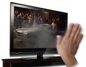
With the latest updates, the XBOX 360 is able to show live TV via Verizon’s FIOS service. For Kinect owners, this enables a vision of a fully gesture controlled TV.  Swipe your hand left/right to change channels, up/down to change volume, and do a backflip to return to the channel you were previously watching.  Wonderful.

Well, wonderful in theory, that is.  But in reality, I’m not so sure.  First, I’ll get past the concern of my TV randomly changing channels when I gesticulate wildly during a hockey game (Go Habs!) and just assume it only does it when I want it to.  I’m going to move to the part of the conversation of “how much does this help me as a TV watcher?”

How does it help?
If I don’t need a remote control, at all, I’d say it’s a nice improvement (though as you’ll read below, this is pretty close to impossible).  With a caveat: it needs to work in such a way that every “command” is completely memorable.  If there’s a risk that I’ll forget how to Pause, Record, or access my DVR menu, and I’ll ever need to reach for that remote, it’s a done deal.  From my experience ranging from Siri on the iPhone to early gesture technology (my first ever was the original Black & White game), the moment the technology becomes semi-reliable it is functionally equivalent to unreliable.  And, dropped calls not withstanding, people for the most part do not regularly use unreliable technology.

How doesn’t it help?
Well, since there’s no way the gestures can replace on-screen menus (the dreaded 10′ UI), ultimately all the gesture does is replace a physical remote (in other words – there’s no gesture for “I want to watch The Office from my DVR” or “change to channel 704”).  So the user still has to deal with their sluggish, painful to use EPG (electronic program guide), navigate the tedious DVR menus, etc etc etc. Which begs the question – is waving your hand “up” really a “Great” improvement to pushing “up” on a remote?  I’d file this under the “not-so-much” category.

There’s a lot to be said for the transformation of TV.  There’s a lot of new functionality coming.  There’s a lot of new services coming.  This is about the most exciting time for innovation and change in the television industry that I’ve ever seen.  This also directly implies we’re going to see a lot of gimmickry, under which gesture controls firmly sits in my opinion (though ZDNet thinks it’s the bomb – but hey, to each their own).

But then again, if it lets people put down their poop-laden remotes, I guess that does make the world a better place.

Share this:

  • Email
  • Facebook
  • LinkedIn
  • Twitter
  • Reddit
Posted in General | Tags: dvr, fail, fios, future of tv, gesture, iphone, kinect, siri, TV, TV UI, user experience, verizon | 3 Comments |

7 Simple Ways To Improve Twitter

Posted on October 10, 2011 by Jeremy Toeman

Last January I wrote a post “Will Normal Folks Ever Use Twitter?” in which I decried the service from a “regular” person perspective, including the new user experience, search, etc.  It’s been almost two years, we’ve seen change of CEO, product team, engineers, lots and lots of cash, and #NewTwitter, but in my opinion, it’s far from enough.  I’m of the mindset that if Twitter cannot get it’s collective product experience together, their growth will flatten, and usage will recede amongst several populations (great post on that over at AllThingsD).  Here are some of my thoughts on how to improve the Twitter experience:

Eliminate URLs and @Users from 140 character limit
Twitter announced their official URL-shortener is here to stay, which is fine, but I think it’s a poor experience for all users.  Instead, I’d prefer to see a URL and an @User take up a single character each of the official limit.  It makes no sense, even in “tight” communication/messaging, to count against a link or a person simply due to character length. Twitter’s system should ingest all URLs and @Users and only count against the usage, not the length.  Further, all twitter clients should auto-expand the URLs, and preferably replace them with the title of the target website.  Here’s some examples:

whats your opinion on Google+ versus facebook and twitter?  do you think they’ll be able to “win”? @harrymccracken @Scobleizer @jlouderb @jlanzone

Is currently 147 characters, and I as a user would probably remove the 2nd half of the question to tie in the names.  Instead, removing the 39 characters “wasted” on the usernames would make the tweet legit.

i think this is the most important news of the day, everybody should take a moment, stop what they are doing, and read it.  http://bit.ly/p7Ez3c

The above is 144 characters, but of them only 6 were needed to uniquely identify the link, and 14 were a waste.  Further, if the above were auto-fixed by a twitter client, they’d know better than to click on the link.  Suckers.

Make Search Work
I’m not sure which is more useless, searching on twitter.com for something, or trying to stop getting printed catalogs from Restoration Hardware. It’s been more than a decade since Google figured out search, why can’t twitter?

Autocorrect Error @-Replies and DMs
Twitter only really has two “commands” and both can be done so wrong so easily.  That’s like having an iPod that doesn’t always play music when you pushed the play button.  Twitter should intercept tweets “gone wrong”.  Not only would this improve the product experience for all its users, it would probably save some famous people from incredibly embarrassing moments.  That said, perhaps this is just nature’s way of weeding them out?

So if twitter “sees” a tweet like “D @username” or “DM username” or ” D username” or anything *even close* to an almost-DM, the client should prevent it from being sent without a Yes/No pop-up dialog.  Same thing when a user starts a tweet with an @, since I still believe even experienced users don’t realize those tweets are fairly hidden.

What could possibly go wrong?

Offer Multiple Views
Lists are definitely a great way to view tweets, and the media views are good, but realistically they are barely a band-aid on the massive problem: separating signal from noise.  Twitter needs to offer a lot of new ways for me to view my twitter streams.  For example, how about letting me select a few users whose most recent tweets are simply always in my timeline.  Or how about showing me my stream based on which tweets have been retweeted at least X times.  I use Tweetdeck to separate numerous topics, but there’s so much more that could happen here.

#Explain #Hashtags #Somehow
OK, so a hashtag lets people tweet about one topic, and really only seems to exist because of the brokenness of Twitter search (see above).  But most of the hashtags I see make no sense, and even clicking on them doesn’t exactly “answer” the question of why they exist. How about having users “register” a hashtag for a period of time?  Even if multiple users do that, it’d be fine.  Then when a new user clicks on a hashtag, they can see all the “terms in use at present” to close the loop on it.

Eliminate Trending Topics
When was the last time a single trending topic was actually useful to you?  That’s right, it was never.

I'm sure I'd learn a lot by clicking on these...

Help Manage Contacts
Ever get a DM from someone, try to reply, but can’t because they aren’t following back?  That’s not user error, that’s product design error.  Users shouldn’t be allowed to DM without following the target themselves. Alternately, at least inform the user they aren’t being followed back…  Also, why can’t I easily ingest LinkedIn and other contacts into the people I follow?

In Conclusion

The reality is I could keep going.  I could explain why 140 characters is arbitrary at this point and should be bumped up to ~200/250 without “damaging” the service.  I could talk about how they should fix username squatting issues.  I could talk about improving integration with other Web services.  I could talk about fixing the RT/Retweet issues.  But then I’d have to write more, and that would far exceed my character limits.

Share this:

  • Email
  • Facebook
  • LinkedIn
  • Twitter
  • Reddit
Posted in Web/Internet | Tags: twitter, user experience | Leave a comment |

About

Jeremy Toeman is a seasoned Product leader with over 20 years experience in the convergence of digital media, mobile entertainment, social entertainment, smart TV and consumer technology. Prior ventures and projects include CNET, Viggle/Dijit/Nextguide, Sling Media, VUDU, Clicker, DivX, Rovi, Mediabolic, Boxee, and many other consumer technology companies. This blog represents his personal opinion and outlook on things.

Recent Posts

  • Back on the wagon/horse?
  • 11 Tips for Startups Pitching Big Companies
  • CES 2016: A New Role
  • Everything I Learned (So Far) Working For a Huge Company
  • And I’m Back…

Archives

Pages

  • About

Archives

  • January 2019
  • April 2016
  • January 2016
  • December 2015
  • June 2015
  • May 2015
  • April 2015
  • March 2015
  • February 2015
  • January 2015
  • December 2014
  • November 2014
  • October 2014
  • September 2014
  • August 2014
  • June 2014
  • May 2014
  • April 2014
  • March 2014
  • January 2014
  • December 2013
  • September 2013
  • August 2013
  • July 2013
  • May 2013
  • February 2013
  • January 2013
  • December 2012
  • October 2012
  • September 2012
  • August 2012
  • May 2012
  • April 2012
  • March 2012
  • February 2012
  • January 2012
  • December 2011
  • November 2011
  • October 2011
  • September 2011
  • August 2011
  • June 2011
  • March 2011
  • February 2011
  • January 2011
  • December 2010
  • November 2010
  • October 2010
  • September 2010
  • August 2010
  • July 2010
  • June 2010
  • May 2010
  • April 2010
  • March 2010
  • February 2010
  • January 2010
  • December 2009
  • October 2009
  • September 2009
  • August 2009
  • July 2009
  • June 2009
  • May 2009
  • April 2009
  • March 2009
  • February 2009
  • January 2009
  • December 2008
  • November 2008
  • October 2008
  • September 2008
  • August 2008
  • July 2008
  • June 2008
  • May 2008
  • April 2008
  • March 2008
  • February 2008
  • January 2008
  • December 2007
  • November 2007
  • October 2007
  • September 2007
  • August 2007
  • July 2007
  • June 2007
  • May 2007
  • April 2007
  • March 2007
  • February 2007
  • January 2007
  • December 2006
  • November 2006
  • October 2006
  • September 2006
  • August 2006
  • July 2006
  • June 2006
  • May 2006
  • April 2006
  • March 2006
  • February 2006
  • January 2006
  • December 2005
  • November 2005
  • October 2005
  • September 2005
  • August 2005
  • July 2005
  • June 2005
  • May 2005
  • April 2005
  • March 2005
  • February 2005
  • January 2005
  • December 2004
  • November 2004
  • October 2004
  • September 2004

Categories

  • Convergence (81)
  • Gadgets (144)
  • Gaming (19)
  • General (999)
  • Guides (35)
  • LD Approved (72)
  • Marketing (23)
  • Mobile Technology (111)
  • Networking (22)
  • No/Low-tech (64)
  • Product Announcements (85)
  • Product Reviews (109)
  • That's Janky (93)
  • Travel (29)
  • Video/Music/Media (115)
  • Web/Internet (103)

WordPress

  • Log in
  • WordPress

CyberChimps WordPress Themes

© LIVEdigitally
loading Cancel
Post was not sent - check your email addresses!
Email check failed, please try again
Sorry, your blog cannot share posts by email.