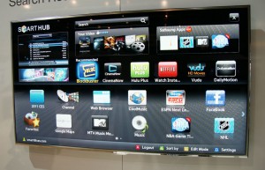
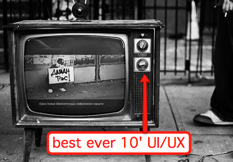
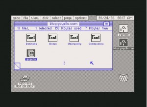
Please don’t look at the following images on a full stomach:
Ok, sorry I had to do that, but it’s important. And to my friends on the TV manufacturing side of the world – it’s not your fault! It’s not your fault! Most “Smart TV” user interfaces, suck, and you’re doing your best. But fundamentally they violate so many rules of user experience design. But why are they so bad? In a nutshell, its for the same reason you don’t expect loggers to sell fancy high-end furniture (think about that one for a second). The products are being built from the wrong end of the production team.
Let’s agree that user experience design is a challenge to begin with. Apple does it great, everyone else, not so much – and even Apple products have flaws. Further, virtually everything about a “ten foot” user interface (the terminology we use to describe what happens on-screen on your TV) is a broken interaction model, so this is going to be crippled no matter what. I’ll write about this more in the future, but I believe there’s a fundamental breakdown on the limitations of what you can do with any 10′ UI and a remote control, regardless of gestures, speech, etc.
Next, per my logger analogy, effectively the teams building these products have absolutely no experience nor expertise at this kind of design. The world of consumer electronics has (barely) evolved from dials, knobs, and switches to doing highly complicated interfaces on screens. Not only that, every year the requirements are changing!
And since this is a new field (despite almost 20 years worth of ten-foot UIs), there are very very few folks out there who have dived deeply into this problem (the Wikipedia page on the topic barely even requires a scrollbar to read everything). So the same people who are used to just getting the TV to work right, are now also in charge of creating “an experience”. I think this is a guaranteed to fail situation, and it’s unfortunate for everyone involved.
I do have some tips and thoughts for these UIs, since I can’t effectively get everyone to just up and stop making them (pretty please?). First, you can read my comments a while back on designing better Boxee and Google TV apps. Now, here’s three more things to think about:
- Stop making things look like Commodore 64 graphics. Seriously, I understand the graphics processors inside the TV platforms are low powered inexpensive solutions, but people have a natural (bad) reaction to seeing such low quality graphics on their beautiful HD sets. If you can’t match them up, find ways to cut down on the overall interface and use the scarce resources to make things prettier. See Boxee, Google TV, and Apple TV for the “prettier” 10-foot experiences.
- Understand a 2D “grid” of options. Many of these UIs create multiple planes of interfaces, yet fail to recognize the user has to navigate with a simple UDLR remote control (or wand or whatever). This creates unpredictable experiences, and makes your user less naturally comfortable with the interface. You should be able to look at the screen and always know “what happens if I push the Up arrow button”.
- Reduce button clicks. At no point should the user have to click more than 3 times to get from one part of the screen to another, and you should never create an internal scrollable region. For example, my VUDU service (which I love) has me scroll through long lists of movies when browsing a category (such as Comedy/Drama, which, let’s face it, really means depressing movie with some funny moments). But, as a result, if I want to change the category,I need to scroll all the way up to the top of the screen again to choose a new option. This is too much work!
Ultimately, this again reinforces my belief that anything new coming from Apple will be highly based on AirPlay concepts, and the 10-foot UI will one day be a thing of the past. And what will replace it? This.


Any thoughts on the new Xbox UI?
Hint on the VUDU UI. If your remote has a “back” button (may also be labeled as “return” on some DVD player remotes), pressing it will get you back to the top of the screen. It’s not called out because it cannot be implemented consistently across CE devices.
It’s so great to hear someone else focusing on TV UIs. I’ve been specialising in this area as a UX consultant at ExperienceLab for 7 years and if anything this area is becoming more of a UX challenge than ever before. It’s not just the interfaces provided by the manufacturers and key service providers we have to worry about now (although I agree it would be fabulous to see some real UX expertise coming from the TV manufacturers – and I do understand their challenges, I used to work for one of them!), it’s the huge array of apps on smart TVs, all tackling the challenges separately. It’s like the early days of web when there are no conventions and every design works differently leaving users with a real headache (potentially literally).
Yes, without a ‘bigger’ solution (I’m thinking real, simple tablet/TV interactivity) operating these TV services will never be as seemless as it should be, but there’s so much more that could be done to make things just a bit easier…
Pingback: Idea Source » TV Multimedia Experience
Pingback: Defining The Television Experience In A Single Word | TechCrunch
Pingback: The Four Most Underhyped Trends In Social TV | TechCrunch
My impression, having purchased a Samsung Smart TV, is that what you are looking at here are “second order” kinds of problems. Samsung don’t even seem to have addressed any of the absolute basic “musts” of UI interaction. Two examples:
– when you press up/down/left/right on the remote, you have to wait until one press has taken effect, before pressing again! Yes its true. You just want to move the cursor down 3 rows – press 3 times, right? Wrong…
– when replaying recorded video, it does not remember where you watched to last time, nor even give you the option of starting where you left off! Cue more frustrating button-pressing.
My conclusion is “not even close”. The above are total facepalms. Did they not even try to use the thing themselves before productizing it?
I hate most Samsung UIs… from their pre-Android phones to their televisions…
They know how to make decent looking hardware but the software is never intuitive.