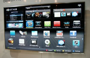
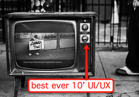
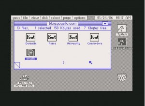
Please don’t look at the following images on a full stomach:
Ok, sorry I had to do that, but it’s important. And to my friends on the TV manufacturing side of the world – it’s not your fault! It’s not your fault! Most “Smart TV” user interfaces, suck, and you’re doing your best. But fundamentally they violate so many rules of user experience design. But why are they so bad? In a nutshell, its for the same reason you don’t expect loggers to sell fancy high-end furniture (think about that one for a second). The products are being built from the wrong end of the production team.
Let’s agree that user experience design is a challenge to begin with. Apple does it great, everyone else, not so much – and even Apple products have flaws. Further, virtually everything about a “ten foot” user interface (the terminology we use to describe what happens on-screen on your TV) is a broken interaction model, so this is going to be crippled no matter what. I’ll write about this more in the future, but I believe there’s a fundamental breakdown on the limitations of what you can do with any 10′ UI and a remote control, regardless of gestures, speech, etc.
Next, per my logger analogy, effectively the teams building these products have absolutely no experience nor expertise at this kind of design. The world of consumer electronics has (barely) evolved from dials, knobs, and switches to doing highly complicated interfaces on screens. Not only that, every year the requirements are changing!
And since this is a new field (despite almost 20 years worth of ten-foot UIs), there are very very few folks out there who have dived deeply into this problem (the Wikipedia page on the topic barely even requires a scrollbar to read everything). So the same people who are used to just getting the TV to work right, are now also in charge of creating “an experience”. I think this is a guaranteed to fail situation, and it’s unfortunate for everyone involved.
I do have some tips and thoughts for these UIs, since I can’t effectively get everyone to just up and stop making them (pretty please?). First, you can read my comments a while back on designing better Boxee and Google TV apps. Now, here’s three more things to think about:
- Stop making things look like Commodore 64 graphics. Seriously, I understand the graphics processors inside the TV platforms are low powered inexpensive solutions, but people have a natural (bad) reaction to seeing such low quality graphics on their beautiful HD sets. If you can’t match them up, find ways to cut down on the overall interface and use the scarce resources to make things prettier. See Boxee, Google TV, and Apple TV for the “prettier” 10-foot experiences.
- Understand a 2D “grid” of options. Many of these UIs create multiple planes of interfaces, yet fail to recognize the user has to navigate with a simple UDLR remote control (or wand or whatever). This creates unpredictable experiences, and makes your user less naturally comfortable with the interface. You should be able to look at the screen and always know “what happens if I push the Up arrow button”.
- Reduce button clicks. At no point should the user have to click more than 3 times to get from one part of the screen to another, and you should never create an internal scrollable region. For example, my VUDU service (which I love) has me scroll through long lists of movies when browsing a category (such as Comedy/Drama, which, let’s face it, really means depressing movie with some funny moments). But, as a result, if I want to change the category,I need to scroll all the way up to the top of the screen again to choose a new option. This is too much work!
Ultimately, this again reinforces my belief that anything new coming from Apple will be highly based on AirPlay concepts, and the 10-foot UI will one day be a thing of the past. And what will replace it? This.


 Definition: For sake of discussion, I’ll define the First Age of Gadgets as starting with calculators and LCD watches (and, of course, calculator watches). Sticklers will quickly point out something I’m missing, but in my opinion that’s when the concept of “gadgets” really got kicking. These products (1) required batteries and (2) did one thing, typically pretty well. These early gadgets were typically fairly functional in nature, not very gimmicky or showy. They were also workhorses as compared to modern products – you can drop most “old school” products and not fear for significant damage (probably directly related to LED or single-line LCD outputs).
 Definition: In a nutshell: USB connectivity and/or card reader integration. Slightly more detailed: the Second Age of gadgets is about products that were able to connect and/or share data with a computer (but did not include WiFi) and/or cell phones. Gadgets started becoming a little more pervasive, a little more mainstream, a lot more pop culture. In addition to the gadgets themselves, the category of gadget accessories really began to boom (chargers, carrying case, rechargeable batteries, etc). This was also the dawn of the gadget blogs. I asked Peter Rojas, founder of Gizmodo, if he could recall why he launched the site: “It was an experiment, something Nick and I started almost by accident. I don’t think either of us thought blogging would become as big as it did. People are a LOT more interested in gadgets now than when I started Gizmodo in 2002 – it’s become part of pop culture.”
 Definition: Internet access and connectivity. Devices had either built-in Internet access, or some hybrid method of interacting with the Internet to share content, data, or services. In many cases Third Age devices are simple evolutions to their predecessors, but some innovated distinctly enough so that there’s no blurry lines. Just as the
  Displays: I assume we’ll be seeing flexible display surfaces (folding, roll-up, etc) that change the way we physically interact with a device. The concept of a hard, flat screen (even a touchable one) seems very outdated to me. I think the real revolutionary tablet will be the first one with some form of flexible display (and my money’s on Apple for making this happen). I also foresee better use of microprojectors to remove the need for an on-board display at all.