• About

LIVEdigitally

Category Archives: Product Reviews

Blackberry's Imperfect Storm

Posted on December 1, 2008 by Jeremy Toeman

I had some time to play with the BlackBerry Storm last week, and I’m surprised how much I disliked it.  I feel it was a complete misstep on the part of RIM, and is indicative of the problems of handset manufacturers short-sighted thinking as they compete with the iPhone.

Competing with the iPhone is like competing with CSI
CSI is one of the top broadcast TV shows every week.  Millions of people tune in to watch a fairly vapid crime drama show with cool lighting effects and gruesome murder scenes. Many millions of people.  So if you are a clever TV exec, and you want to compete in the same timeslot, do you (a) create an equally vapid crime drama show with more cool lighting and gruesomer murders, (b) create a completely different show, such as a romance, comedy, reality, hospital, etc, or (c) offer alternating reruns of Matlock and Baywatch? As tempting as (c) might be, the answer is (b) – they call it cross- or counter-programming.

The World’s First Touchscreen Blackberry?
This is the main marketing campaign around the product (don’t ask me why).  The commercials (much like the gPhone commercials) are blatant ripoffs of the iPhone commercials, and they shouldn’t be.  This is the core problem of the whole device – it’s not an iPhone, and more to the point it shouldn’t be an iPhone.  Instead of building a great next-gen BlackBerry (like they did with the Curve, Pearl, Bold), they made a less functional product by trying to duplicate the core strengths of another product.  In other words, they are airing CSI: Indianapolis when they should be showing Reality Stars Paintball on Ice.

All CrackBerries need a keyboard
The BlackBerry is beloved because… it integrates perfectly into Exchange/Outlook/Corporate email environments and it is a phenomenal mobile email device.  IT administrators love it as do the end-user who can easily write emails while attending meetings, at family events, on the tarmac, dinner parties, and even while driving. The product experience is heavily tied into the keyboard, one could even consider it the signature piece of the device.  A BlackBerry without a keyboard can’t possibly (and, to the point, doesn’t) replicate the same “BlackBerry Experience”.

The Missed Opportunity
The “correct” touchscreen BlackBerry would have a physical keyboard as well.  Seems like an obvious, yet somehow missed move by the company.  Touchscreen keyboards can’t replace the physical one, and just dabbling touch-UI features onto the rest of the BlackBerry experience makes for a wholly unsatisfactory device.  Instead, the company should’ve kept the form factor of the present-day device, but made the screen touch-enabled.  Best of both worlds, satisfies the email-craving workaholic as well as the fun-having gadget owner.

Instead, the BlackBerry Storm might just be the mullet of phones.  It’s probably the best “other” touchscreen phone on the market (so far), but that’s just not good enough.  There are plenty of ways to compete with the iPhone, and I’m dissappointed at the lack of originality and creative thinking displayed by other cell phone manufacturers.  Something tells me the best competition will come out of left field, the way Asus first innovated with their eeePC.  I hope the clever product people at RIM who’s ideas got shot down to make the Storm can bring out the concepts they really wanted to ship (and I’m just going out on a limb with that – despite being Canadian I have no special insight into their product roadmap).

Posted in Mobile Technology, Product Reviews | Tags: blackberry, blackberry storm, iphone, touchscreen | 5 Comments |

The Microsoft Wireless Laser Desktop 6000 – a review

Posted on October 19, 2008 by David Speiser

Back to basics for me on LD.  This one is just a straight-up, old fashioned gadget review.

This wireless laser Desktop 6000 v 3.0 mouse and keyboard have some pretty cool features, though the keyboard suffers from some serious performance drawbacks.  I’ll start with the mouse, and then my impressions, and then the keyboard, and my further impressions.

The mouse is well shaped, comfortable, and has some nifty features.  The front thumb button lets you magnify a small section of the screen, and the rear button lets you move back a page.  In the settings area you can re-designate some different functions for those buttons.  The USB wireless “dongle” fits into the bottom of the mouse; this dongle connects both thhe mouse and thhe keyboard.

The mouse has worked great so far.  the plastic and rubber surfacing is comfortable and pleasantly tactile.  The “magnify“ feature is OK, but the back button is awesome.  When I use my portable mouse I reach for it, and I’m  bummed that it’s not there.   This is not an incredible innovation – features like this have been around a long time.  But efficiency is a funny thing: once you get used to a simpler / faster / more efficient mechanism, it’s hard to give it up.  Overall, I am very happy with the mouse.

The keyboard has similar whiz-bang features and a wrist-friendly layout.  I’m used to using my old-school Dell keyboard, complete with coffee stains and non-ergonomic design.  This new black and smoke gray model, with it’s ergonomic curvatures, enlarged “critical keys” and rubberized hand rests seems like a huge step up.  There are some hot keys as well with useful shortcuts and lots of customization options.  My favorite key is actually the “documents key;” you can use it to open a specific folder (like “My Documents.”  🙂  Again, efficiency is a pleasant thing, and easy to get used to.

Here’s the issue: performance has been spotty.  When I first plugged in the dongle and tried to type I saw significant lag.  For a minute or two the keystrokes would be fine, then all of a sudden no type appeared.  Then ten seconds later, it all appeared in a rush. I try to delete or backup knowing that I mis-typed something, but no type is appearing (or disappearing.)  Then I have to just stop and wait for things to realign.   Sometimes it would type fine for a minute, and then lag for eight or ten characters, and then catch up again.  Also, sometimes the keyboard seems to lose itself.  By this I mean that though I haven’t moved the cursor or moused into a new application, suddenly the keyboard seems to stop typing, and I am forced to click on something else, and then click back into the “typing zone.”  Not OK.

I tried moving the dongle to a couple of different USB ports, tried the “reset / reconnect” button, and also tried installing the software that came with the setup (I like to check for plug-and-play compatibility before installing software).   After doing all of that, the performance improved significantly.  Having shut down and re-booted a half dozen times while running these peripherals seems to have helped as well.   At this point performance is largely acceptable, though not quite equivalent to my old PS/2 connected keyboard.  However the ergonomics, hotkeys,  and overall shiny-newness makes up for a lot.  As long as they type-pace keeps up with the speed of the keystrokes, I think I will stick with it.  But I’m not throwing out my old keyboard just yet.

This rig costs $99 retail – you can purchase it from Microsoft directly, or from any number of alternative online and traditional retailers.  Overall I think it’s a pretty good rig.  If I were forced to give it a numeric score from one to ten, I’d give it a 6.   If performance were as solid as my old wired keyboard, I’d give it a 9.  There’s another great review of this item over at IStartedSomething with some beautiful pictures if you want some more info on this setup.

This review is also posted at 1TO10REVIEWS.

Posted in Gadgets, Product Reviews | Tags: Desktop 6000, keyboard, laser, Microsoft, mouse, wireless | Leave a comment |

Review: TuneUp Finds Missing Music Meta Data

Posted on September 15, 2008 by Guest Contributor

In brief: TuneUp (500 song cleanups for free, $12/yr subscription, $20 lifetime license) makes it easy to find missing metadata for songs and missing album art.

I bet your music collection is a lot like mine used to be: a hodgepodge of mp3s, m4as, and other types of audio files that you’ve acquired over the years and ripped using various shareware products of dubious quality, resulting in hundreds or thousands of tracks that are misspelled, missing album names, and are generally a mess:

A small snippet of my pre-TuneUp Library

Sad Snippets of my pre-TuneUp music collection are coupled with…

Album covers small

… an even sadder dearth of album covers.

Sorting your library in iTunes yields a list of songs named “Track 01 – Insert Song Name Here” or “Kanye West Christmas Album 02: Jingle #(@*#ing Bells.” You’re missing album art, your genres are a mess. And, since doing a file-by-file fix would take hour upon frustrating hour, there’s no prospect of things getting better any time soon.

But don’t lose hope, because TuneUp (Windows only, Mac version coming this fall) is here to help. Launched earlier this year by the TuneUp Media, TuneUp offers a dead-simple way to scan audio files and correct missing or corrupt meta data, including album cover art. Its back-end is powered by Gracenote’s music fingerprinting service, which boasts a database of 80 million different tracks and 6 million albums.

Cleaning up your wayward tunes is easy – drag incomplete tracks to TuneUp’s interface, and the program returns results in a few seconds. Click to approve the suggested changes to update the file information, or reject suggestions or undo changes if you see a mistake.

In addition to scrubbing features, TuneUp offers a “Now Playing” companion that suggests YouTube videos, merchandise, and concert schedules for the song that you’re scrubbing or playing.

So what’s good?

  • It works: I threw nearly 400 songs at TuneUp, and it found the correct track name, album, artist and genere for all but 2 – a godawful techno remix of Boys of Summer (like you don’t love DJ Sammy), and an instrumental version of the New York Mets theme song (my favorite ringtone). That’s 99.5%, for you stats geeks. TuneUp claims a standard 85% – 90% success rate, with most misses coming from remixes, unreleased live concert tracks, and the most obscure of obscure songs.
  • It’s easy: Drag, drop, click. Done.
  • If you don’t have a ton of music to fix, it’s free: TuneUp offers a free trial version that will clean up to 500 tracks.
  • “Added value” is actually added value: The “Now Playing” section offers a fairly comprehensive list of videos, concert schedules, related music, and more. The merchandise and ticket auction sections feel like you’re having a bunch of referral links pushed at you, but they’re easily ignored.

What’s not as good?

  • Clear the schedule: While TuneUp identified tracks quickly (2ish seconds apiece in my run), writing the metadata and album art was not. My 400 songs took nearly 15 minutes to find, 40 minutes to write.
  • It’s not that I don’t love you, it’s just that sometimes I need some me time: Like a needy, whiney, insecure significant other, TuneUp won’t let you start iTunes without TuneUp tagging along. There is no feature in the preferences to disable this, and a forum posting on the topic doesn’t contain any reassurance that it will be coming anytime soon. Without uninstalling the program, I couldn’t find any obvious way to prevent TuneUp from loading.

As for my results? Take a look:

Fixed covers

If you’ve got an eyesore of a music library that seems to taunt you every time you try and find a mislabeled track, you would be well-served by shelling out an Andrew Jackson to give TuneUp a try. It does what it says it will do, and does it well. As long as you’ve got a couple of hours to kill and don’t mind an application that loads every time you run iTunes, you will be rewarded with a music library that is so pristine that it looks like you actually paid for every single one of your tracks.

Update: The San Francisco Chronicle also provides a write-up of TuneUp, and contains a brief discussion of the Picard Project, which offers a free alternative to TuneUp. I haven’t tried Picard.

Editor (JT)’s Note: While I have both a personal and professional relationship with the TuneUp team, I did no edits whatsoever to this review, nor provide any direction or insight into the content, tone, etc.  My only involvement was to provide an introduction between Dan Rubin (article author) and the individual providing reviewer support at TuneUp.

Posted in General, Product Reviews, Video/Music/Media | Tags: tuneup | 3 Comments |

Review of Suunto Core Wristop Computer

Posted on August 22, 2008 by David Speiser

I bought a Suunto Core watch, in orange. I like climbing, and being in the mountains, so a watch with an altimeter makes at least some sense, which helps me justify the purchase of this rather expensive watch wristop computer.

Suunto is probably best known for their dive computers, both wristop computers, and the kind that attach to a SCUBA diver’s regulator. However, they also make several lines of outdoor / mountain oriented wristop computers. And they have a long history of excellence in manufacturing compasses.

An outdoor, mountain-oriented watch / wristop computer should include a couple of important features:

  1. It should tell time
  2. Effective alarm(s)
  3. Luminescence (push button, generally) for night time use
  4. Altimeter (this tells your elevation)
  5. Barometer (for monitoring changes in air pressure, a good signal of impending stormy weather)
  6. Compass
  7. And a bunch of other things like difference measurements, logbooks, “start from zero,” depth measurements (for when you go under water), rotating bezel, button lock, etc.

There’s a cool video that shows a bunch of the neater features. Check it out.

Truthfully, what initially caught my eye was the look and style of this watch. Many would call it garish. I call it me. I love the color orange, and I think the palette and style of the face itself is magnificent. My affection for the rubbery orange band ebbs and flows, but that’s easy to change. There’s a high-quality double hinge on both the top and bottom bands, which is an incredibly strong mechanism, and a good sign of quality.

If you’re not as into orange as I am, Suunto sells this watch in a number of different guises, both plainer and more grandiose than my selection. (See choices to the left.)

Aside from the aesthetics, this watch packs a lot of impressive features into a small package. Aside from telling time, my favorite feature is the altimeter. It’s necessary to calibrate it correctly; this can be accomplished either by knowing your current elevation and setting it accordingly, or by a trickier method involving the calibration of the barometer function (which is also very cool.) Truthfully, the manual on this sucker is extensive, and I have not quite waded through all of it yet. However, the watch, alarm, calendar, stopwatch, light, button lock, and basic altimeter have all fallen before my wily charms. I also had some help from my wife who is usually cleverer than me when it comes to gadgets, buttons, sequences, and other things requiring both patience and logic. Those are not my strong suits.

It’s fairly large compared to an average wrist watch, though not excessively so. It’s very comfortable, and not overly heavy in spite of its bulk. Sometimes if it slides forward and when I bend my wrist it gets in the way. Also, if I’m resting my hands on the edge of my laptop to type, the band can interfere with my personal ergonomics. Small price to pay for fortune and glory, but it’s an issue nonetheless. It’s also waterproof to 30 meters, which is not diving depth, but certainly has you covered for showers, swimming, or even most snorkeling. For more extensive water activities (like SCUBA) you might look at some of their other products.

This device is not cheap. The retail on the orange model is around $350. The least expensive Core model is $250 (in black and yellow.) You can purchase it through any number of online retailers, including Backountry.com. If you want to see one in person, REI carries them, and many high-end, well stocked outdoor retailers will also probably carry them.

If you’re looking for a distinctive looking and expensive wrist watch, or for an extremely feature-rich, mountain-focused wristop computer, this is an outstanding purchase. I highly reccomend, and if I were forced to give it a numeric rating I’d call it an 8 out of 10. I will update this review after my next big outdoor trip.

Here’s a video review of the Suunto Core in twelve seconds:

Suunto Core Wristop Computer on 12seconds.tv

This review is also posted on 1to10reviews.


Posted in Gadgets, LD Approved, Product Reviews | Tags: Core, Suunto, Watch, Wristop Computer | 1 Comment |

Review: The Nextar T30 Portable Media Player Demands a "Saved By The Bell" Analogy

Posted on August 22, 2008 by Guest Contributor

Saved By The Bell CastNote: If you’re not familiar with Saved By the Bell, I suggest you open up your wallet, clear a couple of days, and catch up. Then, return for the review.

The Nextar T30 is the Jessie Spano of the Portable Media Player world. The sub-$100 player has its upsides – it’s attractive, has a decent feature set, and the price for picking one up isn’t nearly as daunting as the cost of its more popular competition. But, much like AC Slater discovered when he started courting Jessie, the Nextar T30 features just enough potential deal-killers that you’ll wish that you had either made the effort to get your hands on the more attractive competition, or settled for something just as middling, but not quite as frustrating.

The Superficial

The T30, like Jessie, is a smart-looking piece of hardware with a slim profile. Its face is dominated by a 3.5 inch QVGA (320 x 240 resolution) screen, which Nextar claims supports over 260,000 colors (I didn’t count). The body, which is just under half an inch thick, sports a cheery orange accent. Tiny buttons for playback and navigation run the top and right edges. At 4″ x 3″, the whole package is light, easily pocketable, and garners the coveted “wow, that’s a big screen! Cool!” reaction from the easily impressed.

Nextar with Jessie SpanoNextar T30 ports

Nextar T30 Nav buttonsNextar T30 Play, Volume Buttons

In any range of conditions, I had no problem with the screen’s brightness – even in full sunlight, the picture wasn’t washed out. The picture quality is passable, but not great – even with well-encoded video or 320×240 images, there was still noticeable pixelation.

Sound quality was adequate via the built in speaker, better using headphones.

Smarts (It’s What’s on the Inside That Counts, Right?)

Jessie Spano, a geek’s girl before there was an even a concept of a geek’s girl, knew it all. History, math, science, she could handle it all. The T30’s functionality is almost as impressive, with qualifiers – it plays music, plays video, displays photos, and serves as an “ebook” reader. 4GB of internal storage come built in, and an SD port allows for up to an additional 2GB. If you roll analog, you can calm your Top 40 craving with a built-in FM tuner that also allows you to record the audio directly to the T30’s storage. I was able to manage my media with Windows Media Player with no problem, and the brave can simply create folders and drag files in Windows Explorer.

I’m So Excited! I’m So Scared!

So how can you resist? Let’s reserve a table at The Max, get on the Zack Morris phone, and take this little mama to the prom!

Not so fast, bucko.

Hands-on, the Nextar T30 has some issues that could, for some users, prove more worrisome than our beloved Jessie’s skeleton-laden closet (most worrisome first):

  • The Caffeine-Pill Addiction (the deal breaker): Just like Jessie’s lust for caffeine-fueled all-night study sessions almost destroyed her, the Nextar T30’s downfall is the device’s interface. It’s maddeningly slow and the button layout forces you to operate it with two hands. New media is listed seemingly by the day it was added, and there’s no way to adjust the display. Since you can’t sort your data (by album, song name, artist, etc), finding any piece of individual media when you’ve uploaded a full 6 GB will be an extensive, frustrating click-fest.
  • The Bad-Boy Brother: Media management, like Jessie’s rebellious half-sibling Eric, is aggressively irritating. Quick example: I own Wang Chung’s Greatest Hits (who doesn’t?), and I want the option to be able to listen to the album as a whole, or to listen to “Everybody Have Fun” on my “All Time Greatest Hits” playlist. To do this, I had to create two folders (one for each playlist), and then copy the song into each folder. Having to load the same media onto the same device twice is about as bad as trying to cheat Screech out of his valedictorian spot because you want to get into Stamford University.
  • The Know-it-all Attitude: You can play any type of video, as long as it’s an avi (video conversion software comes in the box, but doesn’t convert Quicktime files). You can read any ebook, as long as it’s a .txt file. You can listen to any type of music, as long as its an mp3 or wma file. Blech. I know format lock-ins aren’t unique to Nextar, but it’s still frustrating.

The Kelly Factor

Kelly Kapowski. Must... Not... Be... Gratuitous...
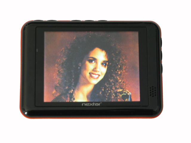
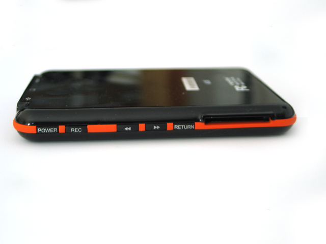
Like Jessie, the Nextar T30 is in a field laden with tough competitors. Jessie Spano always seemed to find herself shown up in one way or another. The Nextar finds itself similarly outcompeted:

  • The Creative Zen 4 GB, the Stacey Carosi of the bunch. Not much prettier, but a lot more pluck – for the same price point, provides a more vivid (but smaller) screen, better media management, and basic contact info/calendar management.
  • The iPod Nano 4GB, for $50 more, is the Lisa Turtle – richer, and more polished. It’s an iPod. The screen’s smaller, but if you’re reading this site, you don’t need a rundown on how the iPod works.
  • The Archos 605 and iPod Touch are the lust-worthy Kelly Kapowskis. Both sport similar sized, more vivid screens, and are heads and shoulders above the Nextar in every category. I know the comparison is completely unfair, as these devices are targeted at entirely different markets, but the men of Bayside High and the Malibu Sands Beach Club had to make their choices as well. Is it worth a couple hundred extra bucks to have everything you always wanted, or do you want to settle for the issues-laden, unmanageable cheapie? The choice is yours.

The Report Card

Poor Jessie, despite all of her surface appeal, never came out on top. Time after time, her beauty and smarts were subsumed by her haughty whining, costing her friends, boyfriends, and audience love. The same holds true for the Nextar T30, a portable media player that manages to disappoint despite its attractive price point, appealing design, and huge screen. You may need to shell out a couple of extra bucks to pick up a better option, but the trifle of a few bucks is worth not having to deal with the T30’s maddening interface and media management issues. This little mama is going to detention – turn your sights elsewhere.

Posted in Gadgets, Product Reviews | Tags: ipod, nextar t30, portable media player | 1 Comment |

Explaining the "Digital Transition" and Review of the RCA ANT1500 Antenna

Posted on August 19, 2008 by Guest Contributor

I recently had a phone interview with Lou Lenzi, Sr. Vice President, Product Management with Audiovox Accessories and he gave me the statistic that 13 million homes in the US currently use an antenna to receive television signal to their main TV. Then there is another 6 million that use and antenna to receive signal to one or more of their extra TVs. Lenzi explained that people have TVs in the spare bedroom, basement, or out in the garage, all fall into this category. That means that come February 17, 2009, there will be about 13-16 million TVs that will stop working unless some actions are taken. Some of you are saying 13 million plus 6 million is 19 million, but there are some small markets that are not required to kill their analog signal.

For those of you that want answers to every digital TV questions, here are some resources. DTVanswers.com, DTVtransition.org, and here is a video created by CEA that explains everything. For everyone else, here are the basics.

There are 2 different OTA (over the air) TV broadcasts. NTSC (National Television System Committe) and ATSC (Advanced Television Systems Committee). There is no such thing as a HD antenna, all antennas can pick up the ATSC signal, or the NTSC for that matter, it is just that the rabbit ear antennas aren’t able to pick up a strong enough digital signal. Each of the signals need a tuner to correctly interpret the signal for the television.

Everyone that has an older TV with a rabbit ears antenna, will have a couple options. The first is to pony up the money and pay for cable or satellite service on the TV. If you want to keep on receiving free television, your next option is to purchase a newer TV that comes equip with a digital (ATSC) tuner. If you want to keep your old TV, you will need to purchase a converter box that has a digital tuner. With both of these free TV options you will also need to purchase an antenna that is built for the ATSC signal, and is strong enough to receive the signal in your location.

For all of the options above there are some pros and cons. First of all, anytime an antenna is used there is the possibility of what is called “drop off”. Meaning, if the signal drops too low for the tuner to display the TV picture, the picture freezes or skips. There is no fuzzy picture that happens, which is the case when the analog (NTSC) signal is not strong enough. If you don’t have the correct antenna for your location, this problem may occur many times during a show or game, and become very annoying. The big bonus of using an antenna for HDTV is that the OTA signal is uncompressed. So if you receive a clean signal with no drop offs, you will have the potential for the absolute best picture possible, pending your TV display. If you decide to go with cable or satelitte, you will receive a 100% uninterupted signal (unless you have Comcast, but thats another issue all together), but the picture could be highly compressed. You will also be paying a monthly fee, where as with the antenna, HDTV and/or converter box, you will just be paying a one time fee. Finally, most of the indoor antennas are bulky and pretty much the eye sore of you entertainment center. Enter the RCA ANT1500.

RCA ANT1500 Photo 1 RCA ANT1500 Photo 2
Front view of the RCA ANT1500

Front view of the RCA ANT1500
with DVD case for size reference

RCA ANT1500 Photo 3 RCA ANT1500 Photo 4
Top view of the RCA ANT1500
with DVD case for size reference
Back view of the RCA ANT1500
with DVD case for size reference

This new antenna from RCA is a compact, multi-directional, HD optimized antenna. With its small, form factor, you can lay it flat on top of entertainment center, hang it flat on the wall behind your TV, or in theory, stand it upright on a shelf.

Before anyone goes out and purchases an antenna to use with their digital tuner, they should check out AntennaWeb.org. Here you can type in your address to see what channels should be broadcasted in your area, and what type of antenna you should be able to use to receive them. After you find out what antenna you should be able to use, I would purchase one at a retailer with a good return policy, in case the antenna doesn’t work quite as well as you’d like.

I live in an apartment near O’Hare airport creating 2 factors that are big downsides for digital reception. AntennaWeb.org says that I should use a powered multi-directional antenna. I tested this ANT1500 with my ATI HD Wonder card in my PC, and a 24 in widescreen monitor. I loved how small and compact the antenna was, I was able to shove it in the corner, out of the way of all of my A/V gear. I just wish I could have kept the antenna in the corner out of the way, all of the time. In fact, I had to move the antenna between 2 different locations depending on the channel that I wanted to watch. I think if the antenna wasn’t hard wired with a 6 ft. coax cable, I would have been able to attach a longer cable, and find a single location farther than 6 ft away from my tuner, that would be able to receive all of the channels successfully. With the antenna in the correct location in order to get a good signal, I would still have “drop off” about 3-4 times in a 30 min program.

RCA ANT1500 Back Stand

Besides having a hardwired coax cable, the only other design flaw is the “stand” that comes with the antenna. As you can see, there is a C shaped metal attachment that goes into 2 holes at the bottom of back of the antenna. The only thing is that, the cable comes out of the bottom as well. There is no notch or anything for the antenna to safely avoid bending at an awkward angle, making the antenna look like it is ready to fall over. I think the stand should have been thought about better, or just removed from the package altogether.

After reporting my not so awesome reception to AudioVox, they went ahead and sent me a Zenith converter box, saying it should work better than my HD Wonder card. Using the converter box was super easy, I connected the antenna to the box, and RCA cables from the box to my video and audio. The box automatically scanned for channels and was able to display programming details. Again, I had the exact same problems, needing to move the antenna between the 2 different locations, and 3-4 “drop offs” per 30 min program. My apartment might be one of the worst scenarios when it comes to digital reception.

If you live in a location where a non-powered multi-directional antenna will receive most of your channels, I highly recommend this antenna. Its small form factor is a huge plus in the world of antennas, because most of them are so darn ugly, and HUGE. Example A, B, C, D and E. Again, I would recommend trying the antenna out in your setup before you throw away your receipt.

I know some of you might be saying, with all this hassle of signal, and “drop off” why would I even want to bother with this whole HD antenna deal? As mentioned before, the two positives are no monthly payments, and uncompressed HD quality. But the real question is, whether or not either of those two are worth it, if your signal drops out every so often, especially during the big game. If you can receive a 100% free, crystal clear signal, with limited “drop offs”, I would say it is, for sure worth it. This digital transition, can be as costly or as not so costly as you want it to be. Hopefully this information can help you make the best decisions.

Posted in Guides, Product Reviews, Video/Music/Media | Tags: ANT1500, ATSC, AudioVox, digital, HDTV, RCA | 7 Comments |

Kindle Review: Good but I Prefer Books

Posted on July 16, 2008 by Jeremy Toeman

JT with Amazon KindleDespite me writing a rather scathing commentary on the Kindle when it debuted, Amazon recently sent me a loaner to try out for a couple of weeks. Without a doubt, I will say I enjoyed using the Kindle in a variety of locales, and it’s a rather well-thought-out product (more eye-catching action photos are all at the bottom of this post). I’ll also state up front I feel it’s overpriced, the content (books and blogs) are also overpriced, and I still don’t believe books are in any danger of vanishing in the short term.

Let’s start with the good. The packaging is great, it has a very “book-y” feel to it, it’s very inviting, and also looks professional enough to go along with the price of the unit. The OOBE (out of box experience) was also well done, as the first “boot” of the Kindle had a nice “Welcome Jeremy” letter from Jeff Bezos (thought I’m pretty sure it wasn’t unique). While there are a few quirks to the user interface, the learning curve was fairly close to zero, I’d be surprised to see someone needing a lot of help to get started.

Glowing KindleBrowsing the Amazon store on “Whispernet” works great, I was able to easily find numerous lists of books that were interesting to me from a variety of criteria (most popular, newest, etc). There’s a well-done integration with my Amazon.com account, so I didn’t need to register anything new to pay for titles. Also, the download speed for content (books, web pages, etc) was much better than I anticipated, definitely fast enough to provide a decent experience.

Reading books was also quite pleasant. If you’ve never seen an e-ink interface, it’s much slower than LCD (think about a second per page – it’s definitely noticeable). That’s the con, the pro is that is looks very close to paper-like and uses almost no power. I was a little disappointed that I couldn’t change the font density or size, as it used a spacing that ended up making me feel like I was reading one of my 1-year-old’s jumbo books with 3 sentences per page. There’s also no backlighting (not even Indiglo), which I think is an essential feature for a 2nd Edition.

Funky Kindle!The Kindle is fairly light, and feels nice to hold in your hands. That said, it can be awkward to hold one-handed (ex: on the bus) and I think it should have a strap on the back so you can slide your palm into it without worrying about dropping it. The buttons click well, though I feel the keyboard is in the way a lot of the time, and think it could be better suited as a slide-out or other ‘hidden’ key setup. The primary navigation wheel is nicely responsive, though definitely has oddities in the on-screen menus.

Now for my short list of problems, and they have little to do with the gadget itself. First up it’s a half-closed system. I don’t like Amazon charging for blogs I want to read, especially when they are free on every other platform possible. Secondly is the price for books themselves. While $9.99 is a bargain compared to a $19.99 (or higher) new hardcover, it’s not great relative to $6.99 and less for softcover, and laughable next to used book prices. That plus the sticker price for the device itself and we’re well beyond yuppie territory. At current pricing I’d say the product is really only for those with ready supplies of disposable income.

Kindle at Warp SpeedWhile I believe the Kindle is probably one of the better e-book readers on the market, I am still (very) squeamish about the category. While it’s nice to have the ability to have hundreds of books with you on a long trip, it’s not nice to worry about dropping a Kindle in the bathtub (or the beach, pool, forest, or basically anywhere else). As the “all the books I want” argument tends to be the big point for those in favor of e-readers, I’ve truly never known that as a real issue. I’m an avid and fairly fast book reader, and even on my three-week honeymoon I didn’t run out of books on the trip, and I wasn’t exactly overburdened in my luggage.

Some specific product recommendations for a “2nd edition“:

  • Allow me to customize the font size/weight (will really help users with poor eyesight)
  • One word: backlight
  • Redesign the front to have the keyboard hidden when not in use (slide-out?)
  • Put a strap on the back of the reader that I can slide my hand into for comfort
  • Automatically synchronize my wishlist from Amazon.com
  • Ship the Kindle with samples of books that are currently popular
  • Have the ability to auto-subscribe to certain book ‘feeds’ for sample delivery
  • Offer a subscription model for all-you-can-read pricing
  • Set a precedent with a peer-to-peer licensed and monetized “used eBook” system (use an open market for it, give a %age of the resale price back to the publisher. it’ll work, trust me)

Kindle during a lovely beach sunsetIn summary, I think the Kindle is a good product but trapped inside the wrong price points and business model around e-books. If you are like me, and buy most of your books used, it’s definitely going to seem like a ludicrously priced gadget. If, on the other hand, you buy two or more new hardcover books a month, it’s worth checking out (probably pays itself off in about a year or so). Overall the good user experience combined with the auto-download features with a huge library behind it absolutely make the Kindle a great e-reader. That said, I’m still opting for used books for my personal needs, and I’m still pretty bearish on the whole concept of e-readers.

And now… zany Kindle photos!
Le Kindle
Kindle while rollercoastering
Kindle on the Moon

Posted in Gadgets, Product Reviews, Travel | Tags: Amazon Kindle, ebook, ereader, Kindle | 12 Comments |

Sprint Mogul Review

Posted on June 10, 2008 by Guest Contributor

The HTC Mogul is a smartphone available on the Sprint network, which runs Windows Mobile 6 Professional. It is equipped will a full QWERTY slide-out keyboard, and a QVGA (240×320) touchscreen. The Mogul I’m using for review has the newest ROM upgrade which unlocked the GPS chip, and the EV-DO Rev-A data connection.
To get the new ROM update for your Mogul go here.

Listed are the rest of the phone’s important specs (taken from phonescoop.com)

Weight 5.8 oz
Dimensions 4.33″ x 2.32″ x 0.73″
Check out this iPhone vs Mogul size comparison
at sizeasy.
Battery Talk – 5.4 hours max. (324 minutes)
Standby
– 340 hours max. (14.2 days)
Processor 400 MHz
Memory RAM – 64 MB
Storage – 162 MB
Connectivity Bluetooth – Supported Profiles: HFP, HSP, OPP, A2DP, AVRC, HID, PAN, SAP version 2.0
Wi-Fi
– 802.11 b,g
Memory Card Slot Type microSD (TransFlash)
Camera Resolution 2+ megapixel

Like all other WM devices this phone works best with the Microsoft Exchange server. It flawlessly integrates all your information over the air, without needing to connect to any computer, ever. It can receive emails the instant they are in your inbox, add dates and times of accepted calendar invites directly into your calendar app, and sync your contact and task listings. Users who are looking to get these tasks done quickly and effectively are the ones looking into the HTC Mogul. This device is very powerful but it isn’t for everyone, below are my opinions which should help you decide whether this smartphone is right for you.

Hardware–
The Mogul is a very tactile phone. It has 5 programmable hardware buttons, a 5-way directional pad, 2 hardware softkeys, a call and end button, a start button, 2 “OK” buttons, a navigational dial, a full QWERTY slide out keyboard, and a hardware WiFi on/off switch. The device feels like a rather good size for my hand. It couldn’t hurt if it was a little bit thinner, but it doesn’t feel overwhelmingly thick. The phone feels very sturdy, but it is a little on the heavy side. This might be a problem for someone with children that like to use their phone every once in a while. My other concern about the physical hardware is the super flimsily battery cover.

One of the best features of the hardware is its slide out keyboard. It has a spring loaded action, which causes it to snap open and closed, making a solid clicking sound. The keys themselves are spaced out very well and give good feedback when typing. There are also 2 indicator lights, located at the top, that illuminate when the caps or the function locks are activated. This is a cool feature that makes typing on this device, that much easier.

The one down side about having a slide out keyboard and no keypad on the face of the device is that it is extremely difficult to type with one hand. There is an onscreen keyboard that lets a user do so, but the keyboard that comes standard is so small you end up hitting the wrong letter half the time. There are 3rd party onscreen keyboards, but each of them has its own flaws and they don’t seamlessly integrate with every application. For those of you that text and drive, this phone isn’t for you. (disclaimer: don’t text and drive, it is very dangerous to take your eyes of the road for extended periods of time.)

OS-
Windows Mobile 6 Professional is overwhelmingly decent right out of the box. It is a multi-tasking OS, meaning more than one application can run at a time. Due to only 64MB of RAM, the OS tends to lag a little between clicks and app changes. When a user is done with an application, they need to be sure they hit the “X”, to close the app, or else it will stay open and drain memory resources. This is a change that was added with the newest ROM update. On some occasions the phone requires a reboot, in order to function at normal speeds again. These lag and speed issues are ones that a user must learn to live with, or else they will find themselves looking to get a different phone, fast.

User Interface-
The user interface for WM6 is out dated; it takes its design cues from Windows XP. While one can accomplish all of the same tasks on its default setting, WM6 doesn’t start to shine until you step into the realm of customizing it and making it your own. Here are some before and after shots of my home screen.

Default HTC Mogul Home Screen Custom HTC Mogul Home Screen
Mogul Default Home Screen Mogul Custom Home Screen

As you can see on the left I have the default home screen with some basic information that a user needs. On the right is my customized home screen with a nice big clock along with email, text message, and missed call buttons. Below that are 3 big tabs that give me access to, this home screen, a weather screen, and a quick launch screen with shortcuts to 9 most used programs. Since the Mogul has 5 programmable hardware buttons, with this home screen plug-in, once my phone is turned on and unlocked, I am no more than 2 click away from 20 different programs. Which makes navigating much faster than the default home screen.

This home screen plug-in was actually taken from the HTC Touch and adapted to work on other HTC WM6 smartphones. A web community called XDA-Developers, made this and other HTC apps conversions possible.

The home screen is only the beginning of the modification I have made to my WM6 Mogul UI. I installed threaded text messaging, an iPhone-like contacts app, a new skin for the phone screen, a new system font, a single click app that changes my phone from ring to vibrate, and an HTC on screen keyboard. The great thing about WM6 on an HTC smartphone, is that with the xda-developers community and other sites like it, there are endless possibilities of the looks and applications you can add to your smartphone.

Must have app-
The absolute best application that every owner needs to add to this phone is Google Maps. Since it has a GPS chip you can use the app to find your current location, which takes about 10-15 sec. Once it has that, you can search your area for whatever business or address you are looking for. If you like, you can then get directions from your current GPS location to the location you just searched for. With this app it’s truly amazing how fast you can find places and get directions from your current location.

Highlights-
-The full QWERTY slide out keyboard, gives users a rather quick and easy way to type on this device. The downfall is the lack of a quality onscreen keyboard for the times that a user would want to use one hand to type.

-Over the air syncing makes this phone a much needed tool for user working at a business with the Microsoft Exchange server.

-This phone begs to be customized, therefore if a user doesn’t have the time or skill to do so, their user experience won’t be at its optimal level.

-The ability to multi-task on this phone lets user accomplish multiple things at a time. The downfall is that its RAM is limited and causes the phone to lag when too many things are running.

-Google Maps with the updated ROM that unlocks the GPS chip, makes this phone a valuable tool for traveling business users.

Final thoughts-
Overall I think that the HTC Mogul is a great smartphone with tremendous power. This device is perfect for business users that do a decent amount of traveling. The Mogul is also a good fit for users that enjoy tweaking out their phones and spending time to customize them. Casual and beginner smartphone users, might find this phone a little too overwhelming.

Hopefully I have given you enough information for you to decide whether or not this smartphone could be the right smartphone for you. If you still need more information, I recommend, like I do with every smartphone, try it out before you commit to purchasing it. Since every service provider has a 30 day return policy, anyone can sign up for a new phone, return it within the 30 days, and only pay for the service used in that time period. This will help you know for sure you like the phone before you port your phone number and/or get locked into a 2 year agreement.

Posted in Gadgets, Mobile Technology, Product Reviews | Tags: HTC, Mogul, review, Sprint, Windows Mobile, WM6 | 5 Comments |

Avi Greengart reviews 5 iPhone cases

Posted on June 6, 2008 by Jeremy Toeman

I get a lot of accessories and other doodads that don’t merit formal reports at Current Analysis, but are interesting nonetheless. Here’s a quick rundown of five iPhone cases:

DLO HipCase ($34.99) – this was one of the first iPhone cases on the market, and easily one of the most attractive – provided you don’t mind the wide “eyeglass case” style. The leather case protects the phone reasonably well, though the corners are left exposed. I managed to dent – but not break – my first iPhone sample when it dropped to the floor in this case and hit precisely at the corner near the headphone jack. The big downside to this case is that the belt clip is permanently attached, so it is awkward to slip into a pocket instead of perching it on your hip.

DLO Jam Jacket ($24.99) – this one looks like a simple silicone overlay, and it is, though there’s a twist around back. Instead of a belt clip, there’s a hard silicone protrusion which is used to wrap your headphone cord around, and even indentations for inserting Apple’s stock earbuds. There are a bunch of problems with this case: it doesn’t protect the screen in any way. It doesn’t have a belt clip, so if you want to use it that way, you can’t. Worse, if you want to stick the iPhone in your pocket, that’s difficult, too, because the cord winding thing sticks out. Finally, if you don’t use Apple’s stock ear buds – I don’t – then they won’t fit in the spots cut out for them on the rear protrusion, either. If it fits your needs perfectly, great. But I can’t generally recommend this one.

Griffin Elan Holster ($29.99) – Griffin has a bunch of different cases for the iPhone, and this one is one of the simplest. It is a leather sleeve open on one of the short ends and exposed along the sides for access to the volume buttons and ringtone on/off switch. Fit is pretty snug, which is a good thing if you want to take advantage of the case’s flexibility: it can be used with a removable belt clip in either vertical or horizontal orientation (if it wasn’t a snug fit, the iPhone would fall out when you have it in horizontal mode). So, vertical belt case? Check. Horizontal belt case? Check. Pocket case without a clip? Check. Screen protection? Check. It is attractive, but not as attractive as the DLO HipCase, so if flexibility matters more to you than fashion, Griffin’s Elan Holster is an easy recommendation.

OtterBox iPhone Defender ($49.99) – the Defender series of cases from OtterBox are semi-rugged, designed to survive jostling and moisture, but not sledgehammers and swimming pools. The case is built in layers: first, there’s a hard plastic shell (which splits in half to insert/retrieve the iPhone itself) which has a “patented thin membrane” that covers the iPhone’s screen. Surprisingly, I found that the membrane does not interfere with usage of the phone at all. On top of the hard plastic shell, you then put on a silicone jacket, which includes plugs for all the ports so that moisture can’t enter them when they are closed, but headphone jacks and USB cords can be used when they are open. Then, the whole contraption fits into a belt clip made of even thicker hard plastic with a rotating hinge so that the clip can be worn vertically or horizontally. I did not deliberately drop test the iPhone in the OtterBox case because I’m fairly certain Apple wants at least one of its loaners returned from me unharmed, but I used this case for months and came away extremely impressed with its well thought out design.

There are a few drawbacks, however. First, the case does add some bulk to the iPhone, particularly when the belt clip is used; that is to be expected. All the iPhone’s controls are accessible, save one: the ringer on/off switch cannot be used when the iPhone is in the case; this is a minor, but significant loss. The biggest problem is that getting the iPhone in and out of the case is a nightmare, and when in the case, the iPhone doesn’t fit in its white stand or in any of three or four iPod speaker docks I tried. It can be synced using the USB cable itself without the stand, so if you don’t ever dock your iPhone even that won’t be an issue.

H2O audio iFR Sport Combo ($29.99) – H2O Audio is known for cases and headphones that are fully waterproof, but the iFR case/armband combination is merely water resistant, much like the OtterBox case. Unfortunately, it is not nearly as well designed as the competition. It is far bigger and bulkier, and looks more like the fully ruggedized waterproof cases H2O Audio sells for the iPod (those cases are advertised as being designed for taking an iPod surfing which justifies their size). On the iFR, there is a clear hard plastic front piece that protects the screen which must be flipped out of the way to gain access to the iPhone’s controls underneath, which then completely exposes the iPhone to your fingers and to moisture. In practice, the flip-away cover makes it very difficult to answer the phone quickly, and you cannot surf the Internet outside during a light drizzle, never mind go into real surf. The armband is almost comically large. On the other hand, inserting and extracting the iPhone is a relatively simple and quick affair compared to the OtterBox. I have been quite impressed with some of H2O Audio’s ingenious waterproof cases, but I cannot recommend this one.

About Avi: At Current Analysis I focus on testing mobile devices and advising clients how competitive they are in the market. None of the products I’m recommending here come from clients, and I do not own stock in any of the companies. I do not pay for review units, and while most devices I test get sent back (whether the companies want them back or not – I need to get them out of my house), I have kept some of the items listed below for… lets call it a long term loan.

Posted in Mobile Technology, Product Reviews | 1 Comment |

Quicken Online makes it easy to track your finances, at a price

Posted on May 28, 2008 by Guest Contributor

Intuit’s Quicken Online purports to offer a simple, all-in-one control panel that lets you easily monitor and manage your monthly finances. For the basics, it succeeds, but users who need complete control may find themselves wanting more, especially for $2.99 per month.

What’s your problem? I use four different sites to manage my finances online: one for my brokerage accounts, another for my 401(k), one for my credit cards, and yet another for my checking and savings accounts. Because 90% of my online financial activities requires nothing more than a quick balance check and a look at recent transactions, I’m on the hunt for an easy, secure application that I can use to aggregate the information without having to hop from site to site to site. I’d also love integrated budgeting features, so that I can compare my spending vs. personal goals.

Enter Intuit’s Quicken Online, which I first came across through Lifehacker’s personal finance tips (full disclosure: I have nothing to do with Lifehacker). The promise was there – a simple, one-stop interface that lets you easily monitor all of your financial accounts, and a breakdown of your expenditures in a monkey-couldn’t-get-confused-by-it pie chart. I’d used Intuit’s online TurboTax for years to handle my tax returns, so Quicken Online also offered something that is an absolute must for any type of bank account aggregator: security that I can trust (I hope).

As the video on the Quicken Online site promises, setup was a snap. Sign up for the 30-day free trial ($2.99 per month after that), enter your bank names and login information, and the application automatically retrieves the last 90 days’ worth of transactions. Once all your data is available, you’re presented with the home dashboard, which features the most basic look at your finances: three boxes representing your income, your expenditures, and the differential:

spending snapshot - I overspent.
Confirmation of my profligate spending, complete with pastel Web 2.0 gradients. We’re off to a good start.

The dashboard also provides a quick look at all your account balances, broken out by bank, and a customizable list of bill alerts, which sends a “pay your bills” reminder to either an email address or mobile device via SMS.

The site features two other main categories: My Accounts, which lets you add, remove, and otherwise manage your account settings (which we will totally ignore for now), and Track Spending, which is where you’ll spend most of your time.

Track Spending offers the aforementioned pie chart, which breaks your spending down into both pre-assigned and user-created categories (such as rent, travel, paycheck, etc.). You can also view all the transactions that contribute to each category.

pie chart example.
The pie chart breaks down your expenses by type…

selecting travel transactions.
And the menus allow you to drill down in each category…

transaction breakdown.
Which lets you see how you spent your money. By the way, if you’re ever at the Atlantis, try the Leap of Faith water slide. Just trust me on this.

Quicken tries to automatically assign your imported transactions to one of its pre-defined categories and, for the most part, it does a good job. It did initially list a number of transactions as undefined, such as my monthly rent payment, but you can easily reassign those wayward expenditures and deposits to their proper categories.

The one big gotcha I noticed with the initial setup is that Quicken Online, in Costanza-like fashion, double dips expenses – it interpreted both the purchases I put on my credit card and the payments that I made from my bank to my credit card companies as expenses, so it looked like I had spent twice what I had actually paid. The fix involved a transaction type called “Transfer Out,” which you use to classify a payment that shouldn’t count towards your total expenditures. Fixing the double dip was the most difficult part of setting up the account, and it took a total of about five minutes.

Since setup, managing the application has required very little maintenance – switch a random uncategorized transaction here and there, make sure that my bank’s web site allows Quicken to refresh account balances, and that’s it. I can say with some reliability how much I’m spending on what, and whether or not I’m hitting that magic threshold of living within my means.

For support, users have access to the Quicken Online blog and User Community forums. The blog is updated regularly, but the forums tend to be filled with unanswered questions, and aren’t much use. You can also contact Intuit support directly.

Sounds like the perfect solution! So far, so good. But Quicken Online isn’t perfect. As an anal control freak, one of the biggest problems I had with the service is that you can’t split transactions; that is, designate multiple purposes for a single expense. For people with mortgages, who need to differentiate interest from capital for tax purposes, or for people who just want to say “I split that $100 ATM withdrawal among dinner, drinks and White Castle at 3 AM,” this lack of functionality could be a deal breaker.

For $2.99/month, I also would have liked even rudimentary budgeting features, such as alerts when my monthly spending in a specific category reaches a pre-determined limit. These shortcomings are especially problematic for Intuit because competitor mint.com offers split transactions, comparable security and, most importantly for many people who are looking for a cheap budget/finance tool, the service is free (although it is ad-supported, which Quicken is not).

So what’s the bottom line? Quicken Online does what it says it does: it presents you with an easy-to-read view of your financial transactions. Setup is easy, maintenance isn’t a problem, and if all you want to do is get the bottom line, Quicken Online does it. The only reason I have a hard time recommending it is the price: even at $2.99/month, the service is overpriced for what it does.

Competitors offer everything that Quicken Online does, plus personal budgeting features (a feature that Quicken’s blog claims is coming soon), and it’s free. Quicken Online is better than manually updating a spreadsheet to track your spending, and easier than using the full offline version of Quicken, but if all you’re looking for is something to give you a quick overview of your finances, and maybe some basic planning functions, you might be just as satisfied somewhere that doesn’t ding you with a monthly fee.

Posted in General, Product Reviews, Web/Internet | 7 Comments |

Six things you should know about Grand Theft Auto IV before you commit to a work week’s worth of gaming

Posted on May 19, 2008 by Guest Contributor

The epic stories of early reviews of Grand Theft Auto IV are already legend: stalwart game reviewers, shipped to hotels in undisclosed locations, are given nearly a week of time with the most hotly anticipated title of the year. They spend dozens of sleepless hours inflicting upon themselves the sins of protagonist Niko Bellic and the depraved Liberty City.

When they emerge, tired and unwashed, and with a nagging feeling that their next ride is only a broken window and a couple of twisted wires away, they rush to compile glowing homilies to their week-long captor. The results, Legions of perfect scores, could fuel a multi-year study on Stockholm Syndrome. Were the scores on metacritic posted in the same way that the Boston Red Sox use to update their scoreboard at Fenway Park, we’d be suffering a national shortage of green placards that read “100 OUT OF 100!”*

GTA IV Fenway Scoreboard
“These scores – you make them good, OK?”
(Source materials from mlb.com and gamespot)

To their credit, and I speak as a veteran with 28 hours of play time and a 42% completion rate, the glowing reviews aren’t just hyperbole. Grand Theft Auto IV presents by far the most immersive environment ever rendered in a video game. There are few other gaming experiences that I can recall that had characters this well-written, a story this clever, and an option to just putz around that, in many cases, is a lot more fun than the actual storyline.

For those who haven’t made the purchase, it’s natural to be skeptical of the unprecedented outpouring of love for GTA IV. There’s good reason for it, because as great as Grand Theft Auto IV can be, there are plenty of things that players, sucked in by the lure of the golden reviews, should know before hopping off the boat with Niko. Disclaimer: these should not be considered reasons NOT to buy the game, but just a friendly “heads-up” to my fellow gamers who may not quite know what they’re getting into. Minor, non-story related spoilers abound:

  • Do you have a fear of commitment? There’s a geek syndrome that I call “Mulderscullyphobia,” the fear of getting trapped by the latest X-Files-ripoff TV series. The new show usually features a massive conspiracy/mystery that you KNOW you’ll have to follow every episode, whether the show runs for one season or ten, because once you start, you NEED to find out what happens. GTA IV inspires similar fear. Even though most reviewers say the game will take 40 hours, plan on a lot longer, especially if you’re new to the series. At four hours a night (you don’t have a job or family, right?), you’ll be in for at least two solid weeks of playing. And trust me, you’ll be stuck – this game is the epitome of “just one more mission, and then I’ll come to bed.”
  • Happy Family
    Daddy, please don’t play the hooker game again tonight!
    (Source materials from www.azmortgageguru.com)

  • The immersive, expansive world is not immediately all available: Like with most GTA games, the most tantalizing locations are initially out of reach – all the bridges heading west are barricaded and protected by the Liberty City PD. I tried to run the barricade, and they called out the Special Forces. I tried to sneak through (hint: get your car on the El train track), and they called in Special Forces. I even tried to swim across the equivalent of the East River, and they called the Coast Guard to take me out. You’ll be able to cross eventually, but not until you put in 13 – 14 hours.
  • You’re going to spend a lot of time getting places: It’s Grand Theft Auto, and it follows the standard Grand Theft Auto scheme: get a mission, drive across the map to the mission, fail mission, retry mission. After the sixth time around, you’ll manage to succeed, and then drive all the way back to where you started. Even with a built-in GPS map, it gets very tedious very quickly.
  • But what about my needs?: Your virtual criminal buddies are all like insecure high school girls: pay them enough attention, and they’ll love you. Turn down requests to play darts a couple of times, and all of a sudden you’re out of the club. And since it’s in your best interest to keep them happy, you get to spend plenty of time with awkward bowling, darts, and pool simulators. And that doesn’t even include managing your in-game love life, which requires constant calls, dates, and wardrobe changes (my real life significant other’s favorite part of the game, incidentally). Nothing gets you in the gangster mood quite like choosing between the Russian hat and the Army hat.
  • Roman and Niko
    No darts? How about pool? Bowling? What about a strip club? Why won’t you LOVE me?
    (Source materials from amazon.com)

  • Didn’t I just do this mission?: Kill drug dealers/mobsters/bikers in a shootout that becomes disgustingly easy when you find somewhere to take cover. Chase someone in a car (or motorcycle), and shoot him. Perform a coup de grâce on a major mob boss. Lather, rinse, repeat.
  • How am I supposed to finish the game when I can both watch TV and surf the internet in the freaking game?: I was even clicking on links in the spam, for God’s sake.

If you haven’t bought Grand Theft Auto IV, and think that you can handle the time commitment and repetition, then it offers the best action and story combo since Bioshock. Just don’t be blinded by the brilliant gleam of all those perfect 100s – you’re going to have to work to get everything the game has to offer.

*For those that notice, yes, I know that metacritic adjusts everyone’s score to a scale that tops out 100, even if the reviewing site only rates on a scale of 1 – 10 or 1 – 5.

Editor’s Note: this is written by Dan Rubin, one of LIVEdigitally’s new reviewers.  I’ll have a “welcome” post up soon enough, but in case you miss that one, welcome Dan!!

Posted in Gaming, Product Reviews | 2 Comments |

The Vaio Returneth

Posted on April 22, 2008 by Jeremy Toeman

Here’s the detailed account of Ed’s journey with the Vaio.

The above video should give you a pretty solid understanding, but if not, here’s the background:

  1. Had a Vaio, it was great, it got stolen.
  2. Bought a new Vaio ($2500 with insurance check), it ran Vista, it was terrible.
  3. Bought a MacBook 10 weeks later ($1100), it’s been great.
  4. Mocked the Vaio many many times until Ed Bott approached me, interested in seeing if he could fix its problems
  5. He did, it works great.

My thoughts on the matter, in no particular order:

  • It’s not Vista per se, it’s the PC manufacturers who are failing to deliver consumer-ready products. If you have either an IT department or an Ed Bott, you can do fine. If you don’t, you’re in a heap of problems.
  • PC manufacturers should massively separate the “home/consumer” group from the business groups. Further, there is a huge opportunity for a PC company to make a finely tuned, consumer-ready Vista laptop.
  • Making a great laptop requires a minimal quantity of options. For reference, call Apple. If the MacBook had 44,000 possible combinations, it would be just as bad as any off-the-shelf PC notebook.
  • This is a very classic Innovator’s Dilemma situation – “the market” is telling PC companies they want options, but the reality is they want easy to use, reliable, affordable computers.

Until a PC company follows any of this advice, Apple will continue to gain market share, and here’s why: Virtually all MacBook users today are happily recommending others to try MacBooks, with a predictable, reliable recommendation. PC users cannot as easily do the same. I had a great Vaio, then a terrible one. I’ve used Toshibas before (great – in the 90s), a Gateway (wasn’t bad), and 3 Dells now (one good, one bad, one ugly). But they are all vastly different.

Thanks and hats off to Mr. Ed Bott for putting in so much time with me. I’ve learned a lot from this process, and I sincerely recommend to any PC company who is listening: go spend some time talking to Ed and take his advice. If you really want to stop the slide (and trust me, the slide is happening even if the numbers you look at today seem like rounding errors), you need to get experts like him to better explain the consumer PC needs of today.

Posted in General, Product Reviews | 22 Comments |
« Previous Page
Next Page »

About

Jeremy Toeman is a seasoned Product leader with over 20 years experience in the convergence of digital media, mobile entertainment, social entertainment, smart TV and consumer technology. Prior ventures and projects include CNET, Viggle/Dijit/Nextguide, Sling Media, VUDU, Clicker, DivX, Rovi, Mediabolic, Boxee, and many other consumer technology companies. This blog represents his personal opinion and outlook on things.

Recent Posts

  • Back on the wagon/horse?
  • 11 Tips for Startups Pitching Big Companies
  • CES 2016: A New Role
  • Everything I Learned (So Far) Working For a Huge Company
  • And I’m Back…

Archives

Pages

  • About

Archives

  • January 2019
  • April 2016
  • January 2016
  • December 2015
  • June 2015
  • May 2015
  • April 2015
  • March 2015
  • February 2015
  • January 2015
  • December 2014
  • November 2014
  • October 2014
  • September 2014
  • August 2014
  • June 2014
  • May 2014
  • April 2014
  • March 2014
  • January 2014
  • December 2013
  • September 2013
  • August 2013
  • July 2013
  • May 2013
  • February 2013
  • January 2013
  • December 2012
  • October 2012
  • September 2012
  • August 2012
  • May 2012
  • April 2012
  • March 2012
  • February 2012
  • January 2012
  • December 2011
  • November 2011
  • October 2011
  • September 2011
  • August 2011
  • June 2011
  • March 2011
  • February 2011
  • January 2011
  • December 2010
  • November 2010
  • October 2010
  • September 2010
  • August 2010
  • July 2010
  • June 2010
  • May 2010
  • April 2010
  • March 2010
  • February 2010
  • January 2010
  • December 2009
  • October 2009
  • September 2009
  • August 2009
  • July 2009
  • June 2009
  • May 2009
  • April 2009
  • March 2009
  • February 2009
  • January 2009
  • December 2008
  • November 2008
  • October 2008
  • September 2008
  • August 2008
  • July 2008
  • June 2008
  • May 2008
  • April 2008
  • March 2008
  • February 2008
  • January 2008
  • December 2007
  • November 2007
  • October 2007
  • September 2007
  • August 2007
  • July 2007
  • June 2007
  • May 2007
  • April 2007
  • March 2007
  • February 2007
  • January 2007
  • December 2006
  • November 2006
  • October 2006
  • September 2006
  • August 2006
  • July 2006
  • June 2006
  • May 2006
  • April 2006
  • March 2006
  • February 2006
  • January 2006
  • December 2005
  • November 2005
  • October 2005
  • September 2005
  • August 2005
  • July 2005
  • June 2005
  • May 2005
  • April 2005
  • March 2005
  • February 2005
  • January 2005
  • December 2004
  • November 2004
  • October 2004
  • September 2004

Categories

  • Convergence (81)
  • Gadgets (144)
  • Gaming (19)
  • General (999)
  • Guides (35)
  • LD Approved (72)
  • Marketing (23)
  • Mobile Technology (111)
  • Networking (22)
  • No/Low-tech (64)
  • Product Announcements (85)
  • Product Reviews (109)
  • That's Janky (93)
  • Travel (29)
  • Video/Music/Media (115)
  • Web/Internet (103)

WordPress

  • Log in
  • WordPress

CyberChimps WordPress Themes

© LIVEdigitally