• About

LIVEdigitally

Tag Archives: usability

Is the Smart Phone also a Smart Remote Control?

Posted on November 5, 2010 by Jeremy Toeman

photo source: Engadget. markup: JT

Over the past few months I’ve seen tons of speculation, demos, and implementations of companies building apps and technology to turn smartphones into remote controls.  Now I get the vision, and yes, for some folks, this is going to be a wonderful marriage of technologies.  But when I say “some” I mean few.  I just don’t think people are really thinking it through in an actual home with real people.

Here’s what I think is going to happen:

  1. User downloads smart remote app to phone
  2. User manages to get said app working
  3. User controls TV with phone
  4. User is psyched, declares new configuration as “hella cool”
  5. One of the following occurs:
    1. Phone battery dies terribly rapidly due to persistent wifi connection.
    2. User takes remote control to bathroom during pivotal moment of show.
    3. Phone call during even more pivotal moment of show.
    4. etc
  6. User goes back to using regular, reliable remote.

Sounds great on paper, but I think it’s one of those problems that people aren’t going to typically face until they actually run into issues like I describe above.  But once they do, the safe prediction I can make is they stop using it that way.  For more, here are the 9 reasons a smart phone makes for a dumb remote, in my latest column at Crave on CNET.

Share this:

  • Email
  • Facebook
  • LinkedIn
  • Twitter
  • Reddit
Posted in Convergence, Mobile Technology, That's Janky | Tags: remote control, smartphone, usability | 2 Comments |

New TEDTalks iPad app is good – here's how to make it great

Posted on October 14, 2010 by Jeremy Toeman

I was thrilled to discover the new TEDTalks app for my iPad this morning, and quickly installed and liked much of the experience.  There they are, over 700 amazing Talks to listen to.  This is particularly sweet for me as I watch a TEDTalk on my iPad virtually every morning whilst on the bus to the office, currently obtained through the suboptimal process of subscribing to the podcast in iTunes, and syncing to the iPad.  And if I may slide for a moment here, I can’t believe in 2010 there’s still anything that has to “sync” via a wire.  But I digress, back to TED.

In just a few minutes of use I quickly realized the app was content-rich, but not feature-rich.  While the “Inspire Me” feature is extremely well done (it’s all about length of video – this is a key realization most entertainment/content people need to clue in on), I felt it was otherwise a little flat. In fact, it’s not going to be very useful for my personal needs, and I’m concerned that’ll be true for others as well.  So in my support of TED, and by the way – I genuinely believe that if all people watched TED Talks the world would actually be a better place – I thought I’d quickly jot out the notes to make it better for users such as myself.

  1. Add search
    The browse works great, but there’s no search.  So when I see a tweet from a friend about a given TED Talk, I can’t find it without browsing for it.  And, to boot, I need to know the category/tag that applies to the talk to find it.  While we’re at it, make search by keyword and author too.
  2. Add alphabetical browsing
    Per above, at present you need to know how the Talk is categorized to find it.  Personally, I’d like to find something just by browsing a list of titles.
  3. Add sharing features
    At the end of virtually every TEDTalk, I want to share it with someone, whether a peer, my team, a friend or family member, or the entire world on Twitter.  Add simple “tweet this” and “like this” and “email a link to this” TEDTalk to every clip.  Also, the link should probably share the YouTube or TED.com version of the clip.
  4. Add a history/watched list
    Once I’ve watched a few dozen videos, I find it hard to remember if I’ve seen one, or hard to remember the exact title of one if I want to reshare it.  A simple history feature is essential.  And in the would-be-nice category?  Show me “You Watched this on MMDDYY” on the video preview page if I come back to it.  Also, add a “mark viewed” feature along the way, in case I’ve watched the Talk on another platform.
  5. Incorporate social features
    Since everyone’s busy “liking” everything else via Facebook these days, would be great to see in a video profile page that friends of mine have liked something.
  6. Add download controls
    Once I begin a download, there appears no way to delete the download, queue for later, or otherwise manage whats going on.
  7. Add more “cool views”
    Timelines. Maps. Duration.  etc.
  8. Integrate with other platforms
    There’s the TED site, YouTube, the iPad app, a forthcoming iPhone app, a Boxee app, the iTunes podcast, and I’m sure more to come.  Assume I am using more than one method to consume the content, then allow me to integrate from one to the other.  In other words, let me favorite something on your site, then see that on my iPad app.

I think the “1.0” version of the app is probably pretty decent for most people.  If you have even a few free minutes and an Internet connection and want to get inspired, this app will certainly do the trick.  Hopefully these ideas can help inspire team TED to take it just a bit further!

Share this:

  • Email
  • Facebook
  • LinkedIn
  • Twitter
  • Reddit
Posted in Product Reviews, Video/Music/Media | Tags: boxee, content, features, ipad, iphone, itunes, podcast, recommendations, TED, TED Talks, UI/UX, usability | Leave a comment |

Who's going to solve the mega photo library problem?

Posted on July 28, 2010 by Jeremy Toeman

Despite adopting digital cameras in the late 90’s, I managed to lose my pre-2003 library somewhere along the way (hence my quintuple backups, including online and offsite copies). That said, I have over 15,000 digital pictures in my iPhoto library, and average 300 or so new images per month, not to mention the videos stored along side them. At this point, the library is so large it’s right on the edge of being completely unusable.

Scrolling through images? Useless. Manually creating albums? If I don’t do it as I sync the camera, it never happens. Events? Nearly worthless. Browsing through photos on my Xbox? Actually impossible. About all I know is I DO have safe backups, and if I’m willing to scroll enough, the photos are all there to view, print, etc. Which I basically never do.

Further, the actual size of my library is now so big (125gb) I had to move it to a USB drive. And as cameras continue to improve, or as people adopt more DSLRs and video recording devices, collection sizes will grow out of manageable sizes.

And this is a problem that actually notably worsens every month.

So what’s to be done about it? Here’s what I propose:

1) Photo management tools must become capable of comprehending multiple file storage locations.
A user should be able to divvy up their collection across local, USB, and networked drives, and have clear comprehension of how to manage this. Maybe I keep my “recent” and “favorites” on the laptop, the “last year” on a USBdrive, and all the rest on a networked drive (or secondary USB drive, or both). Further, this must be implemented in such a way that a user can easily figure out where stuff is, in a non-technical fashion.

2) Photo tools must have independent, intelligent, automatic, redundant backup services
There are no files I have that are more important to me than my pictures. In fact, my photos become *more* important over time, and as the collections grow, *more* likely to have problems (data corruption, loss, etc). Backup should not be an afterthought, it should be a required element of the environment – plus it’s a great upsell opportunity for virtually all involved providers. On a related note, the management tools should effectively inventory my entire collection, and warn me if any given subset is at risk.

3) The introduction of new photo organization paradigms
While all the apps do effectively decent jobs at creating events, albums, albums within albums, folders, timelines, tags, favorites, and more, it’s simply not enough.  Which makes sense, given that in all reality, this is a problem the photo world hasn’t really faced before for typical users.  In the past, the only people with tens of thousands of photos were professional photographers, who never really need to manage or even access all of them simultaneously.  The digital photo management world is only slightly more powerful than print photo albums and shoeboxes full of pictures.  We need new concepts in how we’ll organize pictures (and incidentally, making users tag them, is not the answer).  I’m personally still noodling on the concept, and have yet to come up with something – but I trust there are better data/knowledge management folks out there than myself.

4) Video must become a side-by-side feature to photo management
Whether it’s video capture built into a digital camera or a standalone device like a Flip, users are increasingly creating video libraries.  And much like our photo libraries, the files are disorganized, not easily searchable, and have no strong mechanisms for organization beyond simple file/folder/date concepts.   Since there’s a high likelihood of people creating even more videos in the future than they do today, this problem must be addressed in parallel to the photo one.

There it is, my “manifesto” for personal photo management software.  Looking forward to seeing the future of iPhoto, Picasa, and other mainstream tools for what is clearly an impending mainstream problem!

Share this:

  • Email
  • Facebook
  • LinkedIn
  • Twitter
  • Reddit
Posted in General | Tags: digital cameras, iPhoto, photos, Picasa, usability | 8 Comments |

Usability Request: Make My Browser Tabs Smart

Posted on March 24, 2010 by Jeremy Toeman

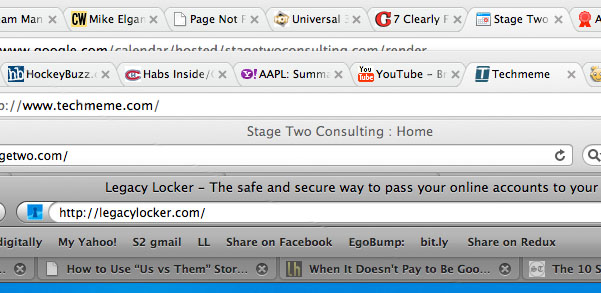
It’s safe to say I’m not the only Web surfer who has lots of tabs open at any given time.  It’s also safe to say I’m not the only one who all of a sudden thought he was hearing voices, only to realize it was actually some Web site that automatically plays audio (or a video with audio).  Funny at best, annoying on average, embarrassing / disruptive at worst.  Especially if your desktop looks like this:

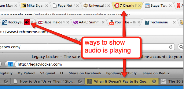
What if it looked something more like this:

I’m obviously not the best at Photoshop (and thanks to Jing for the easy markup tool), but there are so many ways to think about how to help users out a bit more.  Tabs could also show:

  • Download status
  • Buffer status
  • Flash/script problems
  • Incomplete forms
  • Loading issues/status
  • and so much more…

We’ve been online and using “the Web” for about 15 years now (some of us, at least), and despite the amazing advances in the capabilities of a Web browser, I find in many ways things aren’t much “better”.  Web sites still can’t seem to load much faster than they did a year, five years, or ten years ago. I understand you can “do more” in a Web page than ever before.  But is “more features” better than “load faster” in our fast-paced lifestyle?  I’m not quite sure…

Share this:

  • Email
  • Facebook
  • LinkedIn
  • Twitter
  • Reddit
Posted in Web/Internet | Tags: browser, usability, web browser | 6 Comments |

What we really want out of new operating systems

Posted on August 27, 2009 by Jeremy Toeman

With Snow Leopard set to debut tomorrow (except for all my industry friends who already have it that is), I’ve been pondering a lot as to the true value of new/improved operating systems.  In a nutshell for SL it seems to be $30 to improve the overall performance of existing Leopard installations.  That makes sense as a value proposition (for only $30, my $1000 laptop will perform better than it does today? count me in). Windows 7 is coming soon, which seems primed as a substantial improvement over Vista (insert cheap shot here), and again I ponder as to the alignment between market needs and product offerings.

My basic assertion is we’ve reached a plateau in the cycle of improving computer/OS/Internet experiences, and the investment should be more oriented on basic performance and reliability, as well as dramatic improvements in simple ease of use. As a simple assertion, it’s my belief that the average computer user (PC and Mac) is still challenged to perform tasks as “basic” as locating downloaded files, upgrading software, and virtually any kind of networking function.  And for those of you reading and slowly sticking your nose in the air in a mocking fashion, your snobbery does not benefit those who use computers day-in and day-out, and in the long run is costing you time and money.

Here’s my target list of what fixes would help the bulk of computer users today and tomorrow:

  • Expert Mode.
    The steepest challenge in most systems is helping novices while empowering expert users.  When it comes to as big a system as the core OS to a computer, the challenge is close to insurmountable.  As a result, features that many people would want to use are buried into hard-to-find places or unknown keyboard shortcuts (command-shift-3 to screenshot? come on). In the short term, letting a user “flip a switch” to go into expert mode after getting comfortable with basic OS usage could be the easiest way to improve overall usability.  Then, all sorts of helpful tooltips, modal alerts, and more could be used to help new/novice users learn the basics.
  • firefox-downloads-screenshotThe Download – Save – Install sequence.
    Good examples: Firefox extensions and AIR applications.
    Bad examples: everything else.
    I am still stunned at the complexity of most installers, and I’m not even talking about the poorly designed installation wizards.  The number of ZIPs, SITs, DMGs, RARs, and more that sit on desktops and download folders without getting opened is awful and reflects poorly not on users, but on the developers who built these systems.  I get it that we need protection against viruses and malware, but can’t there be a smarter way to deal with this?  Yes we can.
  • Taking Screenshots.
    If making screenshots was as simple for people to use as it should be, my hunch is tech support costs for application developers would drop dramatically.  Instead, it’s a highly buried feature in both Windows and OS X, and it doesn’t look like that’s going away anytime soon.
  • Integrated support for removable storage (semi-permanent vs not).
    There are literally hundreds of millions of removable storage drives, both USB thumb sticks and external hard drives.  Yet almost no basic set of applications have native support for the concept of a “semi-permanent” drive (one that sits on your office desk, for example, but not at home).  Sure most apps can use data on these drives, but it’s always in a semi-dysfunctional manner.  iPhoto, for example, retains thumbnails on the local hard drive, but at no point informs the user that the full resolution image won’t be available until the drive is reconnected.  There should be utter clarity to the user, at all times, as to which files are where, and how to properly manage stuff.  For a follow-up example with iPhoto, I should be able to “move” folders/events to removable drives (as my iPhoto Library is the biggest space consumer on my hard drive), and it should act smartly about it.
  • Browser speed!
    Okay, this is happening in Snow Leopard anyway, but I still wanted to iterate it.  The bulk of time spent on computers is inside the browser these days, so the more the browser can natively be fast, the more productivity we have.
  • File sharing.
    I fundamentally believe that Finder and File Explorer still represent the worst aspect of computing. Watching people try to upload photos to sites like Tumblr is such an easy example of the brokenness of it all. The analog of folders/file folders is simply broken, as is the entire concept of what files, shortcuts, applications, etc are. If tied in to my earlier comment on “expert mode”, then the creation of a “novice” file browser could be a huge step forward.  In the interim, the more the OS can help promote local search, the better.
  • photo-82Webcams.
    Everybody (and I use the term fairly literally now) wants to use webcams. Whether its for dating, remote working and productivity (disclosure: Team Apart is a client of Stage Two Consulting), or staying in touch with friends or family, the webcam is probably the most useful accessory I can think of.  So why did it take me over an hour to get my father’s working with Skype? Whatever needs to happen in regards to drivers, API, and other common technology components to make Webcams work all the time needs to happen, and soon.
  • Backups.
    Both Windows and OS X include backup capabilities.  Both are better than they’ve ever been.  Neither are good enough.  If I had to make a wager on impending individualized technology crises, I’d bet that a lot of good people are going to suffer some serious data loss in the coming years.  Backup should be more than just “an option”, but an annoying, pestering reminder that prevents users from doing much without properly configuring backups.  Further, backup should be enabled on a per-file, per-folder, per-application basis (like Time Machine does, but even moreso).
  • Automatic Document Saving & Versioning.
    Technically this really lies within Office applications more than the OS, but it could happen at any level.  The entire concept of “saving” a file is ridiculous.  When you write on a piece of paper, it’s “saved”.  You can opt to discard it, which you’d have to pro-actively do.  If you want to easily retrieve it from a stack of others, you might put some special tag or label on it, or put it in a specific drawer or file cabinet that you have, which you’ve probably organized fairly easily.  Electronic files must work the same way! The entire concept that one could write a document, then accidentally click a single button to destroy hours of work is utterly idiotic. The mere act of typing a new document should save, and every edit you make should also save, and every version of every edit should be retrievable (especially considering apps like Stickies and sites like WordPress do this natively).  Instead of renaming documents, there should simply be a visual timeline and an easy-to-use slider that lets you use Time Machine-like visuals to see prior versions.
  • e-Wallets.
    If the computer guys want to stop the mobile guys and social networking guys from owning my transactions, they need to step it up soon.  A built-in wallet to more rapidly enable e-commerce and microtransactions is a logical evolution of the operating system, not a third-party Website.

Unfortunately there seems to be a bit too much energy into “video desktop backgrounds” instead.  Ah well, one can dream.  Any other “basic wants” people have to improve computing, please share in the comments!

Share this:

  • Email
  • Facebook
  • LinkedIn
  • Twitter
  • Reddit
Posted in General | Tags: osx, snow leopard, usability, vista, windows | 9 Comments |

About

Jeremy Toeman is a seasoned Product leader with over 20 years experience in the convergence of digital media, mobile entertainment, social entertainment, smart TV and consumer technology. Prior ventures and projects include CNET, Viggle/Dijit/Nextguide, Sling Media, VUDU, Clicker, DivX, Rovi, Mediabolic, Boxee, and many other consumer technology companies. This blog represents his personal opinion and outlook on things.

Recent Posts

  • Back on the wagon/horse?
  • 11 Tips for Startups Pitching Big Companies
  • CES 2016: A New Role
  • Everything I Learned (So Far) Working For a Huge Company
  • And I’m Back…

Archives

Pages

  • About

Archives

  • January 2019
  • April 2016
  • January 2016
  • December 2015
  • June 2015
  • May 2015
  • April 2015
  • March 2015
  • February 2015
  • January 2015
  • December 2014
  • November 2014
  • October 2014
  • September 2014
  • August 2014
  • June 2014
  • May 2014
  • April 2014
  • March 2014
  • January 2014
  • December 2013
  • September 2013
  • August 2013
  • July 2013
  • May 2013
  • February 2013
  • January 2013
  • December 2012
  • October 2012
  • September 2012
  • August 2012
  • May 2012
  • April 2012
  • March 2012
  • February 2012
  • January 2012
  • December 2011
  • November 2011
  • October 2011
  • September 2011
  • August 2011
  • June 2011
  • March 2011
  • February 2011
  • January 2011
  • December 2010
  • November 2010
  • October 2010
  • September 2010
  • August 2010
  • July 2010
  • June 2010
  • May 2010
  • April 2010
  • March 2010
  • February 2010
  • January 2010
  • December 2009
  • October 2009
  • September 2009
  • August 2009
  • July 2009
  • June 2009
  • May 2009
  • April 2009
  • March 2009
  • February 2009
  • January 2009
  • December 2008
  • November 2008
  • October 2008
  • September 2008
  • August 2008
  • July 2008
  • June 2008
  • May 2008
  • April 2008
  • March 2008
  • February 2008
  • January 2008
  • December 2007
  • November 2007
  • October 2007
  • September 2007
  • August 2007
  • July 2007
  • June 2007
  • May 2007
  • April 2007
  • March 2007
  • February 2007
  • January 2007
  • December 2006
  • November 2006
  • October 2006
  • September 2006
  • August 2006
  • July 2006
  • June 2006
  • May 2006
  • April 2006
  • March 2006
  • February 2006
  • January 2006
  • December 2005
  • November 2005
  • October 2005
  • September 2005
  • August 2005
  • July 2005
  • June 2005
  • May 2005
  • April 2005
  • March 2005
  • February 2005
  • January 2005
  • December 2004
  • November 2004
  • October 2004
  • September 2004

Categories

  • Convergence (81)
  • Gadgets (144)
  • Gaming (19)
  • General (999)
  • Guides (35)
  • LD Approved (72)
  • Marketing (23)
  • Mobile Technology (111)
  • Networking (22)
  • No/Low-tech (64)
  • Product Announcements (85)
  • Product Reviews (109)
  • That's Janky (93)
  • Travel (29)
  • Video/Music/Media (115)
  • Web/Internet (103)

WordPress

  • Log in
  • WordPress

CyberChimps WordPress Themes

© LIVEdigitally
loading Cancel
Post was not sent - check your email addresses!
Email check failed, please try again
Sorry, your blog cannot share posts by email.